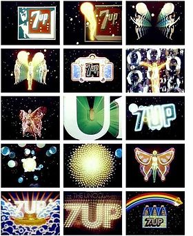
Stoking a California Dream

Early animated abstractions by Robert Abel and Richard Taylor for 7-Up.
“It is common practice today to place the word ‘California’ in front of almost any vagrant word and thus achieve a magic combination hopefully intended to make the heart jump and the purse strings fly open,” the designer Alvin Lustig wrote in 1947.
But it wasn’t the word alone. Mr. Lustig and other graphic artists gave “California” a look, for periodicals, posters, packaging and vacation destinations, that also made the heart jump and loosened the purse strings. It was colorful, it was experimental, it was rough, it was digital.
And the same can be said of the new book Earthquakes, Mudslides, Fires & Riots: California Graphic Design, 1936-1986 (Metropolis Books, $55), written and designed by Louise Sandhaus, 59, a graphic designer. As she writes in her introduction, she chose not to honor text over graphics, and she wasn’t interested in being definitive. Rather, looking through archives and talking to makers, she asked questions like, “Is this historically important work, versus is this fabulous and distinctive and sooooooo California?” The pieces in the book range in mood from the calm abstraction of John Follis’s “Arts & Architecture” magazine covers to the pixelated trips in David Theurer’s “I, Robot” Atari game.
Oh, and that title? Ms. Sandhaus wrote in an email, “It’s a cliché about California, but one that encapsulates a place where big dramatic changes happen.”
On X
Follow @LangeAlexandraOn Instagram
Featured articles
CityLab
New York Times
New Angle: Voice
Getting Curious with Jonathan Van Ness