Gunnar Birkerts, postwar modernist, dies at 92
Gunnar Birkerts, Federal Reserve Bank (Minneapolis), 1976. Photo by Balthazar Korab.
“The School That Will Vanish,” reads the headline on Architectural Forum’s November 1967 story on Gunnar Birkerts’ Lincoln Elementary School in Columbus, Indiana. Birkerts had first worked in Columbus, that hotbed of postwar modernism, in the early 1950s, as project architect on Eero Saarinen & Associates’ Irwin Union Trust building.
Harry Weese, John Carl Warnecke, The Architects Collaborative and Edward Larrabee Barnes had all designed schools in the in the intervening decade but, unlike its six predecessors, Lincoln was set on an urban site, just down the street from Eliel Saarinen’s First Christian Church and the under-construction main library by I.M. Pei.
“They thought they didn’t need another star architect to build another one of those things,” Birkerts told me in an interview last year. “They thought they were losing part of the community. I had a good solution to that problem: first of all, the school occupies the smallest area that you could have, a square, and the rest returns to the town as a park.”
Birkerts died this week, at 92, but his work has never seemed more relevant.
Memphis, Fiorucci and Me
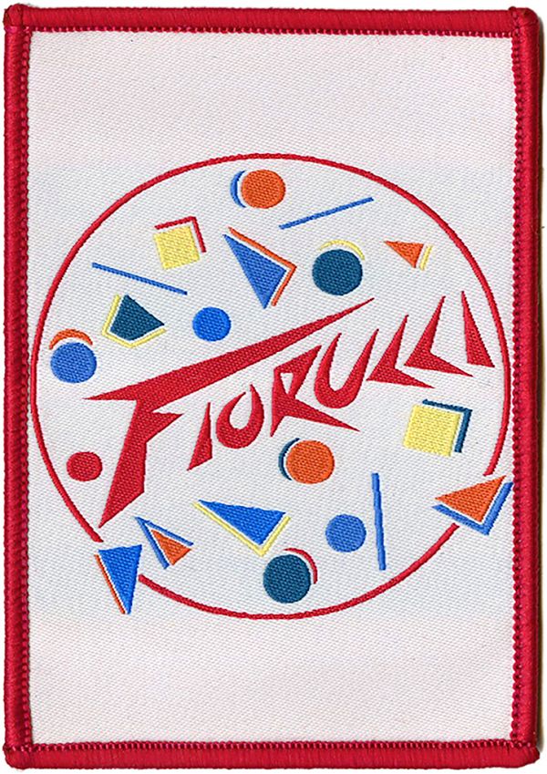
Fiorucci, 1984. Via It's Nice That.
This essay was originally published in the inaugural issue of August Journal as “Learning from Milan.”
In the eleventh grade, at a small Quaker school in Durham, North Carolina, I wrote a history paper about Memphis. Not the city some ten hours away, but the seven-year-old Italian design movement known for its subversive combination of plastic laminate, abstract pattern, and totemic shapes. The cover of my report was blue, and on it I attempted my own hand-lettered version of a jazzed Memphis typeface. Its contents have since been lost to history, as has my teacher’s reaction to the celebration of plastic, color and artificiality at a school where the wind whistled between the vertical siding and, when the wood stove proved inadequate, we just wore our coats inside. Style was not one of the virtues taught here—critical thinking was—and yet a previous generation of upper schoolers had included a boy who thought he was David Bowie, and one of my lunch companions dressed as if she were about to appear in a Guns N’ Roses video. We all rebel in our own way.
My rebellion wasn’t against my education but the place: a wood building in the woods, to which, now that I was 16, I drove with my younger brother in my Nissan Sentra each morning. I had once glimpsed another life, where there were coffee bars on every corner and a tram at the end of the street; where the very old and the very new brushed up against each other, and the stores were filled with rainbow sweaters. That life was in Milan.
I celebrated my 13th birthday with my family on January 7, 1986, our first night in Milan. It was dark and foggy, and I cried. My father was due for a semester-long sabbatical, and my mother had arranged the same, so here we were, for six months, in a vast foreign city whose outlines I couldn’t see. The following Monday my brother and I would start at Italian schools, where we wouldn’t understand a word. I was terrified.
At first, only the food helped. I loved the crown-shaped rolls, crisp around a giant air bubble, from the bakery around the corner. I savored the rotisserie chicken from the farmers market at the end of the block. I slowly learned the Italian varieties of pizza (Siciliana forever) and appreciated that I didn’t need to negotiate toppings with my brother. I gained the courage to order my own cups of cioccolata or orzata at cafés.
School was a mystery and thirteen-year-old girls a brick wall, but in all the time I had to daydream while the professoressa taught, I studied my new classmates. Their clothes were different. Popped collars. Sweaters of many hues. And they carried clear plastic pencil cases and the cutest satchels I had ever seen, with hard sides, a long strap, and a flap that buckled over the top. Each featured a different pattern of cloth, lacquered to a shine. Italian girls didn’t wear backpacks. They came to school with glamour.
My family went downtown on the tram to the biggest plaza I had ever seen, the icicle-like cathedral, the cathedral-like Galleria. Our block and our apartment were clean and orderly, but these spaces were grand and ancient—and there was a Fiorucci around the corner from the Duomo. I recognized at once that this was a place where the cool girls shopped. I remember the shopping bag better than its contents. Made with clear, thick plastic, and adorned with a pair of cherubs, it should have been tacky but it was a treasure.
Benetton was there, too. Their ads were everywhere that year, but the stores, bright and white with stacks of sweaters running up the wall, like Technicolor lanterns lighting up the gray stone storefronts, stopped you dead in your tracks. It was hard to even move past the door without falling for a color. I finally settled on turquoise, but not without casting backward glances at cranberry and jade.
Spring progressed, and I never made any friends. My brother, who was 9, learned the few phrases required to play calcio and used that as his entrée—there were always boys kicking a ball around somewhere. But I made friends with the city. At a certain point, I could walk around the neighborhood by myself, order pastries at the bakery, finger the pens at the stationery store. Later, I would even ride the tram downtown alone to the Duomo to meet relatives visiting from out of town, proud that I knew my way around the monument. Milan became familiar, a home.
The bags were another story. They were from a company called Naj-Oleari, quite expensive, and available in a bewildering array of patterns and sizes, from Liberty-esque florals to stripes that looked dull in context. After much negotiation with my mother, I acquired one just in time for me to take it home to Durham. It was pearly gray, with a geometric scatter of tiny pastel cars. The color said sophisticated, the automobiles said kid. I didn’t know what I was yet—I may not have known until I was 30—but I loved that bag.
I didn’t know about Memphis, officially, while I was in Milan. My mother bought Barbara Radice’s book that year, and we could have seen a show, though we didn’t have the connections to go to the furniture fair. But I saw where it came from. Memphis, albeit for grown-ups, wasn’t that far from the Fiorucci cherubs, the candy colored sweaters, and the cheeky printed plastic bags that were part of 1980s Italian teen culture. My Milanese treasures, and the experience of seeking them out, had made me susceptible to its charms. The plastic aesthetic flourished in that old gray city, much in the way kawaii culture flourishes in new high-rise Tokyo. Cheeky taste refreshes the immovable and immutable. As founding member Ettore Sottsass told the Chicago Tribune in 1986, “Memphis is like a very strong drug. You cannot take too much. I don’t think you should put only Memphis around. It’s like eating only cake.”
Three years later and back in Durham, I wrote about Memphis because it seemed the farthest thing from where I was, a young city of wood and brick and asphalt, and an ongoing connection to where I wanted to be. I knew I wanted to live in a city, a real city, where the buildings were stuck together and I never needed to drive a car. I carried my coveted satchel, used my clear pencil case, and wore my candy-colored sweater until it was ragged. Sottsass’s Carlton bookcase, then as now my favorite Memphis piece, was not merely an object of fascination. It was a portal to the future me.
Hippie Modernism, Italian Style: Ettore Sottsass at 100
Ettore Sottsass, 1974. © Photo Bruno Gecchelin, 1974 by SIAE 2017.
How do you make Ettore Sottsass’s bed?
That was the question facing curator Christian Larsen, who placed Sottsass’s 1992 couch, with a scrolling pearwood footboard and a headboard textured like a high block wall, at the end of the new Met Breuer retrospective of the Italian architect’s work, “Ettore Sottsass: Design Radical.” Should he play up the fairytale aspect of sleeping in a castle with a white fur counterpane? Or go with something more monkish?
In the end, the answer became clear: you make it “very plainly.” White sheets and a single pillow. The ascetic as king.
The question of bedclothes is not trivial to understanding the work of Sottsass, who would have been 100 this year (he died a decade ago, in 2007). Best known as the ringleader of Memphis, the short-lived and wildly patterned design collective that defines 1980s style, Sottsass was perpetually tweaking the nose of modernism while embracing its machines, its manufacturers, and even its colors.
OMA's plan for the Albright-Knox chases the contemporary to the detriment of its past
Aerial view of the Albright-Knox Art Gallery. Photo by Blake Dawson.
The future of the Albright-Knox Art Gallery, in Buffalo, New York, is a blue foam rectangle.
Shohei Shigematsu, partner-in-charge at OMA New York, lifts the block—which represents the new gallery space his firm is designing for the museum as part of its $125 million dollar expansion—over a model of the existing campus, set on a knoll overlooking Hoyt Lake in Frederick Law Olmsted’s 1876 Delaware Park.
The expansion, whose concept design was announced in June, will also include an underground parking garage, renovations of its existing neoclassical 1905 and modernist 1962 buildings, and new education facilities and offices.
He holds the block over a model of the 1962 building, the previous expansion designed by Buffalo native Gordon Bunshaft for Skidmore, Owings & Merrill. Bunshaft’s addition combines a square-donut courtyard, not unlike the elevated box at his Lever House in New York, with ground-floor galleries and a floating, black-glass auditorium—the yin to E.B. Green’s white columned yang.
It doesn’t fit—it’s far too large—but the scheme OMA has proposed bears the fingerprints of designing by boxes: They split the blue box in half, lofting half of the new gallery space in a glass box (or two) elevated above Bunshaft’s courtyard, which would be removed. The other half would be buried underground, next to two levels of parking, in the broad lawn on the Elmwood Avenue side of the museum. The galleries would be topped by a sculpture terrace and a new stair built on the footprint of the 1905 building’s original grand flight.
Organizing the World

Girard house, Grosse Pointe. Photo by Haanel Cassidy/Courtesy Vitra Design Museum, Alexander Girard Estate.
On September 21, 1967, First Lady Lady Bird Johnson visited Columbus, Indiana. The architects of the town’s famous modern architecture program lined up to greet her outside Gunnar Birkerts’s Lincoln Elementary School (1967), leaning on the concrete bollards designed to channel the schoolchildren up the wide concrete stairs and into the body of the school.
John Dinkeloo, Dan Kiley, Robert Venturi, I.M. Pei, Harry Weese, John Carl Warnecke, Birkerts. But over on the far right, clasping hands with Pei and almost out of frame, is Alexander Girard. That’s where he liked to be.
Designer Alexander Girard was also an architect—though most don’t know him as such—and a key player in making America look and feel modern. Today he is best known for the fabrics he designed as director of the Herman Miller Textile Division between 1952 and 1973, which included everything from colorful stripes to eye-crossing checkers, cut-out flowers to a hand-drawn alphabet.
Jane Jacobs, Georgia O'Keeffe, and the Power of the Marimekko Dress

Marimekko "Varjo" dress owned by Georgia O'Keeffe, c. 1963. Designed by Annika Rimala. Courtesy Brooklyn Museum.
On June 20, 1966, Jane Jacobs was speaking out against the destruction of Washington Square Park. “SOS, Park Association of New York City Opposes N.Y.U. Library!” reads the sign taped to the table. And another: “N.Y.U. Don’t block off the … ” The signs overlap. The light? The street? The park? All of the above.
Jacobs was protesting New York University’s plans to build a library on the south side of Washington Square, a great red hulk that she and fellow-protesters feared would turn the public park into an academic green and loom over low-rise row houses. “All the glamour of Philip Johnson [the project’s architect] won’t save that corner of the park from gloom,” she said. “The two elements most destructive of urban parks are highways and educational institutions.” She’d already stopped Robert Moses’s proposed throughway a decade before; now she was trying to take care of the second element.
Peering at a blotchy black-and-white image of this historic event, I noticed something distinctive about the hem of Jacobs’s dress: a lighter-colored scallop wending its way around the bottom, like the brick border on a garden plot. The Jane Jacobs look was simple to the point of caricature: blunt bob with bangs, thick black eyeglass frames, beads. A skirt fit for cycling around Manhattan. Where had I seen that border before? Then it came to me: at the Brooklyn Museum’s current exhibition “Georgia O’Keeffe: Living Modern,” a deeper-than-you-might-think look at the painter’s curation of her wardrobe, home, and image. Against one wall, the curator Wanda M. Corn lines up a series of O’Keeffe’s long-sleeved, full-skirted cotton dresses from a Finnish company that epitomized modern fashion: Marimekko. O’Keeffe and Jacobs had (almost) the same dress.
All About Frank
RIGHT: The Mile-High Illinois, Chicago. Project, 1956. LEFT: Unveiling the 22-foot-high visualization of The Mile-High Illinois at the October 16, 1956 press conference in Chicago. Courtesy FLW Foundation Archives.
MoMA tries to wrest the spotlight from the “world famous architect,” but the player always wins
In 1956, Frank Lloyd Wright appeared on the television show What’s My Line? On the show, a panel of once-upon-a-time celebrities ask a mystery guest yes-or-no questions in order to figure out who he is and what he does. We know who Wright is, of course, and there’s anticipatory pleasure even in the decisive way he chalks his name on the show’s blackboard to start: It is less script than graphic, less name than geometry. If Wright was going to be on a game show, he was going to do it properly, though he only admits to having “watched one of the shows with interest.”
Problem was, Wright had already done his job too thoroughly. Under questioning, he reveals that he is self-employed, that he uses his hands, that clients frequently come to him two at a time. “Is this service for both men and women?” one panelist asks. “I like to think so,” says Wright dryly. One lady finally catches on, wondering if he could be in a profession “such as design, or architecture, such as Frank Lloyd Wright?”
“Wright and architecture had, for many Americans, become synonymous,” writes Barry Bergdoll in the catalog for the Museum of Modern Art’s latest Frank Lloyd Wright exhibition, “Frank Lloyd Wright at 150: Unpacking the Archive,” which he co-curated with Jennifer Gray. Problem is, for many Americans, Frank Lloyd Wright and architecture still are synonymous. Even the Museum of Modern Art— with whom Wright famously feuded after the 1932 International Style exhibition dared to put his work alongside that of younger, less famous, European architects—has gone back to the Wright well more than a dozen times, giving him solo shows in 1940, 1962 and 1994, as well as spotlighting the acrobatic Fallingwater (1938), both earth-hugging Taliesins (1947), and his radical workplace for Johnson Wax (1952).
Learning from Milan

AUGUST is a new journal on design and travel, started by Dung Ngo, with each issue dedicated to a specific city. When I had coffee with Dung in November, he told me the first issue, just released, would be about Milan. My family lived in Milan for seven months when I was 13 (my parents were on sabbatical), and I’ve always felt that that time in a historic city, with a duomo and public transportation and stylish shops, turned me into an urban person.
For the first issue, I wrote a short memoir of my time there, and what I learned at Fiorucci, Benetton and Naj-Oleari. It’s not online yet, but I will update when it is.
In the Second Avenue Subway, art and architecture are at odds
Vik Muniz’s “Perfect Strangers” at the 72nd Street station. Photo by Max Touhey.
Architect Harry Weese’s first Metro design presentation to the Washington, D.C., Commission of Fine Arts in April 1967 did not go well. Commission member Eero Saarinen called the exposed granite sidewalls of Weese’s design for the system’s deepest stations—rumpled and craggy, inspired by several in Stockholm—“Hansel and Gretel.” Commission member Gordon Bunshaft described them as “folk art” and the overall look as “a refined coal mine shaft.”
At subsequent meetings, the commission pushed back on Weese’s desire to express the different station configurations (exposed, tunnel, cut-and-cover) through varied interior design. Rather than fairy tales, they wanted something in the “spirit of the classical style,” as Saarinen put it. According to historian Kathleen Murphy Skolnik:
Halfway through the two-hour meeting, Bunshaft, attempting to illustrate what the commission wanted, turned over one of Weese’s presentation boards and sketched a vaulted design similar to one initially submitted by Weese… Weese refrained from pointing out the similarity between the two and instead praised Bunshaft’s concept as “a pretty exciting thing.” Former Weese employees involved in the project credit Bunshaft with saving Weese’s vision for the grand vaulted spaces that are the dominant feature of the Washington Metro system.
I had cause to reflect on the D.C. Metro—and look up its origin story—after two visits to the first four stations of the Second Avenue Subway, which opened January 1, 2017. The extension of the Q line is already popular, the stations are spacious and clean, and the MTA is justifiably proud of public art installations by Jean Shin, Vik Muniz, Chuck Close, and Sarah Sze in each of the new stations. But I could tell, just by looking at it, that the process had been very different from that of the Metro, just as the photos one takes in the Metro are very different from the snippets of Second Avenue showing up on Instagram.
From Japanese Internment Camps to Mid-Century Modern
Alexandra Lange, architecture critic for Curbed, joins us to discuss her story, The forgotten history of Japanese-American designers’ World War II internment: Revisiting the link between detention and design history, 75 years after FDR’s executive order. The story investigates the connection between how Japanese-American designers and architects, who were huge influences on mid-century modern American architecture, were influenced by their time in American detention camps during World War II.
Lange will be joined by Dakin Hart, senior curator at the Noguchi Museum and the curator of the recent exhibit Self-Interned, 1942: Noguchi in Poston War Relocation Center.
On X
Follow @LangeAlexandraOn Instagram
Featured articles
CityLab
New York Times
New Angle: Voice
Getting Curious with Jonathan Van Ness