Portfolio | New Museum
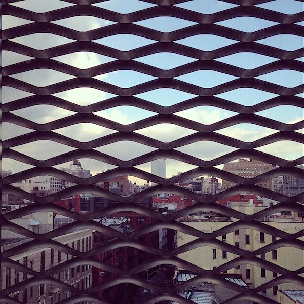
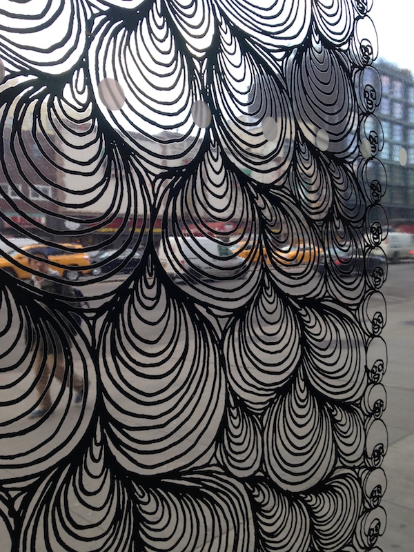
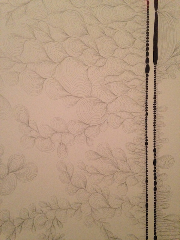
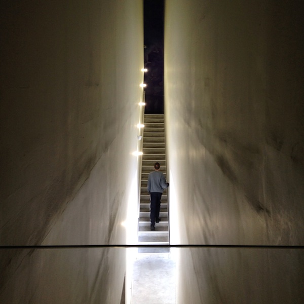
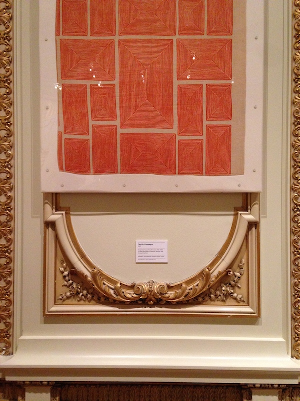
It’s been quite a while since I’ve been to the New Museum, and I wanted to catch the Chris Ofili exhibit before it closed on February 1. I took only a few photographs of the exhibit because it left me underwhelmed. The new paintings seemed thin and derivative — if you create a dark room with dark paintings, they had better have the power of the Rothko Chapel — and the figural shapes reminded me of German Expressionism, but without the added richness and layering of Ofili’s earlier work with sequins, collage, and elephant dung. I did like some of the drawings, one photographed here, that were transformed into films for the big windows on the museum’s first floor. Their aqueous shapes made a nice commentary on the museum’s metal carapace. In general I thought the architecture was looking a little sad. Dirty whites, paint-crusted metal edges, the incessant dinging and scraping of the elevator in that supposedly contemplative gallery. I’ve always liked the SANAA building conceptually, but its simplicity needs upkeep.
Free Ada Louise
My husband is an architect, which means he spends long hours at his computer with his headphones on listening to things. Mostly WNYC. Earlier this year, during a series of late nights in which he did not like their shows, he listened to all 66 hours and 11 minutes of Robert Caro’s The Power Broker. He found Caro’s book inspiring, and began poking around Audible.com for other architecture classics known but not read. He discovered On Architecture, the last collection of Ada Louise Huxtable’s columns, but couldn’t make it past the first few essays. The reader, T. David Rutherford, seemed never to have prepped on architect’s names, and hearing him mispronounce Mies was like nails on a chalkboard.
In the interest of calling attention to the need for a new recording of Ada Louise by someone versed in architect’s names (and, may I suggest, a woman? A critic, of all writers, should be heard in something you can imagine as her own voice) I decided to record an essay myself. I picked the dully titled “A Look at the Kennedy Center,” published in the New York Times on September 7, 1971, for its many famous witticisms. I’m no professional, but you do want to listen to the end.
After you’ve listened, please share with your version of this message: In 2015, Ada Louise deserves better audio. Maybe you also want to record your own?
Stoking a California Dream

Early animated abstractions by Robert Abel and Richard Taylor for 7-Up.
“It is common practice today to place the word ‘California’ in front of almost any vagrant word and thus achieve a magic combination hopefully intended to make the heart jump and the purse strings fly open,” the designer Alvin Lustig wrote in 1947.
But it wasn’t the word alone. Mr. Lustig and other graphic artists gave “California” a look, for periodicals, posters, packaging and vacation destinations, that also made the heart jump and loosened the purse strings. It was colorful, it was experimental, it was rough, it was digital.
And the same can be said of the new book Earthquakes, Mudslides, Fires & Riots: California Graphic Design, 1936-1986 (Metropolis Books, $55), written and designed by Louise Sandhaus, 59, a graphic designer. As she writes in her introduction, she chose not to honor text over graphics, and she wasn’t interested in being definitive. Rather, looking through archives and talking to makers, she asked questions like, “Is this historically important work, versus is this fabulous and distinctive and sooooooo California?” The pieces in the book range in mood from the calm abstraction of John Follis’s “Arts & Architecture” magazine covers to the pixelated trips in David Theurer’s “I, Robot” Atari game.
Oh, and that title? Ms. Sandhaus wrote in an email, “It’s a cliché about California, but one that encapsulates a place where big dramatic changes happen.”
The New Cooper Hewitt

Emoticon Carnegie Mansion mugs, Boym Partners
At a time when so many museums seem intent on new spaces for new design and new art (like the Whitney, Upper East Side deserter), it’s a relief that the Cooper Hewitt finally spent the time and the money to make their 1902 Carnegie Mansion sing. Rather than being a straightjacket, the mansion’s ornate rooms and halls now form a rich and idiosyncratic frame for design objects of all ages. Gluckman Mayner and Beyer Blinder Belle worked together on restoring, updating, and adding to the architecture. The cases, designed by Diller Scofidio + Renfro, are crisp and clean, designed for sightlines and visual connections across the grand salons. The firm, as it did at Lincoln Center, has also jazzed up the outside: a new typographic canopy on Ninetieth Street leeeeans toward Fifth Avenue, and there’s L.E.D. lighting on the granite piers out front. Another example of new and old meeting in an elegant place is Boym Partners’ rendering of the mansion as emoticon: architecture transformed into “#”s, “+”s, and “[]”s, and applied to mugs, playing cards, and notebooks.
Fifth-Annual Year-End Awards
Five golden rings, four calling birds, three French hens, and two critics kvetching. What would the holidays season be without some lumps of coal? For the fifth consecutive year, prodigal contributing editors Alexandra Lange and Mark Lamster return to these robin’s egg blue pages to pick the best (and) worst of this year’s architecture and design. No middle fingers, we promise.
Jabba the Hut Award for Sensitive Urban Design: To George Lucas, for thinking he can dock that facocta Space Mountain on Chicago’s Lake Michigan. PS: Hey George, no design approvals until you release the original Star Wars on DVD without your “fixes.”
Most Unexpected Blobmeister: Peter Zumthor, whose hovering black form for LACMA continues to provoke headscratching.
Top Jargon of 2014: “tactical urbanism,” now enshrined in a MoMA exhibition, and close colleagues “pop-up urbanism” and “bottom-up urbanism.” We’re dangerously close to enshrining the small moves as we once did the big plans.
Best Architecture Money Can Buy Award: Tadao Ando’s new campus for the Clark Art Institute, a pristine if pricey exercise in museum building, with assists from Reed Hilderbrand and Annabelle Selldorf.
Most Architecture Money Can Buy Award: Frank Gehry does his thing in Paris, now with lots of glass.
Bringing Brutalism Back Award: David Adjaye’s Sugar Hill tower, in Harlem. A kinder, gentler brutalism.
Brutal Rejection of Brutalism Award: The Whitney departs its brooding, beautiful bastion by Marcel Breuer to hang out with Jean-Ralphio and his ilk in the Meatpacking District. Sigh.
First Brutalism, Best Brutalism Award: To Timothy Rohan’s long-in-the-writing (but couldn’t be more timely) The Architecture of Paul Rudolph. The rare monograph that leaves you wanting more—and we do wish there were more photos.
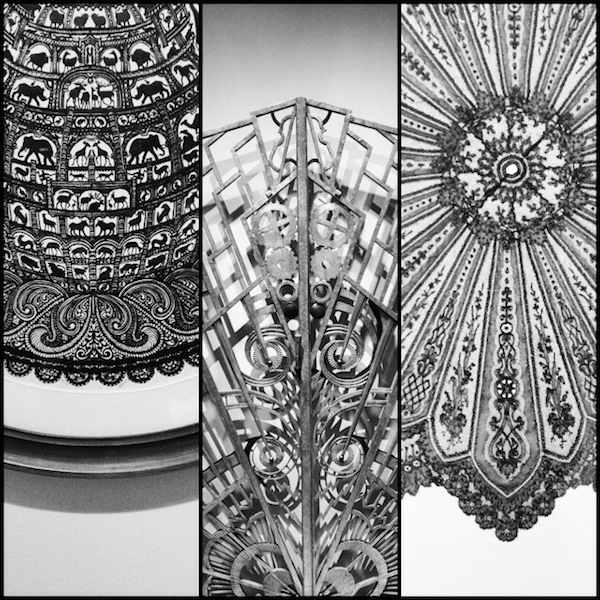
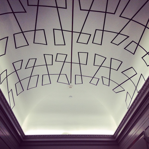
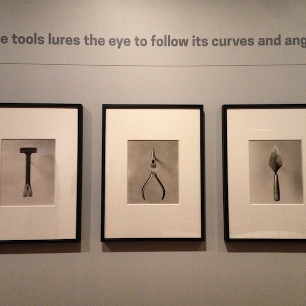
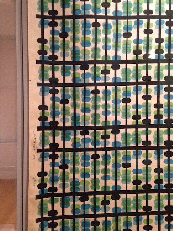
Visit: Cooper Hewitt
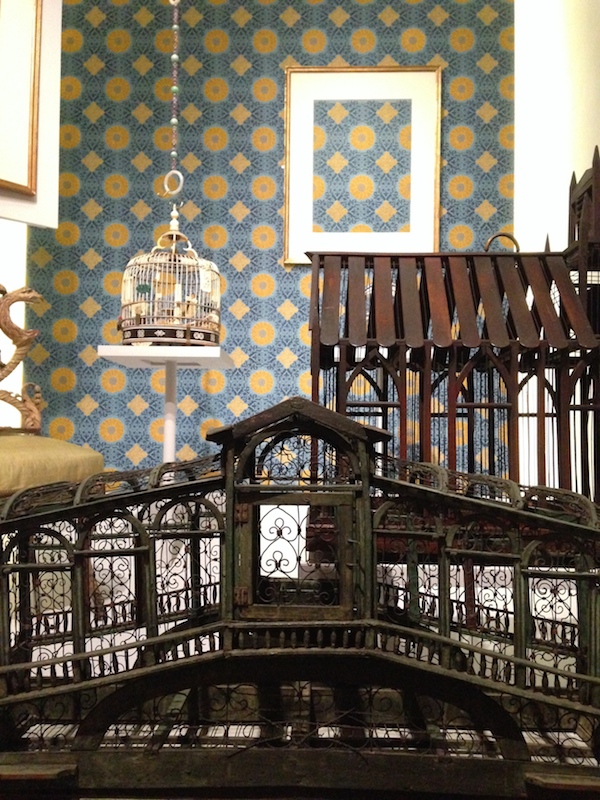
The Cooper Hewitt, Smithsonian Design Museum (which has finally cleaned up its name, among many, many other changes) reopens after a three-year “transformation” on Friday, December 12. My review is forthcoming, but one of the things I liked best about the installation of the collection was the many, many different ways they framed design, and design framed itself. These photos show that. If you want more of the architecture, John Hill posted a collection of shots that give an overview. I got distracted by all the shiny objects.
High Designs
Olabuenaga House, 1989-97, in Maui. Photo by Grey Crawford.
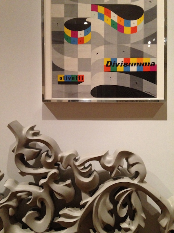
What does a computer look like? We recognize them now as slim and metallic, but not so long ago they were bubbly and candy-colored. Before that they were black and boxy. Before that they filled rooms, attended by staff. (Before that, computers were staff.) Ettore Sottsass (1917-2007), the Italian architect, designer and provocateur, was one of the first to grapple with the character of these new objects in the office landscape.
Sottsass was hired by the electronics manufacturer Olivetti in the late 1950s to design the first computer made in Italy, the Elea. For him to succeed, something strange had to be domesticated, or urbanized or organized. It was hard to say which. Olivetti’s electronics division in Pisa “was a world of science fiction, inhabited by engineers in white coats moving among mountains of wires and valves,” in the telling of Sottsass’s biographer (and widow) Barbara Radice. His solution was to treat the mainframe as a city, with aluminum skyscrapers attached to infrastructure in the sky. Those skyscrapers — smooth-sided, wardrobe-size boxes — were scaled to humans, to avoid alienation for their engineers. A grid of color-coded metal channels carried cables and wires overhead, allowing for rearrangement and future growth. With the Elea, Sottsass created just one of his many totems for the modern age, designing bridges between the handmade (or hand-computed) past and the machine-made future.
A new, comprehensive monograph on Sottsass by Philippe Thomé includes all of these totems, from the adorable Valentine typewriter to the suave Alessi fruit bowl, the Meccano-set modernism of the Elea to the color explosion of Memphis.
Visit: Making Music Modern

Jan Lenica. "Wozzeck," 1964. Courtesy Museum of Modern Art.
The Museum of Modern Art periodically refreshes its permanent collection design galleries. For the past year, the theme was “Designing Modern Women,” in two phases. I wrote about my disquiet with the expanded definition of “women’s work” in the first of those two installations here. On November 15, the museum opened a brand-new installation, Making Music Modern: Design for Ear and Eye that I can recommend without reservation. I’ve written before about my love of themed collection shows: big museums have so many things that never see the light of a gallery, and I’m always excited to see juxtapositions of big names and never-heard-of-hims or -hers, as well as the layering of different media themes can bring. Music, as it happens, is a particularly rich and broad theme.
We have architecture, in the form of a fabulous sketch by German Expressionist architect Hans Poelzig (usually resigned to the quirky margins), an incredible model of the Sydney Opera House that shows where the roof shapes came from (curator Juliet Kinchin said she thought it had never before been exhibited), and a recent model of Snohetta’s Oslo Opera House.
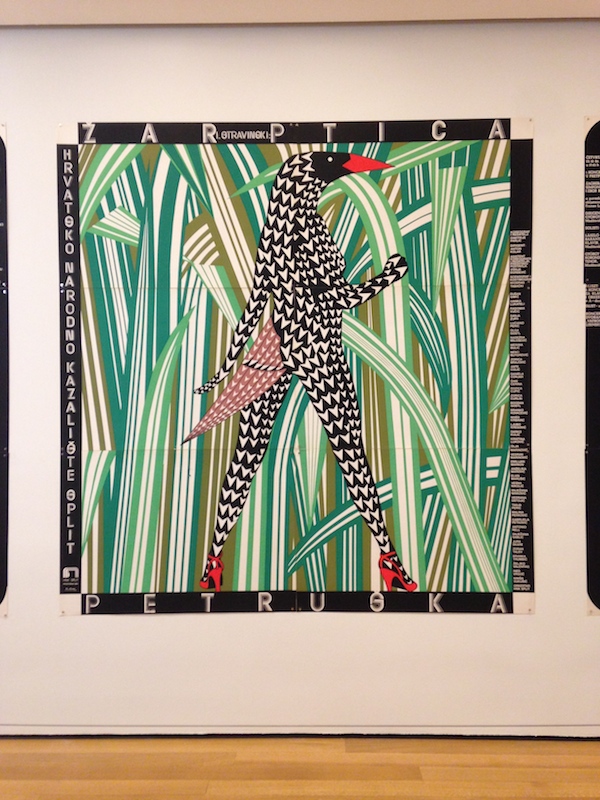
We have posters galore, from Loie Fuller to the Beatles, psychedelia to Paula Scher. I loved the three huge classical music posters from the 1980s, by Croatian designer Boris Bucan, that meet you at the top of the escalator.
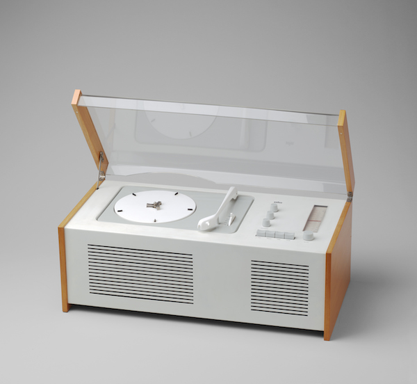
Radios, phonographs, speakers and iPods, including Dieter Rams and Hans Gugelot’s “Snow White’s Coffin” SK4/10 for Braun. It’s a lot of things, people, and sounds you wouldn’t usually put together, demonstrating the strengths of MoMA’s collection and also making connections between the past and the present day. Try to go during one of the lunchtime performances of the instruments of the past, and don’t miss the subtle transparent speakers overhead.
Gridded + Starred

Galaxy Wrapping Paper from Norman's Printery
I have a love/hate relationship with Pinterest, but I do love a theme. I’m not posting a Gift Guide, because I’m not a magazine or a style blogger, but I have created boards that are filled with fun things with grids and with stars. Why use galaxy wrapping paper as wrapping paper, for example, when it could be decor? And here’s where to get your “What Would Jane Jacobs Do?” t-shirt.
Open With Care (for Nordic Design)
The success of Birchbox, the monthly beauty sample subscription box, has spawned many emulators. There are subscription boxes for nail polish, for organic snacks, for homemade food and handmade items. What there aren’t many of, Ana Denmark, 32, noticed, was a subscription box for housewares, particularly the clean and simple home goods from Scandinavia that she favors. After checking out dozens of boxes in the name of research, Ms. Denmark launched Skandicrush in August, sending out her first $50 package to subscribers in October. Currently running a one-woman, self-financed business, with inventory stored in her stepson’s bedroom (he’s at college), Ms. Denmark hopes to eventually expand the site into e-commerce, so you can get that butter dish after the box is gone. And she has ideas for some other boxes that don’t involve moisturizers or mixed nuts.
On X
Follow @LangeAlexandraOn Instagram
Featured articles
CityLab
New York Times
New Angle: Voice
Getting Curious with Jonathan Van Ness