In California, a Marriage of Dance and Design
"Driftwood City," Sea Ranch, CA. Experiments in Environment Workshop, July 4, 1966. Courtesy Lawrence Halprin Collection, The Architectural Archives, University of Pennsylvania.
In 1966, the landscape architect Lawrence Halprin and the dance pioneer Anna Halprin invited 40 young people to Northern California to participate in a roving summer workshop. Moving from San Francisco north to Sea Ranch, the modernist coastal development master-planned by Mr. Halprin, the architects, artists and dancers investigated the common ground between the couple’s two professions: the environment. They staged a happening in Union Square, took blindfolded walks, built a village of driftwood and dropped paper from trees. A new exhibition at the Graham Foundation in Chicago, “Experiments in Environment: The Halprin Workshops, 1966-1971,” explores the Halprins’ interdisciplinary creative process through photographs, films, drawings and the scores that gave the participants’ movement a shape and a purpose. Mr. Halprin died in 2009, but Ms. Halprin, 94, spoke about the workshops and her continuing dance practice earlier this month.
A Celebration of Silver

“Like one’s reputation, sterling silver requires vigilance, lest they both tarnish and lose their luster,” writes Murray Moss in the new monograph “Georg Jensen: Reflections” (Rizzoli New York, $85). Mr. Moss, the design curator and consultant, leaves behind the well-trod path of history and instead explores what makes people want to care for the 110-year-old Danish company’s wares.
These range from the intricate nature-inspired forms of Jensen’s own designs to the pop provocation of Verner Panton’s “crumpled” 1988 dish. Describing jewelry by the midcentury designer Vivianna Torun Bülow-Hübe, Mr. Moss writes, “Ever so thin, subtle, slithery and sensuous, the silver looked light and fresh, like a blade of grass or a piece of string.”
Portfolio + Review | Emerson College Los Angeles
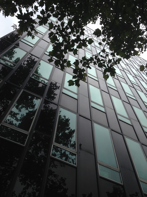
I saw Morphosis's Emerson College LA yesterday and I have to agree w HawthorneLAT</a> review <a href="http://t.co/Lhl0F4BKeH">http://t.co/Lhl0F4BKeH</a> ...</p>— Alexandra Lange (LangeAlexandra) September 18, 2014
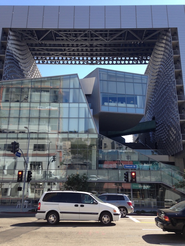
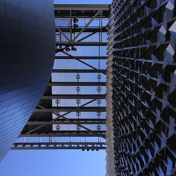
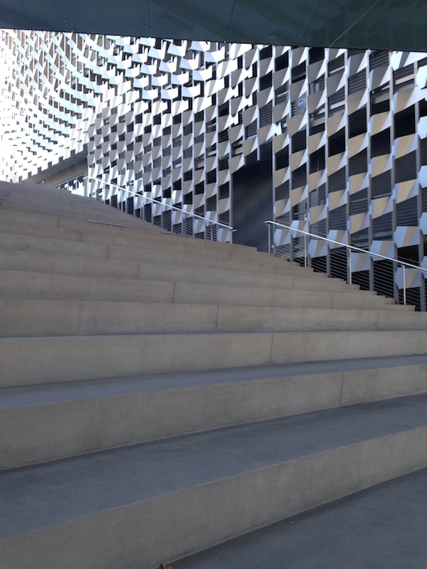
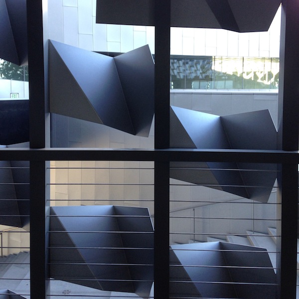
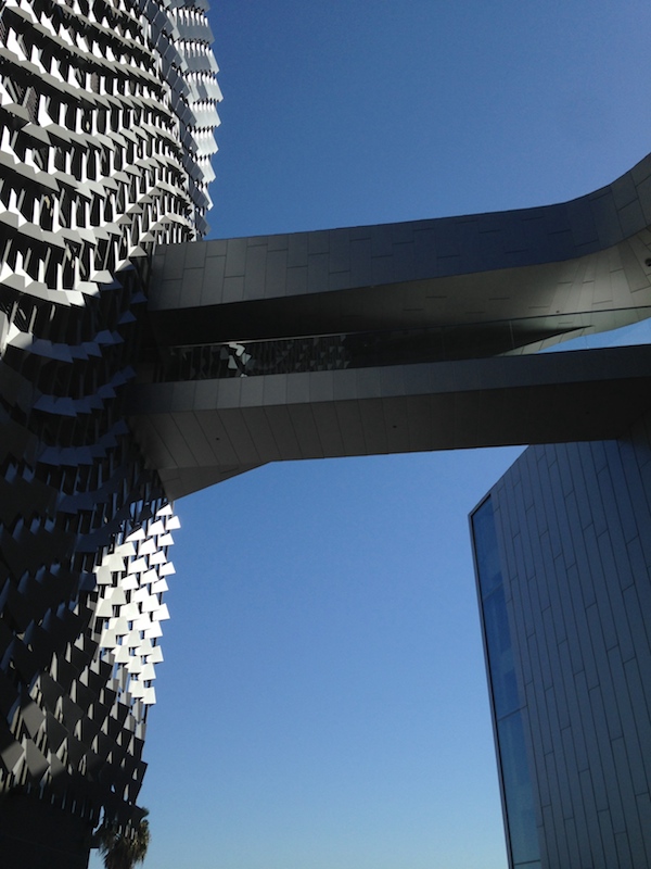
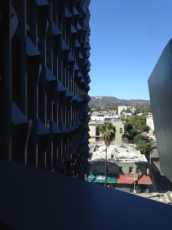
Morphosis’s 2014 building for Emerson College Los Angeles remixes the campus into a single, screen-like building, entirely appropriate to the college’s Sunset Boulevard site and the school’s ambition to have a legible urban presence. It frames the Hollywood sign for the students, there for a semester from Boston to do mostly entertainment-industry internships. It gives the school a marquee on a street lined with them, standing out but not breaking the scale or color palette of the boulevard.
Works as a bill-ding-board, beautiful metal screen but still, every interior space but the kitchens looks cheap + depressing. And idea …
— Alexandra Lange (@LangeAlexandra) September 18, 2014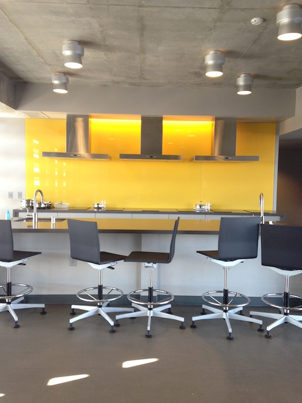
… That stairs = campus, = social life has yet to be proved out, even as M builds for more schools. Glad I know abt helipad zoning too.
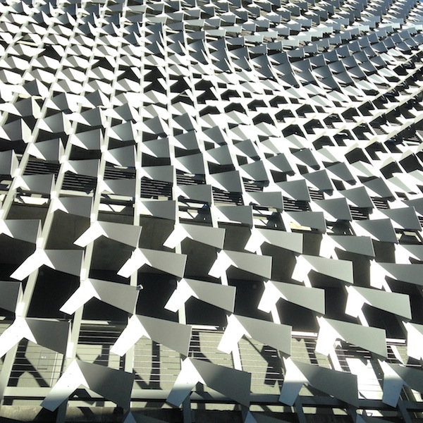
— Alexandra Lange (@LangeAlexandra) September 18, 2014It looked as if 90 percent of the budget was spent on the spectacular flock-of-birds metal screen, the twisting bridges, the helipad that forms the top of the box. The classrooms, the screening rooms, the dorm rooms, even the sittable stairs that are a Thom Mayne academic building signature are all rendered in dull, dead and texture-free materials, mostly gray. The only space with some verve is the communal kitchens, which have wheelie stools and yellow backsplashes. I am told they are wired up in case students want to film their own cooking shows, so that may explain the extra flourish. Yes, LA has a beautiful climate and yes, the students are mostly there for their off-campus internships but still: shouldn’t they have a retreat and a welcoming enclosure? Those spaces made me worry for Morphosis’s Cornell Tech building, where students won’t have as much good weather, and the rhetoric is much more focused on what’s happening inside.
The outdoor steps represent a “quad” at an angle, and were described as both a social space and a potential stage. In my photo you can see how plain they are. Would a little theatricality, in the form of cushions patterned like the screen, been totally out of the question? Even wooden planks, to suggest the idea of the bench, would have added human-scale texture. They could even have been stained gray.
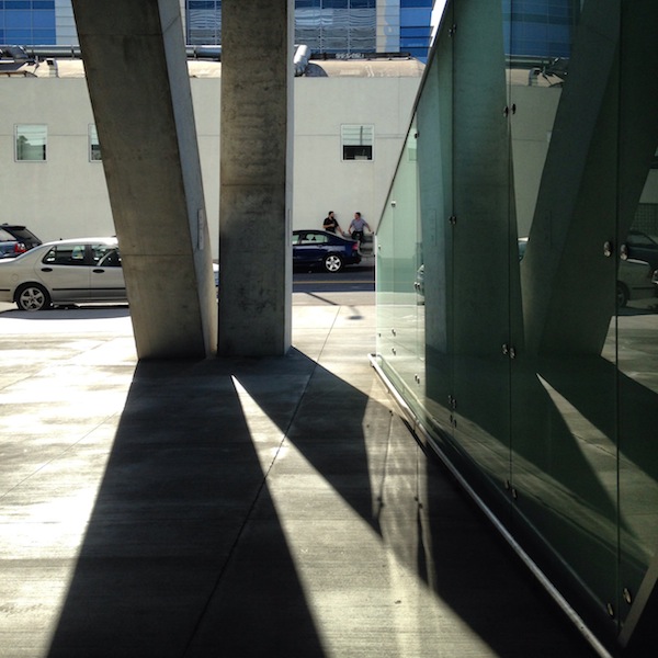
The two sides, formed by slabs of dorm rooms, are ten stories tall with the crosspiece. From the street it looms, but not unpleasantly (see my photo above from across the street, with traffic). It is not a spaceship, like Caltrans downtown or the San Francisco Federal Building, but closer in size to Morphosis’s Cooper Union building in New York. I appreciate the fact that for Emerson, unlike Cooper, Mayne re-articulated its functions, rather than cloaking them in a metal skin with mystery gashes. He also enclosed most of the ground floor on Sunset as a public cafe, perhaps learning from his New York mistake about the relationship of legs to street. As I wrote in my 2009 review of 41 Cooper Square,
At the sidewalk 41 Cooper Square might as well be set in the middle of a parking lot in Mayne’s native L.A. I was thinking of the criss-crossing concrete legs as Breuer-esque (there are lots of big boxes lofted on diagonal columns in his campus buildings in University Heights) when another building, closer to Mayne’s home turf, popped into my head: Eliot Noyes’s 1964 IBM Aerospace Building in Los Angeles, now the Otis College of Art and Design. Almost a cube, clad in precast concrete panels punctuated with windows that suggest a punch card, Noyes’s building lifted its symbolic screens off the ground on shifted diagonal legs and does sit in the middle of a sea of cars. Noyes’s building offered shaded space at the base, before the glass entrance, but in Mayne’s building, the space between concrete and glass is narrow and empty. A strip big enough for some sociability opens up on the south side, where a bookstore is scheduled to open. Maybe they will put out a few tables? In their loneliness the interstices of the legs are filling with bits of trash.
And if you want to see what it looks like in photos not taken by Iwan Baan, I posted a bunch on Instagram. It's smaller than you think!
— Alexandra Lange (@LangeAlexandra) September 18, 2014Finally, the mention of Iwan Baan’s photographs. Look at his first photograph of Emerson College LA on that review by Christopher Hawthorne. Doesn’t it look icy and removed? That’s a view few of us will ever see, and actually undercuts the accompanying critical praise. The questions asked in making that photograph are completely different from those most architecture critics are asking. Baan’s aerial views are heroicizing (and isn’t that what most architects want), but I remain uncomfortable that this is the way we see so much of the world’s “best” architecture. In 2010, I asked almost the same question of the Museum of Modern Art’s use of Baan’s photograph of Michael Maltzan’s Inner City Arts building, “Is it really community-minded to present your building as a sort of secular white temple in the middle of a gray city?”
When there is a description of experience of the building attached, the disconnect matters less; in the Los Angeles Times there were two interpretations of a building, side by side. But more often you have photography without commentary. Or commentary led by photography. Let’s mix it up a little more, image-wise, and not abandon the street-level view for the more glamorous skies.
Six points of viral architecture
I absorb a great deal of design social media daily. Some of it is fascinating, some of it is depressing, much of it is repetitive.
In any given week, there will be one building (or even one rumour-of-building, like George Lucas’s Museum of Narrative Art, now headed for the Chicago lakefront) that appears and reappears, bouncing from Citylab to Dezeen, from Planetizen to FastCo.Design, Architizer to Curbed. As the story turns up, slightly tweaked, in your Twitter stream or Facebook feed, it will usually be accompanied by the same image. Of the five or six provided by the architects, one is the winner. But why?
After a couple of Twitter conversations on the topic, I began to try to identify the common qualities I saw in the repetitions, and why I found many of them so frustrating. There’s nothing inherently wrong with architects playing this game, making sure their rendering rises to the top of public consciousness, for example, when a competition is covered. But I wonder if the viral mentality begins to seep into design proper, simplifying and shining, so that each building moves closer to the easily digestible.
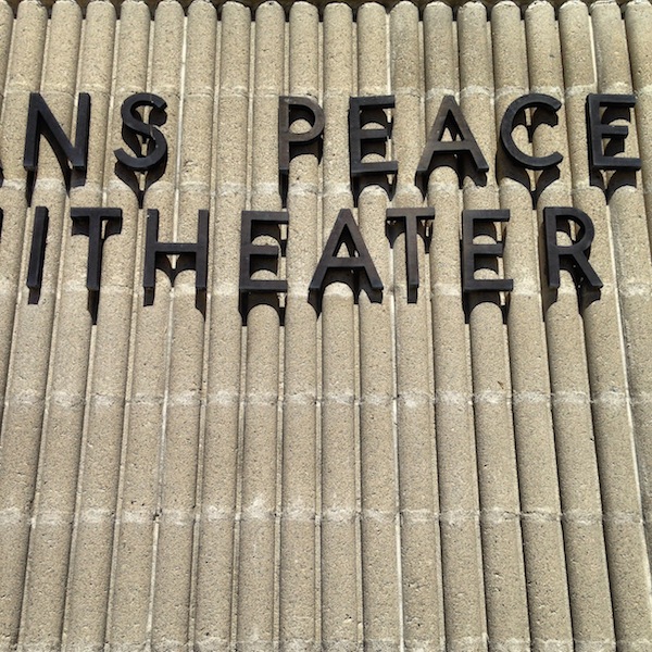
Portfolio | UMass Dartmouth
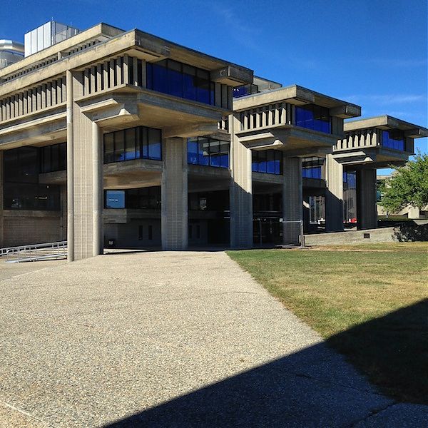
When you only know about locations from architecture books, sometimes your geography can be terribly off. For years I had mentally placed UMass Dartmouth, the campus designed by Paul Rudolph in 1963, in western Massachusetts. It was only recently that, better acquainted with the facts, I relocated it to southeastern Mass. And only on Friday, en route to a wedding on Cape Cod, that I passed the exit off I-195 marked “UMass Dartmouth.” We had to stop on our way home.
To get to the campus, you pass first through an area of strip malls, then through a set of winding historic streets (complete with picturesque New England cemetery), and then up onto a bald and grassy plain. You see the university’s concrete, sans serif sign before any buildings, and the roadway quickly sweeps you around to a series of radial parking lots. Rudolph, like other campus planners of the era, chose to keep the car out of the quadrangle, creating a moat of parking around his interpretation of the quad. This makes the campus very pleasant once you’re inside its embrace, but everything initially feels very far away.
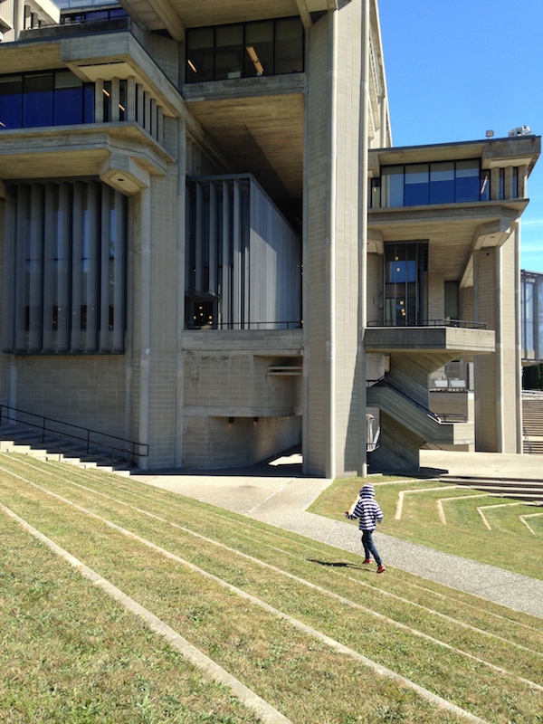
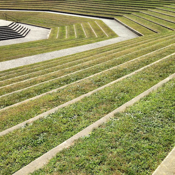
My children were grumbling as I herded them from the car, but the minute we rounded one of the newer campus buildings, and saw the terraced amphitheater, that all changed. Both of them immediately felt that space as theater, as earthwork, as enormous climbing structure, and ran off ahead. Everything is so open within the buildings’ embrace, there was no need to worry about them as they climbed up and down and over walls, sprawled out on benches, tried to get into the campanile. That emotional reaction seemed very telling to me: they were not the least bit intimidated by the materials or the wide-open spaces, and they could intuit the uses of each in turn.
In Tim Rohan’s recent monograph, The Architecture of Paul Rudolph, he writes of the campus design:
Plantings of trees and wide lawns recalled the expansiveness of traditional American campuses; the buildings themselves evoked the picturesque towered skylines of Collegiate Gothic. Two long ranges of turreted buildings, … circumscribed the primary communal space at the campus’s center, a spiral-shaped outdoor mall that widened, pivoted, and changes direction at the foot of a concrete campanile and an adjacent amphitheater to lead out to pastoral views of a pond.
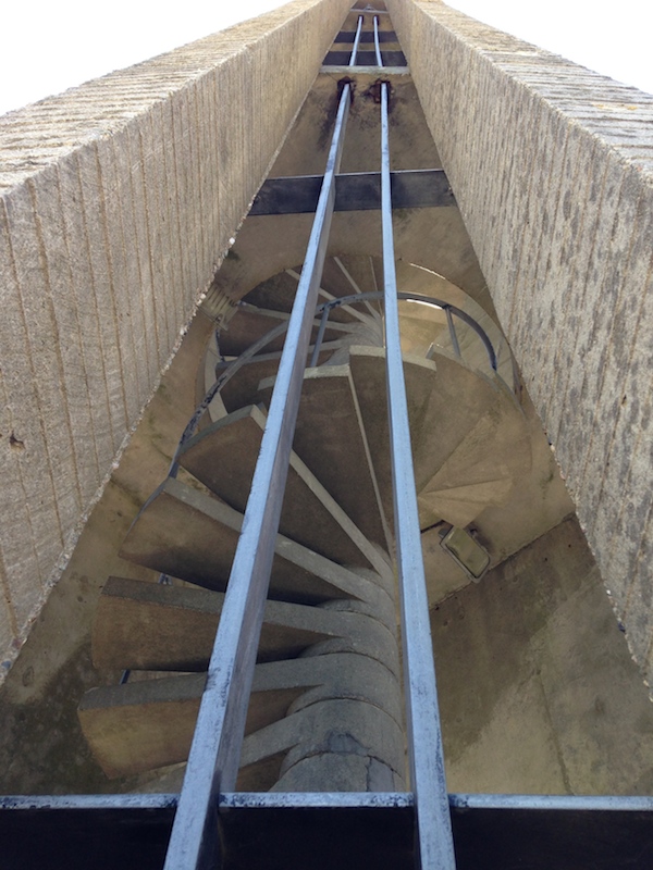
Honestly, I was expecting to have to intellectualize my appreciation of all that concrete (scalloped rather than bush-hammered, it looks even more like corduroy). But Rudolph’s thoughtfulness was so apparent, I didn’t need to think that hard to be excited. Yes, the central spaces are vast, but it’s very possible to work your way around the covered edges in inclement weather. Yes, that’s a lot of concrete, but I could see remains of some stylish plantings, inside and out, and the main plaza is grassy just like at Yale, or Princeton, or any number of classic models. The campanile provides a beautiful focal point for the pinwheel of steps and buildings, bringing you into a tight whirl of ramp and tower, and then spinning you out again. Its simplified form (simpler even than Rudolph’s initial drawings) reminded me of the bell tower on Eliel Saarinen’s First Christian Church in Columbus, Indiana.
More background and quotations from Rudolph about the project are here.
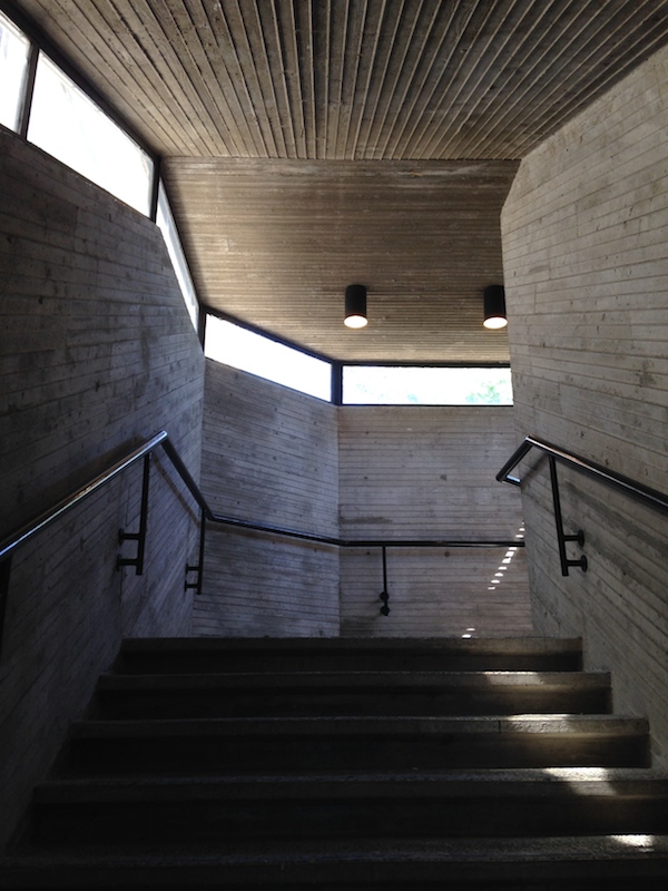
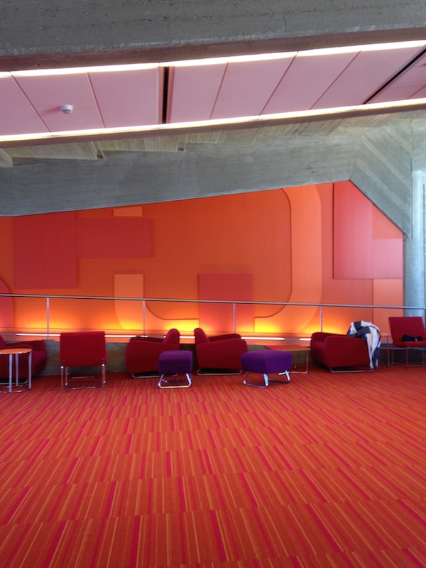
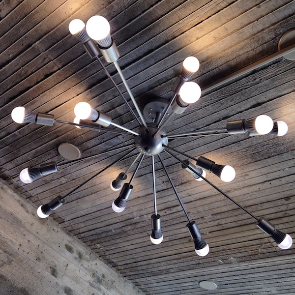
The Claire T. Carney Library was renovated and enlarged in 2012 by Boston-based designLAB, enclosing some outdoor spaces, rearranging stacks, and fitting it out with furniture and workspaces to suit how students study now. From the outside, one can see the twinkling Sputnik lights on every floor. On the inside, the intense reds and purples seem entirely appropriate as a period color choice, and warm up the board-formed concrete hull. I could see many nooks and crannies in which I might like to set up to write.
I also liked this description of the new-old clash, from Robert Campbell’s 2012 review of the project in the Boston Globe:
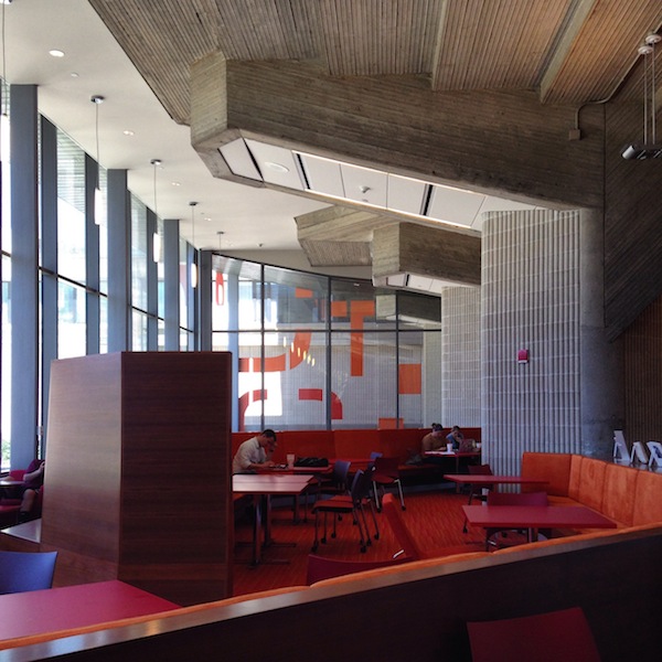
What I like best are the places where Rudolph’s Brutalism bangs right up against designLAB’s innovations. For example, there’s an area where massive concrete piers with rough gray coats, originally part of the exterior, are now sited in the interior because the building has been expanded around them with much added glass. They look like elephants wondering why they’re suddenly trapped in a glassy cage. There’s a wrinkle in time.
In the unrenovated Engineering building next door, one could see the improvement of warm colors and textiles (always part of Rudolph’s own interior design strategy). A multi-level space containing vending machines, a black-upholstered bench and a sad ficus was not welcoming, but the bones were there. And the quality of the concrete, with board-formed zig-zags operating as wayfinding, as HVAC ducts, as wall decoration, was unbelievably impressive. As my husband said, you could see Rudolph wanting to be Frank Lloyd Wright and figure it all out, from structure to ornament, and everything in between.
I hope UMass Dartmouth continues on with its thoughtful renovations. So many new university buildings feel tinny and cheap. (This is my greatest fear about the new Whitney as well. How can it be as good as the Breuer building they left behind?) This campus is a treasure, and the library, along with Yale’s Art + Architecture Building, a lesson in how to use the modernist past to contemporary advantage.
Sherlock's Wallpaper
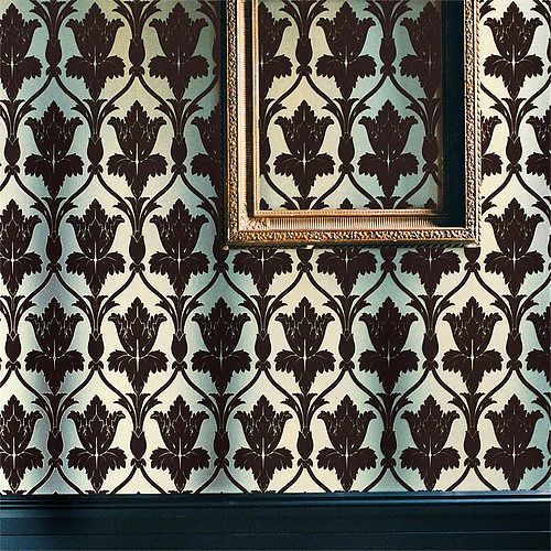
When I started my first blog in 2009 I called it A Bit Late. At that time, with one-year-old, I felt as if I were always catching up, wanting to join conversations that were already, in media terms, over. Many of those conversations revolved around TV because of said baby. This week I find myself in that position again, having just started watching Sherlock after it won several Emmys. (All three mini-seasons are available to stream on Netflix.) It took me all of five minutes into the first episode to sit up and say, This show is serious about wallpaper.
I knew from experience that a show serious about wallpaper would have serious Tumblrs. It took me a few days but I finally found the definitive collection of Sherlock wallpapers, screen-shotted and identified, by Stepford Geek. I’d say my favorites so far are the floating, sepulchral trees of the abandoned house in “A Study in Pink” and the delicate Chinoiserie panels in the therapists office in the same episode. Bonus points for fandom if you can immediately visualize both. Also of interest: the retro-fabulous textured papers. My first apartment in Brooklyn had early 20th century versions of these in the stair hall, much overpainted but still working as industrially-produced ornament.
After rejoicing in their identification, and the strange obsessive communities once finds online, I had to ask: What are the wallpapers doing? Why wallpaper? My first theory would be that it’s a British thing: from Liberty to Boden, kilts to china, British decorative arts and fashion remain more free with pattern than their American counterparts. Steven Moffat has taken a classic and updated it, with just enough historic references (the deerstalker hat, the nicotine patches), to honor the original. These wallpapers do the same, referring to the drawing rooms of the past but, in their oversize glamour, their crime-scene decay, or their hidden messages (Devil Damask Flock at Irene Adler’s house should serve as a warning) undermining their propriety. Production designer Arwel Wyn Jones is providing subtext.
Second, I began to think of them as skins. Sherlock spends a lot of time in interiors, and people with more knowledge of London than I have can probably read the socio-economic status of those inside from their facades. The wallpapers serve as another kind of facade, demonstrating how individuals want to present themselves. Sherlock “reads” clothing and accessories, but rarely the rooms. That’s for us to do. A particularly illustrative example of this self-presentation occurs in the apartment of the blonde, cute, bereaved fiancee in “The Great Game.” Her walls are covered in Sanderson’s Dandelion Clocks, a bright, graphic, modern pattern (clearly inspired by the textiles of Lucienne Day). Her wallpaper says she is from a different generation, a modern young woman, while still maintaining the production designer’s theme.
Lastly, I suspect Sherlock’s costume came before the wallpaper. How better to set off a main character in black, with ivory skin, than by a riot of pattern. Whether fighting off a swordsman or complaining of boredom (on a jaundiced green leather sofa), Sherlock is the supergraphic over the graphics on the wall. As he should be.
Time for Strategic Architecture
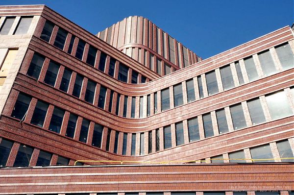
Mecanoo's Bruce C. Bolling Municipal Building, Boston
The new building in Dudley Square in Boston doesn’t look like anything else in sight. And yet it fits right in. That’s a good description of the tempered ambition of many American urban projects opening in the coming months: They aren’t disruptive but (their supporters hope) transformative, and their shapes, even their sparkle, come from understanding past civic hopes and redesigning them to meet the future. The curvaceous brick cornice of the Bruce C. Bolling Municipal Building in Dudley Square knits together three historic buildings, provides offices for 500 employees of the Boston Public Schools and incorporates an old rail track into its ground-floor plan, the better to connect the building to the adjacent bus station.
The building’s striking design, by Mecanoo Architecten and Sasaki Associates Inc., is a literal beacon (the mechanical penthouse has nighttime lighting) as well as a metaphorical one, signaling the city’s reinvestment in an area where community groups fought off a highway and organized land trusts to create affordable housing, schools and gardens on vacant land. The new building does not seem parachuted in, but inflects to the existing fabric, taking its curves not from the computer but from the distinctive round corner of the 1895 Ferdinand building.
The Bolling building fits a new category of what one might call strategic architecture: projects that combine the forces of community activism and historic preservation with government muscle, encourage future development through eye-catching design, and link to the parks, plazas, bike paths and libraries that give neighborhoods a center. These are hybrids, not large-scale institutions like museums but urban players, being built in places not necessarily known for design. They will open new routes through old cities and new ideas about what businesses can be successful in which locations.
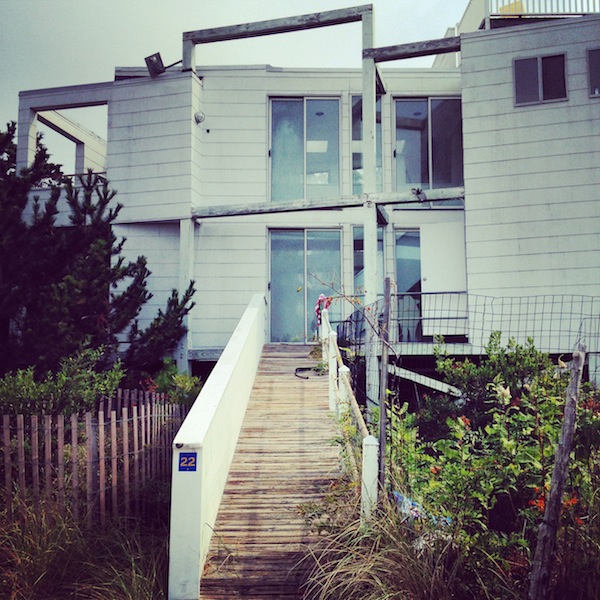
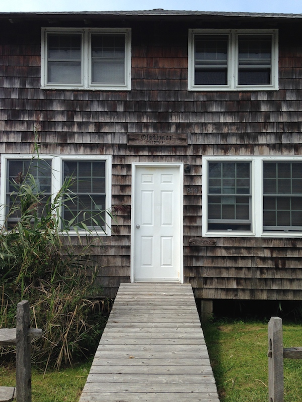
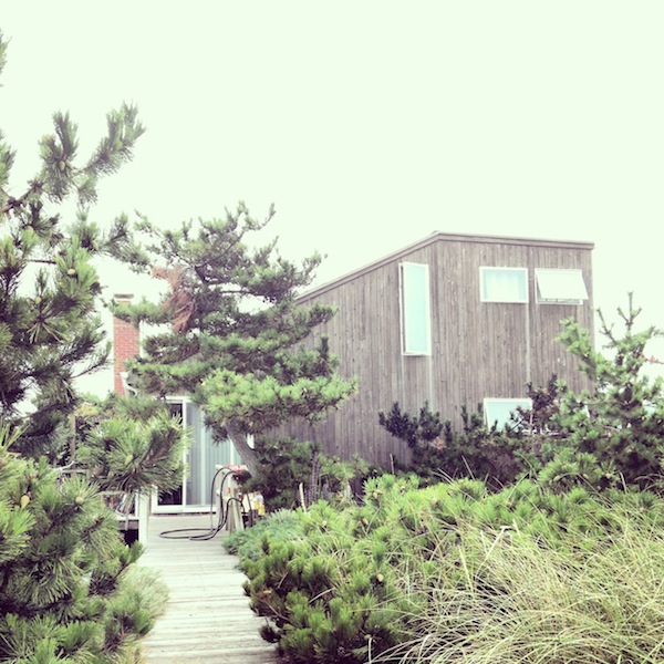
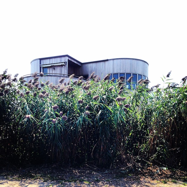
Portfolio | Fire Island
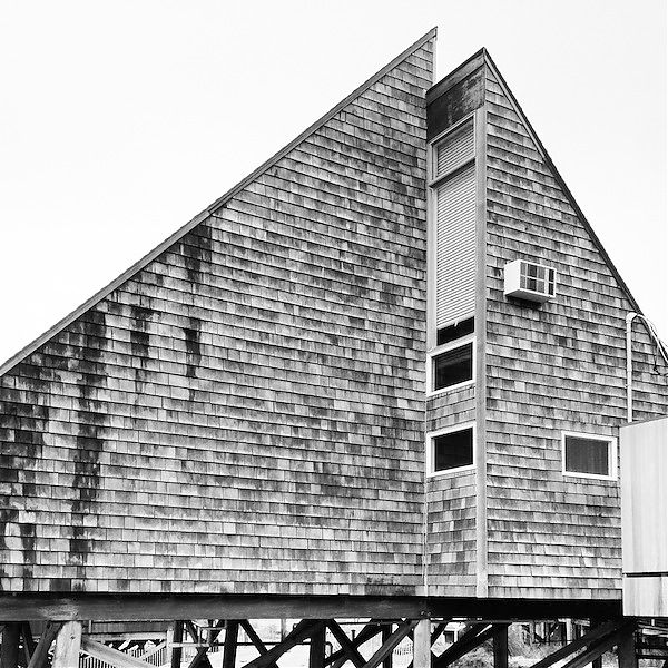
We spent the last weekend of the summer on Fire Island. I did not make it as far as The Pines to see the work of Horace Gifford, but the rest of the island offers ample examples of unpretentious, angular, weatherbeaten modern. The marks of Hurricane Sandy were visible everywhere in new yellow boards, jacking one-story houses up off the dunes, enclosing new ground floors, and radically altering the formerly low-lying domestic topography. Gifford may be one of the name architects out there, but the house style is pretty nice on its own.


Architecture Is A Team Sport
“One would have to go to great pains to be unaware of how many talents and energies share in the creation of a fine building, or of the discrepancy between that truth and the myth kept alive by an obvious cynicism that a building is born full-blown out of a single person’s head.”
E. Charles Bassett, designer of Mauna Kea and Weyerhaeuser HQ.
Portfolio | Corning Museum of Glass
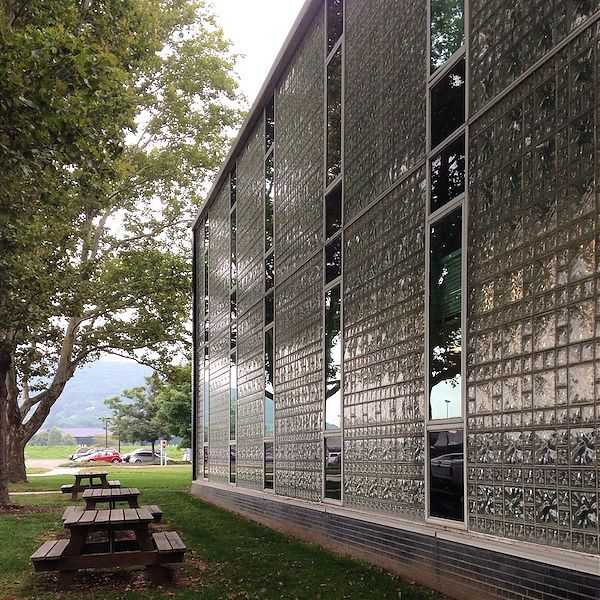
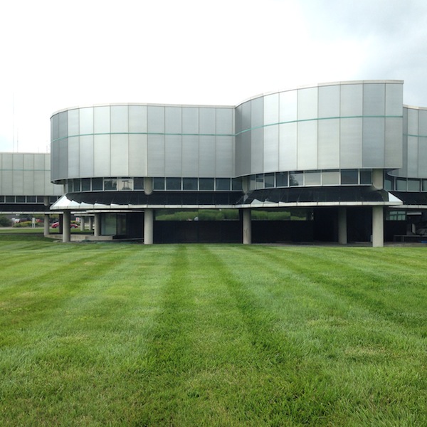
I went to Corning, NY last week to preview the latest addition to the encyclopedic Corning Museum of Glass. The North Wing, by Thomas Phifer and Partners, will open in March, and provide space to display large contemporary artwork in a largely seamless white glass box, alongside live glassblowing demonstrations in a renovated industrial building clad in black metal siding. It should be quite striking, and I look forward to going back in the spring, as well as to the museum’s 2015 retrospective on Pyrex, America’s Favorite Dish. But I was equally excited to see the rest of the Corning campus again. I first visited the museum 12 years ago, in the thick of my dissertation research on the mid-century modernist corporate campus, and was sad not to be able to include it. The Corning buildings are a textbook example of corporate architecture that speaks to the company product, as with Lever House’s custom window-washing gondolas, or Union Carbide’s black-anodized finish. As an ensemble they offer a history of 20th century glass technology.
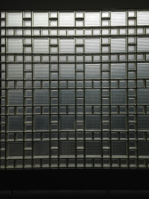
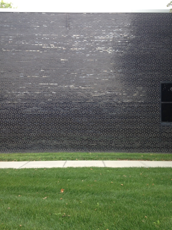
Harrison & Abramovitz did the first master plan for Corning in the early 1950s, when the company was still being run by members of the founding Houghton family. The firm designed the first museum building, as well as a research & development building (seen above), both with a pioneering glass-block facade and black glazed-brick ends. The museum building and its auditorium have now been absorbed by a later addition by Smith-Miller Hawkinson; the R&D building is not open to the public.
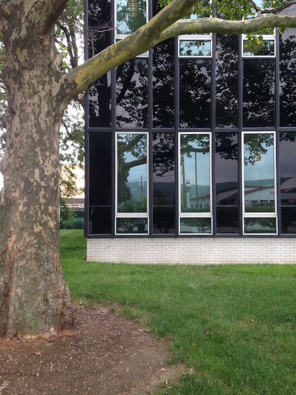
Around the parking lot from the R&D building, facing what was then a major Corning thoroughfare, Harrison & Abramovitz designed a black-glass slab tower for the company administration. In a town that still only had 10,000 people, a tower was obviously not necessary. But its form, and the still-impressively detailed curtain wall, were obviously meant to speak to the skyscrapers of Corning’s urban competitors in the Fortune 500 before the company had a Fifth Avenue building of its own (see below).

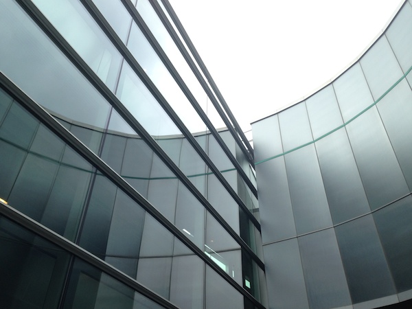
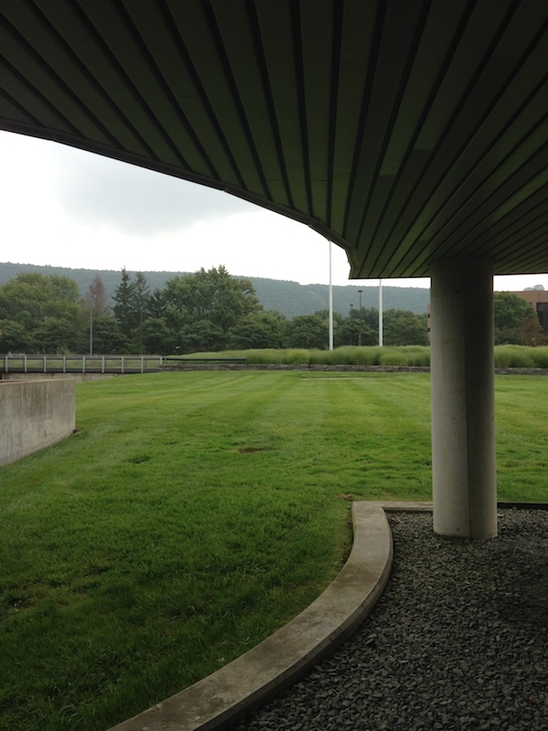
In 1976 Corning asked Gunnar Birkerts to add on to the existing museum. He took the existing 20-foot grid and ran it through Frank Stella’s Protractor series, adding curves and continuing the tradition of glass buildings focused within. Raised above the flood plain on pilotis, Birkerts’s building is space-age without and velvety within, carefully controlling the lighting and display of the company’s incredible collection of historic glass objects. The exterior panels are glass-over-stainless steel, with a bottom flange of mirror, allowing for daylighting without direct light or skylights. Below the building Birkerts cut its shape out of the lawn, so a gravel surround imitates the sharp angles and curves above. I think it’s wonderfully weird, like all the best Birkerts.
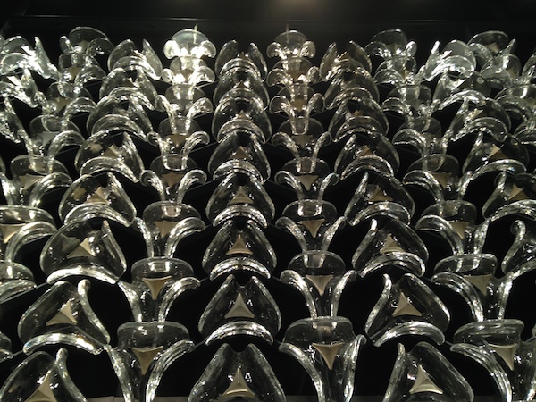
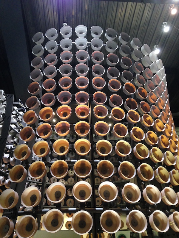
The museum collection is expertly installed, and while curators like to distinguish between art glass, design objects, and teaching exhibits, I found the categories easily blurred. Here, for example, you see a screen once installed in the Corning Glass Building on Fifth Avenue (also by Harrison & Abramovitz, 1959), now in the museum, as well as an explanatory piece on Pyrex, demonstrating the color change in the material depending upon the temperature to which it is heated. At top you see that company’s best-selling, opaque white baking dish, after a trip through clear, to amber, to smoked. My grandmother has one and yours probably does too.
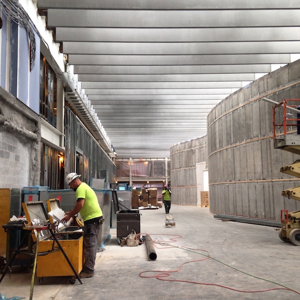
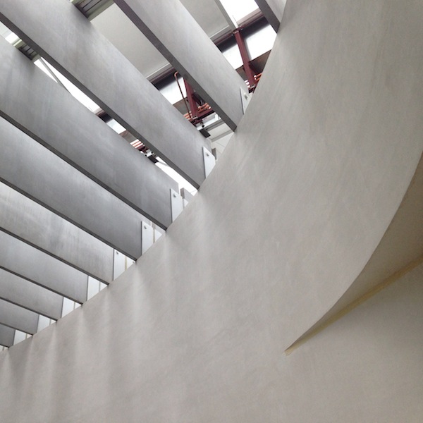
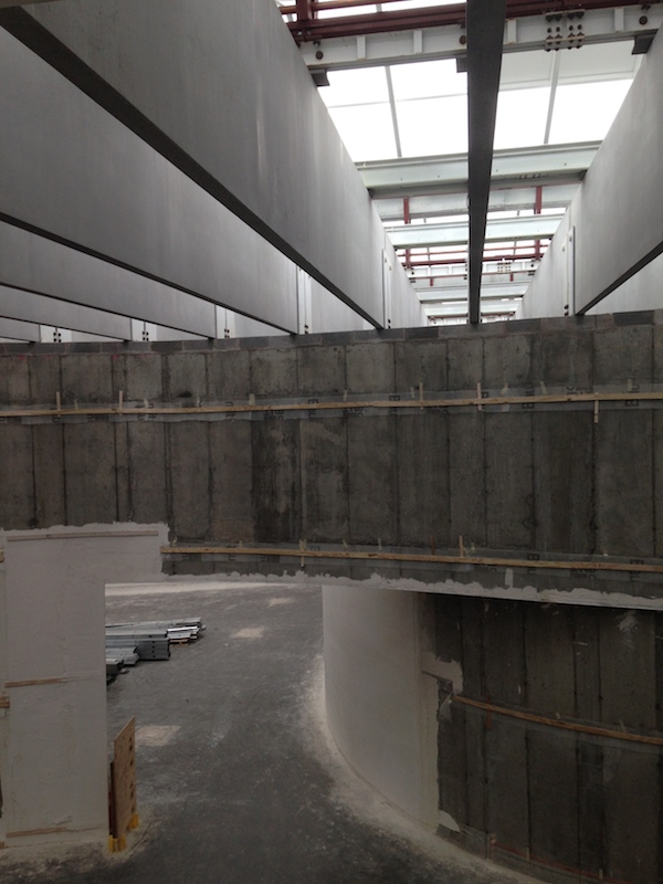
Finally, a few images from the construction, showing what will be inside Phifer’s white glass box: a set of curving concrete walls, inspired by the favorite architect wedding gift of all time, Alvar Aalto’s Savoy vase. Artworks in these galleries will be daylit from above through a set of translucent and transparent skylights; large windows in the box will allow for views out. The curves allow for a number of interesting interior paths and views. Among recent acquisitions that will be on display next year: “Liza Lou’s Continuous Mile.”: http://www.cmog.org/press-release/corning-museum-glass-acquires-monumental-work-liza-lou Four-and-a-half million black glass beads woven into a mile of cotton rope. The work’s minimalism, restricted color palette, and commentary on the labor of making all seem exceptionally well-chosen for this venue.
On X
Follow @LangeAlexandraOn Instagram
Featured articles
CityLab
New York Times
New Angle: Voice
Getting Curious with Jonathan Van Ness