Touring Marcel Breuer's Bronx Community College Campus
Meister Hall, Marcel Breuer and Associates. Photograph by Vicente Muñoz.
A common reaction to Marcel Breuer and Associates’ 1959-61 Colston Hall at Bronx Community College, an arcing slab of concrete and steel hard by the Major Deegan Expressway and overlooking the Harlem River, is What’s that? (This is not an uncommon reaction to Breuer.) I’ve been tagged in blurry Instagram photos and even craned my neck in vain on Metro-North to get a peek. One passes the building so quickly that, when leaves are on the trees on the slope below, it can seem like a modernist mirage, its boomerang curve chiming with the semi-circular colonnade of Stanford White’s Hall of Fame for Great Americans higher up the bank.
Breuer would have been driving at a slower speed in 1960, commuting between his office on 57th Street and his famous house in New Canaan. Checking on the construction from the driver’s seat of his Jaguar, he noticed not the slab but an error in the rubble retaining walls below the building. “He saw some stone that was not proper,” recalls architect Bernard Marson, Clerk of the Works for Colston and the three other buildings Breuer had designed for what was then New York University. “He made a little drawing of how he expected it, and he said, ‘That’s not right.’ I felt very apologetic about it. I said, ‘Do you want it removed?’ He said, ‘No, that’s history,’ that it was done. Everybody would have done what he requested, but he thought that it was important to leave it.” A concrete wall near the staircase in the former Whitney Museum (1964–66) bears a similar flaw where a form board came loose during the pour. That mistake is also, now, history.
MoMA Offers Japanese Navigators in an Architectural Firmament
A diagram showing the architects and engineers whose work Toyo Ito has influenced, and whose work inspires him.
In 2012, Pedro Gadanho, who was then curator of contemporary architecture at the Museum of Modern Art, met with one of Japan’s leading architects, Toyo Ito, about preparing an exhibition on his experimental and organic work and that of the architects in his orbit.
At Mr. Gadanho’s request, Mr. Ito sketched a diagram of overlapping circles showing his “surroundings,” namely the web of architects and engineers whose work he has influenced, and whose work inspires him. This hand-dated drawing hangs at the entrance to the new exhibition, “A Japanese Constellation: Toyo Ito, SANAA, and Beyond,” MoMA’s timely reminder of the beauty and daring that can be brought to public architecture, and the questing intellect required to push the profession forward.
The exhibition turns Mr. Ito’s intellectual “surroundings” into form, with models, drawings, sketches and photographs of work by him and a constellation of fellow innovators: Kazuyo Sejima and Ryue Nishizawa of the firm SANAA (designers of the New Museum in Lower Manhattan), and by the younger architects Sou Fujimoto, Akihisa Hirata and Junya Ishigami. They fill a white-walled maze pleasantly evocative of the bright, visually weightless spaces all members of this group have completed since 2000.
Kiwi’s Big Holiday

Auckland Art Gallery, photo by John Gollings.
The pleasure of travel is often estrangement. Out there, with your wheelie suitcase and sunglasses, you can unmoor from everyday life, imagining yourself as another kind of person in another city. For an American, a trip to ogle New Zealand architecture offers a different kind of pleasure. It’s not a strange land but a version of our own, refracted through a Southern Hemisphere lens.
A long-lost cousin who’s more sun-kissed (thanks to a damaged ozone layer) and a little younger (the Maori settled New Zealand in the thirteenth century, the British in 1840), New Zealand is still happy to discuss dumpling pop-ups and flat whites and how to get the right amount of char on the outside of your blackened cabin. (I’d advise architects to consider olive, as in the metallic siding of Bull O’Sullivan’s Lyttleton crib, which also features interior upholstery in maize-colored wool plaid.)
In New Zealand the taste level is high and the landscape reliably stunning. The hills are jam-packed with houses that rival the indoor-outdoor appeal of California midcentury modern, and new urban office and residential development is clean and contemporary, apparently well-made and without labored contextual reference. The style question felt settled, in a way it never is at home.
Architectural Renderings Are Probably Lying to You
Vertical Farm, rendering via Vincent Callebaut Architects.
Architectural renderings are often very fun, and equally often fairly deceptive—rendering glass becomes more translucent than it could ever be in real life, trees grow in climates in which they would probably have a difficult time surviving, and cities become whitewashed, in more ways than one.
“There are rendering trends, which follow architectural trends,” says Curbed architecture critic Alexandra Lange. “At the moment there’s a real desire, for some reason, to have skyscrapers with trees growing on the top and up the sides as if your skyscraper is a giant trellis.”
In this week’s episode of our podcast, The Curbed Appeal, we sit down with Lange to talk all about renderings: how much (or little) we can trust them, what type of responsibility firms have to render in good faith, and what one earth the renderings on this page are supposed to be depicting.
The Unknown Girard
“In the lobby, Girard lined the long rectangular ceiling with square-base metal cones which were then smoothly covered in a coat of white plaster. Small bulbs were installed at the tips of the cones, which took on the look of stalactites, regularly and elegantly dripping.”
Quoted in Metropolis, March 2016
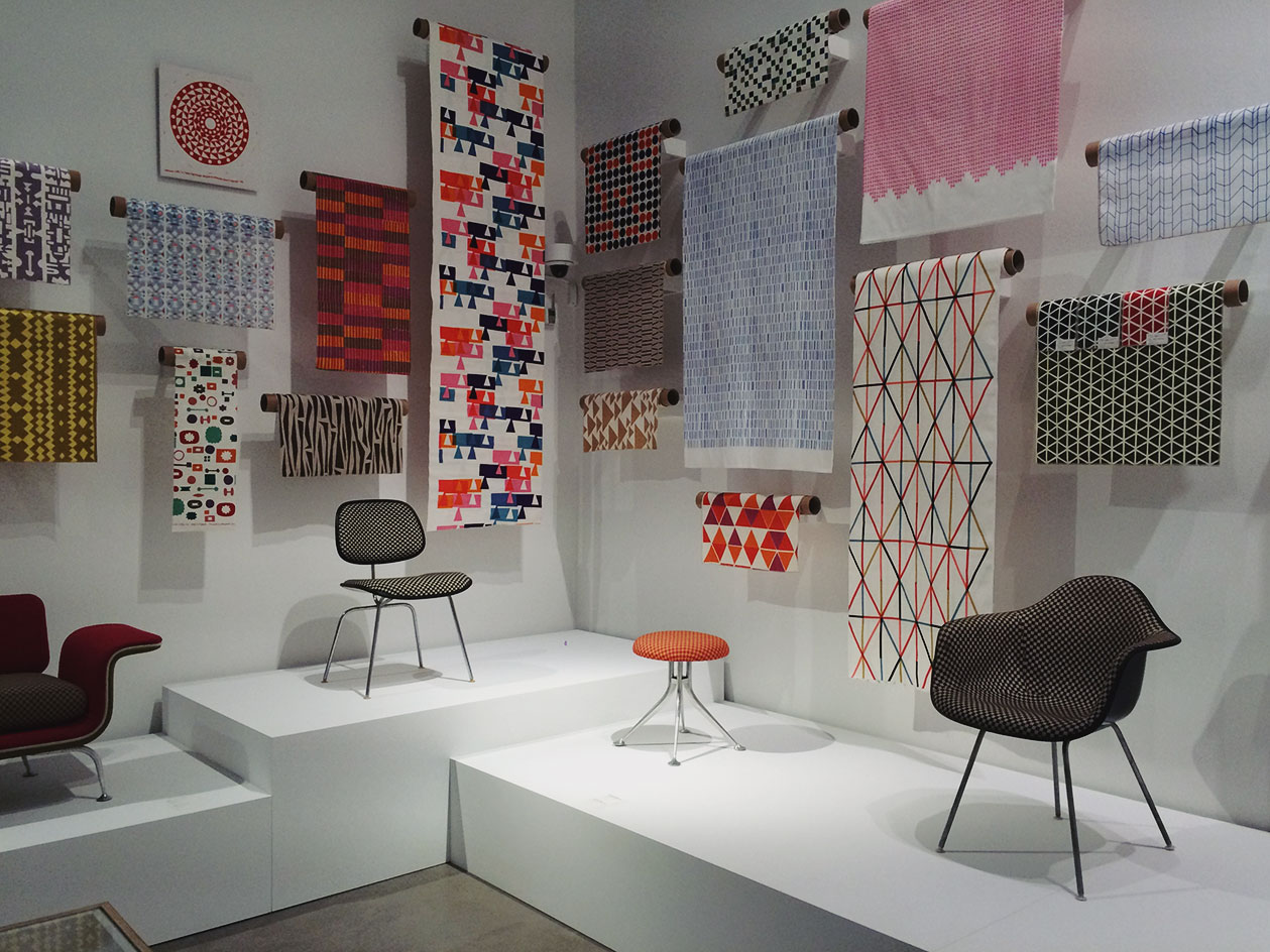
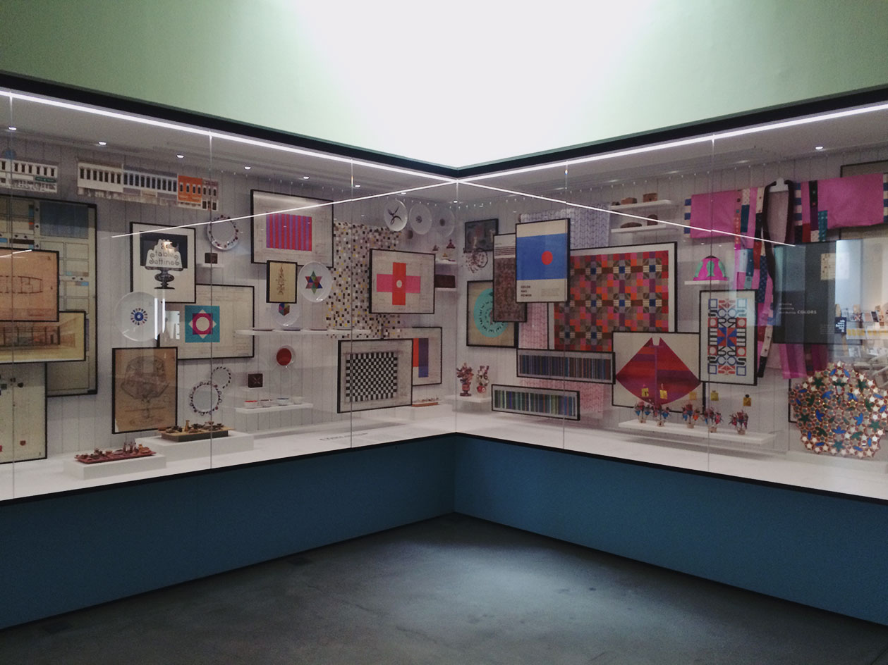
Alexander Girard: A Designer's Universe

Catalog cover, "A Designer's Universe": Matchbook covers, La Fonda del Sol. Below, views from the exhibition.
On March 12, Vitra Design Museum opened the first comprehensive survey of the work of Alexander Girard, the midcentury architect, designer of textiles, interiors and exhibitions, and collector of folk art. He’s long been an obsession of mine, and I was pleased to be able to contribute to the 500-page catalog (seen above). It’s really a must-buy for anyone who loves this period, with lots of treasures from the Girard archive at Vitra, photographs by Charles Eames and Balthazar Korab, and all the gorgeous textile samples you could desire. My essay is on his work in Columbus, IN, which included urban design and some major home and office interiors. Photos from my research trip are here, and an earlier lecture I gave on Girard’s work is here.
To give you a taste, I’ve posted the introduction to my essay below.
Alexander Girard in Columbus
“Driving with Sandro out Highway 46 West, you have a lot of different signs, different heights, different levels, and it would just drive him crazy. He wanted to organize them. He had such a great sense of order. You would go into his office and everything was neatly arranged. Nothing was out of place.”
Bill Chambers on Alexander Girard
In 1964 Alexander Girard got his chance to organize an American street. Not the unruly automotive landscape of Indiana State Road 46 but the smaller-scale commercial facades of the principal thoroughfare of Columbus, Indiana: Washington Street. In God’s Own Junkyard, published the same year, architect and critic Peter Blake documented “the mess that is man-made America,” assigning equal blame to the “well organized and well financed” billboard industry and to “little people . . . tradesmen and shopkeepers trying to make a modest living . . . whose eyes have lost the art of seeing.” In Blake’s chapter on townscape, there is an image of a commercial thoroughfare in Salt Lake City as a mess of conflicting signs: Florsheim shoes, the Paramount theater, the Mayflower Café with a neon sailing ship and a giant vertical UTAH.
Washington Street never reached this level of cacophony but none the less, in March 1961, S. E. Lauther, president of the Irwin Union Trust Company (housed in Eero Saarinen & Associates’ 1954 building4), wrote to Girard about “the possibility of cleaning up and beautifying the fronts of the stores and other business houses up and down Washington Street.” After a positive response from Girard, Lauther and the other members of the Downtown Development Agency invited Girard to come to Columbus on May 5, 1961.
Mr. Girard pointed out that in our effort to be “different” we, as merchants, are growing toward a rather horrible degree of “uniformity”. This is true even though the signs are of different shape, sizes, color, light intensity, etc. We have pretty much arrived at a “jungle” wherein one sees everything at the same time he is seeing a blur of nothing.
Girard took the members of the Downtown Development Agency on a walking tour of the “rogue’s gallery” up and down Washington Street, pointing out such visually problematic decisions as buildings painted two different colors, signs too large for their structures, cheap-looking materials and stores remodeled without respect for their neighbors. At a meeting the next day, Girard suggested that Washington Street needed restoration and “cleaning up”, and that he might be able to create a demonstration of “before and after” by painting or drawing on top of overexposed photographs of the existing storefronts to save the cost of building a model. Lauther added, “He seemed to favor doing one city block on one side and letting it serve as a guide, as well as an inspiration in causing the community to go further.”
The process Lauther outlined in his memorandum proved to be prescient, though it took until 1965 for the first model block, on the east side of Washington Street between Fifth and Sixth Streets, to be executed. In the interim, Girard took scale photographs of all of the storefronts in the central business district.8 Girard and his staff painted each building a combination of the 26 colors he selected for the project, and then mounted these paintings on Masonite boards and shipped them to Columbus, where they were exhibited on Washington Street. A clipping from the Columbus Republican shows Girard and his associate Karl Tani overlooking the storefront
display like smiling design dictators. The panels have been set up on wood stands on a large tabletop to simulate the continuous street front along individual blocks. (Eight of the twenty original panels are now on permanent display at Columbus City Hall; two are in the Girard Archive at the Vitra Design Museum).
In a pamphlet published to commemorate the renovation of 80 percent of the storefronts to Girard’s specifications, the anonymous author wrote:
One of the startling aspects of the proposal and one which was of immediate appeal to young people in the community was Girard’s use of bright accent colors for decorative details and windows, the most popular being the bright orange bay window near Sixth Street on the east side of Washington Street.
That burnt-orange window made it onto the December 1965 cover of Architectural Forum, in a Balthazar Korab image that shows the combination of white, orange, pea soup green and buff that Girard chose for 237 Washington Street. Although Girard had a list of 26 colors, certain hues predominate on the maquettes, including orange, green, white and buff, along with a sky-blue. For each building, Girard and his associates carefully considered its period details, using white to outline elaborate window frames on a brick building, blue to create a shadow below the lacy lines of a white cornice, and combinations of earth tones to modulate the low-relief ornament on a rare stucco facade. The scheme carefully modulated intense, Victorian gingerbread moments with more restful fields of color or tone-on-tone combinations, limiting the color palette and sign size to a narrow range. Other unifying touches included a common awning with indirect lighting and signs flush with the building wall. Color-coded maps show that Girard arranged the dominant color of each facade so that no two
storefronts of the same color faced each other. His suggested sign designs emphasize the nature of the business, prioritizing information such as “Insurance,” or “Schiff’s Shoes.”
He treated the whole town as a composition to be organized, a flat surface over which complex and colorful elements might be gridded and arranged in individual white boxes like his textiles for Herman Miller or, closer by, his handling of the storage wall in the J. Irwin and Xenia Miller House. The way that Bill Chambers connected Girard’s dismay over the American commercial landscape to the organization of Girard’s own office is entirely apposite: Girard would have rearranged and touched up the world, given the chance.
A Critic Looks at Calatrava's PATH Station
To see whether the new World Trade Center Transportation Hub was worth the $4 billion it cost to build it, WNYC Host Richard Hake sought a professional’s opinion: he took a tour of the station the day after it opened with Alexandra Lange, architecture critic for Curbed and author and co-author of several books on architecture and design.
Taking Stock of the New-Old Met Breuer
Artist Kerry James Marshall wore the perfect shirt to the opening of the Met Breuer on Tuesday. A bright grass green, it provided a focal point among the black, gray, and navy sea of arts writers assembled to observe just how Marcel Breuer’s 1966 Whitney Museum building looked under long-term lease. (The museum opens to the public March 18.)
Backed by Breuer’s elegant staircase between lobby and basement, Marshall’s shirt recalled the colors, pigmented to pop, of the modern, large-scale American art the building was made for. Breuer’s earthy interior palette of concrete, bluestone and oiled bronze set off the color fields and metallic experiments of its era, a hard shell for work that ranged from Calder mobiles to Jay DeFeo’s two-ton Rose.
The Met’s new, controversial branding also embraces color, with two slim standards on the museum’s Madison Avenue wall and the underside of the concrete bridge both a brilliant red. On the long skinny flags, the new logo, whose attached verticals make me feel queasy, looks good. It read better at city scale than on any of the print and digital media I’ve seen to date, simple and bold.
As I strolled the first two exhibitions in the galleries, one a retrospective of Indian minimalist artist Nasreen Mohamedi, the other a survey show of uncompleted artworks titled Unfinished: Thoughts Left Visible, I missed that sense of friction and performance. The Met’s deadly greige had taken hold—for now.
Can "Taste" Be Unique?

Photo by Michael Proulx, courtesy Design Research.
To mark its redesign, Curbed published Home Sweet Home, a collection of thoughts by 30 personalities on what home means to them. My contribution below.
Deeney: Everyone thinks that they’ve got good taste. Everyone thinks “Everyone thinks that they’ve got good taste, but I have got good taste …” (Pause) But I have got good taste.
My husband went to David Mamet’s play, The Old Neighborhood, on Broadway in 1997. When he got home he said, “David Mamet is talking about people like you.” But I refused to take it as criticism. I have got good taste, my mom has good taste, my grandma had good taste (my other grandmother had good taste too, but different good taste).
This is my proof.
In my first house, purchased by my parents in Cambridge, Mass. in 1974 for the low low price of $50,000, I played with unpainted wooden blocks, I ate off Massimo Vignelli’s stackable melamine Heller plates, I sat on a blond wood directors chair, I lounged on a geometric rug from Mexico and I slept under a blue Marimekko Puketti duvet. My parents toasted with Ultima Thule and had dinner parties with international foods from Merry White’s Cooking for Crowds by the light of an oversized paper lampshade. Sometimes I was allowed to stay up late to serve the hummus with pita triangles.
New Zealand's Rad Architecture in 46 Photos
Visual highlights from my trip to the gorgeous island country. More written thoughts to come.
On X
Follow @LangeAlexandraOn Instagram
Featured articles
CityLab
New York Times
New Angle: Voice
Getting Curious with Jonathan Van Ness