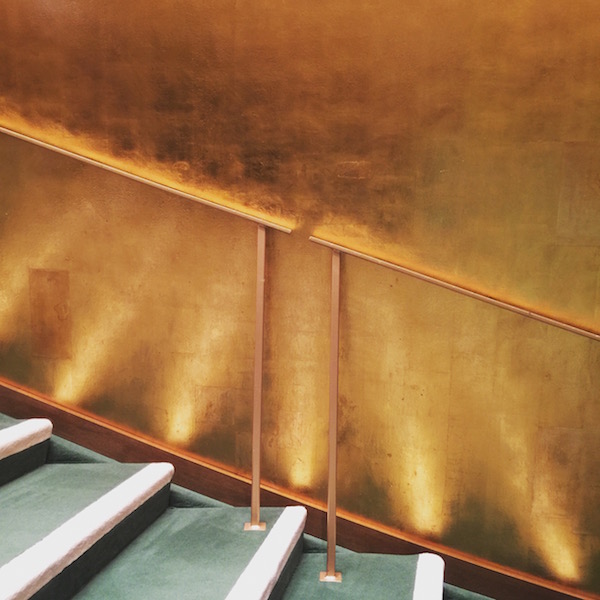
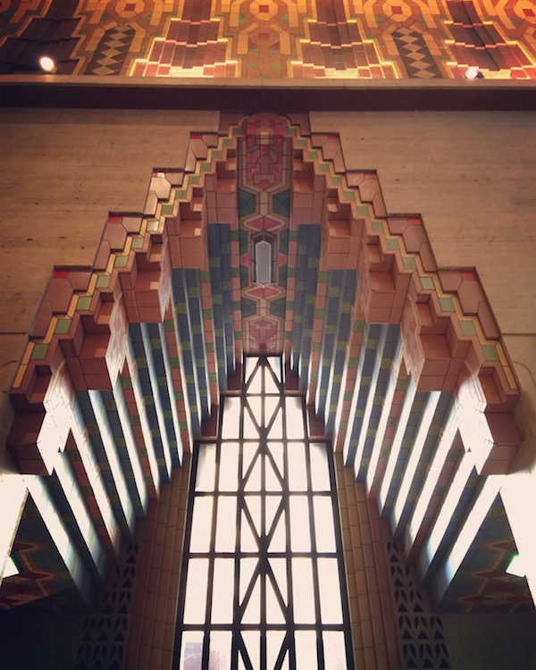
Save the Ambassador Grill!
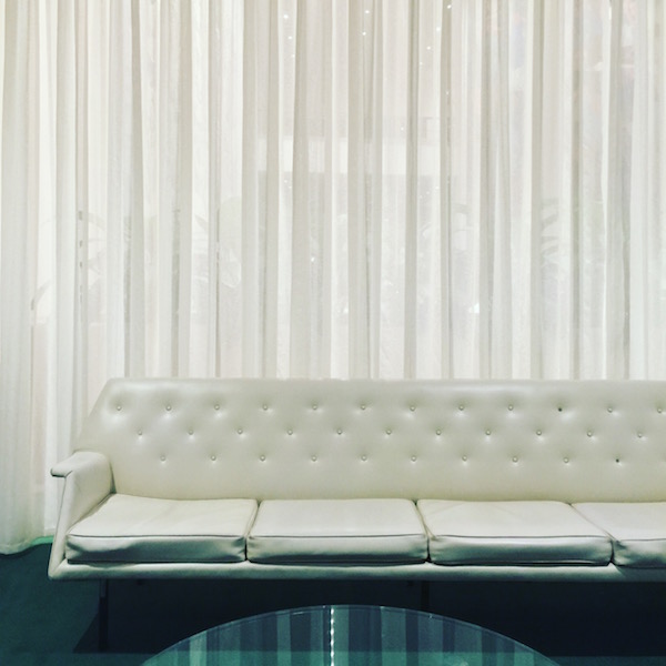
The Ambassador Grill in the mid-1980s. Courtesy KRJDA.
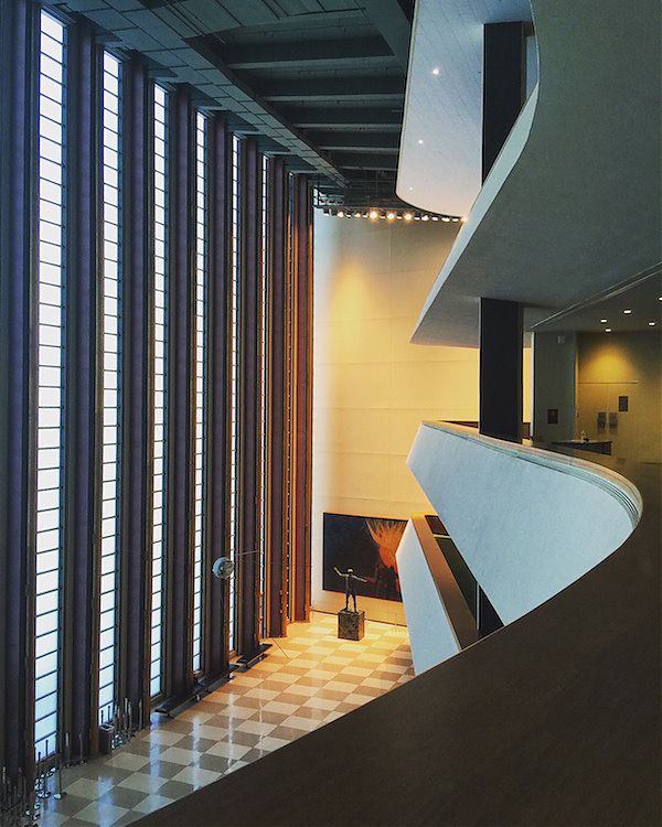
Last week, a group of advocates filed an urgent Request for Evaluation with the Landmarks Preservation Commission for the Ambassador Grill & Lounge and Hotel Lobby at the United Nations Plaza Hotel (now ONE UN New York). These interiors, designed by Kevin Roche John Dinkeloo and Associates, and completed in 1975 and 1983, respectively, are spectacular luxurious rooms, which use mirror, pattern, and lighting to trick the eye into seeing palatial space, daylight, and high ceilings where there are actually none. The Roche Dinkeloo interiors are also among few intact examples of 1970s style left in the city, intended by the architects to draw the prismatic curtain walls of One and Two UN Plaza inside, creating a total work of architecture akin to that across the street at the United Nations proper.
The request was urgent because, though no permits have been issued by the Department of Buildings, Millennium Hotels has made no secret of their plans to update the property. The windows to the Ambassador Grill were recently papered over and Docomomo US reports that some exploratory demolition has taken place—illegally. I urge the Landmarks Preservation Commission to hold an expedited hearing and to keep close watch over 44th Street. We should not allow a repeat of what happened to Frank Lloyd Wright’s Park Avenue Mercedes Benz showroom: demolition when no one’s watching. Those who were watching, this time, include Liz Waytkus, Executive Director of Docomomo US, with assistance from Daniel Paul, a Los Angeles-based architectural historian, architect Kyle Johnson, Guest Curator of the 2011-2012 “Kevin Roche: Architecture as Environment” exhibition, and landmarks advocate Theodore Grunewald. The campaign also has the support of the Historic Districts Council, which commended on Facebook: “It isn’t often we defend shiny glass spaces—but this one is special.”
Plus an interview with Kevin Roche about the origin of his love of mirrors.
2016 Pritzker Prize Goes to Alejandro Aravena
Quinta Monroy housing in Chile (left, 2005; right, 2014). Photos by Cristobal Palma.
48-year old Chilean architect Alejandro Aravena has been awarded the 2016 Pritzker Prize. He’s the first laureate from Chile, the third from South America, and the fourth from Latin America. He’s also a telegenic star of the international architecture scene, best-known for a housing complex built at a cost of $7,500 per unit and a proponent of “the rigorous use of common sense” to create sustainable, affordable and resilient cities.
Tom Pritzker, president and chairman of the Hyatt Foundation, which sponsors the $100,000 prize, said in a press release, “His built work gives economic opportunity to the less privileged, mitigates the effects of natural disasters, reduces energy consumption, and provides welcoming public space.” Among the projects of interest in Aravena’s succinct, high-quality portfolio is the 2012 Bicentennial Park in Santiago, Chile (a city with a paucity of open space): a hillside full of slides, a jungle gym like a Habitrail, a fountain made of concrete bubbles. Its inclusion signals the casualness, and the sense of play, with which Aravena sets out his equitable urban agenda.
Edited Living: Alexandra Lange on the Pinterest Home
This essay originally appeared in the book SQM: The Quantified Home, edited by Space Caviar and produced for the 2014 Biennale Interieur in Belgium. The book gathers a number of leading authors to explore how ideas of house, home, domestic space have changed over the last hundred years.
The front door to the Pinterest house is charcoal gray, or lemon yellow, or turquoise blue. It says “Welcome” or “Hello” or “Hey, Y’All.” In winter it carries a monochrome wreath in white or red or gold. In April, rubber boots line up at its foot. In summer, it is surrounded by wisteria. In October, pumpkins pile up. Its number may be hand-painted, or pieced from tile, or set away from the wall, the better to create a crisp shadow. It likes to be photographed ajar.
The front door to the Pinterest house exhibits the characteristics of the houses collected on million-follower Pinterest boards named A Girl Can Dream and Nooks and Floored and Steal This Look. It is colorful. It has accessories. It is dressed for the season. It looks as though it is waiting for something to happen. Personifying the house, dressing it as one might a paper doll, is far from a leap: most pinners (70 million; 80 percent female; 60 percent American1) have a picture of themselves at the top of their page. Below, a series of rectangles, each with a cover image, define that portrait through pictures of (mostly) other people’s stuff. Domino magazine originated the idea of turning an outfit into a room. Pinterest proliferates it.
As media critic Rob Walker has written of visual collections in general, “It is everything we love about stuff—but without the stuff.” He theorized in 2011 that “simply pondering stuff has become a form of entertainment.” Pinterest, which launched in beta in 2010, would seem to prove his point, except for the “simply” part. Pondering stuff is indeed entertainment, but Pinterest has also become a powerful platform for sales. The types of images pinned to house boards, often further broken down into rooms, and parts of rooms, transform designing and making a house into a series of smaller and smaller purchases. It is not “from the spoon to the city” but a house built from a thousand spoons.
On Pinterest, the house becomes not an object in the landscape but a landscape, mostly interior, of vignettes. The front door. The dining table. The corner of the bed. Those vignettes are styled, by the magazines, websites or photographers who made the images, to further narrow the narrative. The moment of breakfast, with chairs pushed back and a bowlful of berries. The moment of dressing, with an outfit laid out on the duvet. And, of course, the moment of a party, with decorations layered over décor, and a still life set up on a table with pennants, cake, flowers, glasses, a living room in color-coordinated miniature. When Target asked top Pinners to develop products for their stores this year, those products were not furniture, china, or even accessories but largely disposable décor for parties. Parties are the Pinterest house’s equivalent of the Pinterest woman’s manicure: the cheapest, least-committed way to Steal This Look, down to the matching trash bags.
Pinterest collapses the difference between fashion and architecture and, more insidiously, suggests the domination of the part (or the cheap fix) over the whole. Again and again in photographs you see the same sheepskin, the same tableful of succulents, the same Target lamp. People pin these arrangements because they are accessible. The Pinterest pin is a sign of, and perhaps (as Walker suggests) even a replacement for, a purchase that may never happen. But manicures and throw pillows, necklaces and party décor are the low-hanging fruit. They are possible in a way that rainbow-painted stairs, Parisian studio windows, and open shelving with perfectly stacked and matched china are not. To keep up with the daily desires provoked by Pinterest, its users must also moderate their own desires, and figure out how they can have some small part of the Pinterest house of their dreams. Pinterest (alongside Instagram) is changing domesticity by foregrounding styling as a part of everyday life to an unprecedented degree.
If the shelter magazine and the photo book were, traditionally, the way aspirational architecture came into our actual homes, Pinterest creates an environment in which those aspirations come down to earth. There are Architecture and Houses boards, but they are surprisingly dull. On screen, exterior shots of architecture blur together. One sharp modernist roofline becomes another. Even a shot like Julius Shulman’s iconic Stahl House view seems to be too far away. After looking at boards for a while you want to reach in and pull it closer, the better to examine the globe lamps. Famous houses show up on Pinterest in the same vintage image, pinned over and over. Where there are tens of variants on the painted floor, the Eames House (for example) gets reduced to two or three shots, some in black-and-white, that are far more boring in this context than in reality. It is easier to repin content from Pinterest than it is to import it from other locations (though style retailers, in particular, are now careful to include a button for easy pinning under their products). Thus a picture, once it is introduced on the site, tends to make the rounds.
You can choose your favorite “Eames House” from the assortment but, again, you can’t zoom in, because period photographs were designed to be consumed differently.To see what those houses of the 1950s look like optimized for Pinterest, search for Leslie Williamson. Williamson is a photographer whose two books, Handcrafted Modern and Modern Originals, translate the interiors of mid-century and designer homes into a contemporary idiom. Her photographs of J. Irwin and Xenia Miller’s House in Columbus, Indiana, bring the Alexander Girard-designed interiors up close for examination. We see the gridded wall in the master bedroom, which could be pinned to Steal This Look for either the clever arrangement of vintage crosses on pink or the gridded panels, which allow for easy rearrangement of artwork… as on Pinterest. In Irving Harper’s bathroom in Rye, New York, the wallpaper palette seems inspired by Push Pin Studios, and I can’t help wondering, given the context, where I could buy it. On Pinterest, Ray Eames’s sorted drawers of treasures, seen in top-down shots of pottery and flowers, look much more interesting than the house that surrounds them. The Pinterest platform, despite its neutral rectangles and minimal text, seems to eat space. Objects and close-ups are all.
There is nothing inherently feminine about collecting, but Pinterest has become a majority female platform because its early adopters were women, who created communities of common interests (and mutual pinning) around the home, recipes and fashion. Yet the pin metaphor is not from sewing, or jewelry, or other majority female interests, but from the architecture school pin-up (also the parent of Push Pin Studios). Pinterest co-founder Evan Sharp studied at the Columbia Graduate School of Architecture, Planning and Preservation. He created Pinterest to save, share, and organize his architecture images. In 2012 Sharp told Archinect,
As an architecture student I continued to obsessively collect images … thousands of sections, renderings and photographs … and I found that it became really difficult to organize my images and refer back to them. So we built a prototype and shared it with some friends, many of whom were architects.
Organizing things is an essence of the modernist project, visible for example in the architecture and design of George Nelson, Herbert Matter, and the previously-mentioned Alexander Girard. But Pinterest makes the discovery easier; indeed, it describes itself as “a visual discovery tool.” It may make it too easy to be tasteful en masse, commodifying every constellation of choices as “this look.” When you pin or repin an image, the platform suggests more like it, so that many boards have stripes of similar ideas, a row of cabinet fronts, a row of checkerboard floors, a row of clawfoot tubs, to be compared, contrasted, and eventually moved on from. Pinterest’s endless scroll means you never have to get rid of stuff, or “stuff.” Outgrown tastes simply disappear from the bottom of the screen. George Nelson’s Storage Wall fit far more than you might think behind its plain, floor-to-ceiling doors, but it couldn’t fit years of decorating trends, specialized baking equipment, and dead plants. Pinterest means you never have to replace that wallpaper or repaint that credenza. You just need to add more pins on top. When Cooper Hewitt, Smithsonian Design Museum reopens in New York in December 2014, it will be testing a room-sized version of this easy-come, easy-go attitude: an “immersion room,” where visitors can choose from the museum’s 10,000-piece wallpaper collection and have
their selection projected on two walls.
The house that might result from a series of Pinterest pins would be home as a series of events, stage sets for performing particular tasks with maximum beauty. One could imagine the Pinterest grid akin to Superstudio’s Endless Monument, with white space (the disregarded halls, corridors, and paths) between the moments. It’s amusing to search for Superstudio’s gridded furniture on Pinterest, where it seems to be disappearing, replicating the platform too exactly and leaving the children posed on the benches floating in midair. Indeed, houses in America have been growing larger over the years, leaving more dead air between the functional spaces and places; perhaps Pinterest replicates that sense of intense focus followed by a lapse of attention. All-overness is not a priority, just the way things look for pictures, or for a party.
Since my first encounter with Pinterest I have been trying to plot how its commercial tendency might be turned to critique. How might we translate the way an architect thinks about a house (a plan, an organization, a path) in terms amenable to the board and the endless scroll? How might one expand the pieces of these dream homes to include the cheap (but not just the disposable) and the public (but not just the digital)? Charles W. Moore wrote of the domestic landscape of Los Angeles in the 1960s, “The new houses are separate and private, it has been pointed out; islands, alongside which are moored the automobiles that take the inhabitants off to other places.” On Pinterest, that could be translated into a House board, a Cool Cars board, and a Take Me Away board, discrete and unrelated to one another. That door, left ajar, is meant to invite your followers in to your boards. But to put the Pinterest house back together again, the pinner has to come out of that door, to think about what she is seeing rather than just how, season after season, she and her house are being seen. The freedom of Pinterest is to associate yourself with things you’ll never own, and to discard them before they have become worn-out or boring. But that freedom could feel like a trap, your choices bound by the suggestions of those who have come before. The board should feel confining—in real life, things happen between and beyond the squares on the grid.
Architecture in 2015, A Year in Review: The Good, The Bad, and the Potato Chips
Sou Fujimoto, "Architecture Is Everywhere." Courtesy Chicago Architecture Bienniel.
Architecture keep on architect-ing in 2015, and like all things post-recession, it expanded into side hustles. For the sixth year-in-review in a row, Dallas Morning News architecture critic Mark Lamster and Curbed’s own Alexandra Lange examine the best and worst design events, buildings, controversies, architectural stunts, and personalities of 2015. This year, they’re handing out prizes with no shortage of material (some of it food-related), focusing on works demanding praise and damnation—sometimes both.
You Name It Award: Cheesegrater? Waffle iron? Tripas? Diller Scofidio + Renfro’s new Broad Museum inspired more metaphors than the verbal section of the SAT.
Stitching A House
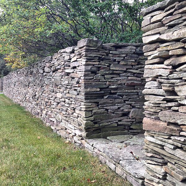
The dry-stacked stone wall outside Peter Bohlin's house in Waverly, PA, photographed August 2014.
In 2010, Martin Pederson at Metropolis asked me to write a profile of Peter Bohlin, recipient of the AIA Gold Medal that year. Bohlin, whose now 50-year-old practice Bohlin Cywinski Jackson is responsible for 65 Apple stores and scores of academic buildings, has always had a love of designing houses. To write the profile, I visited Peter’s own house in Waverly, PA, a historic one-room church to which he and his wife Sally have added rooms, art, and many found treasures over the years.
When Peter asked me to contribute to BCJ’s new book on their houses, Listening, I said yes, on one condition: that I could write about his own house. This is the essay I wrote for that volume, just published by ORO and Rizzoli, along with some of my photos from my return visit.
Stitching A House
When making a house, metaphors matter. Is it a gem? A sweater? A piece of pop art? A nostalgia trip? What’s wonderful about Peter Bohlin’s own house in Waverly, Pennsylvania, is that it can be all of the above. That multiplicity allows it to serve as a kind of lab for the firm’s ideas about domestic space. As you move outward from its modestly scaled rooms and into the array of projects in this book, you can see correspondences and callbacks, ideas refined, inflated, intensified. Clients get something new, but at home, there are layers.
In Waverly it feels as if the buildings (initially, a nineteenth-century African- American church and cottage) are constantly being let out, rehemmed, reversed and resewn, like a set of infinitely adaptable garments. That softness is not reflected in the materials, which tend to the elemental, or the forms, which tend to the rectilinear, but in an overall attitude toward space as a malleable substance and toward comfort as a reigning principle. Kitchen too dark? Pop out a wall. Grandchildren? Stretch out a transparent bridge. Scenery for the dining room? Plant a stand of birches. Each change works not from the point of view of the architect reading plans but from that of the architect sitting in a dining chair, or his wife sitting at her desk, or their guests eating lunch picked from the garden out back. Here, no one is trying to stuff life into a glass box—that’s for Apple. At home, the windowsills accumulate collections of rocks and shells and a vitrine, topped with a stuffed bird, turns out to be a cabinet of curiosities by artist Josiah McElheny.
The compound (house, guesthouse, poolhouse, and pond) is hidden behind an impressive dry-stacked stone wall, native to the countryside. That wall serves as a datum, a straight line from which all else meanders away. The garden melts into a field of grass and wildflowers. The pond disappears into the bushes. The buildings separate to offer views, helpfully extending decks (more like docks) across lawn and water. You’ll notice, throughout this book, the firm’s preference for an entrance you see through to the other side, and for decks, walkways, and bridges to carry you from place to place. The Bohlins’ bedroom is in a little cinder block pavilion, painted gray so you hardly notice its humble material, made larger by a pair of French doors and one of those decks. Bohlin may insist that you lie down to better appreciate the particular combination of sky, field, and cloud he has arranged as his alarm clock.
There are also colors. The pool has an azure bottom, the poolhouse stacks and stacks of blue towels. The closet that pops from one side of the dining room is lime. The stucco is lemon. The Eames rocker is sunflower. The radiators, carpet, and upholstery are white, but the cushions are a winding pattern of vines by Josef Frank. A yellow Amish scooter bike leans against the gray house. These are storybook hues, picked to mark the edges between building and landscape, enclosure and object. Some of BCJ’s houses let the landscape dominate, with big windows and interiors in wood and stone. But I like the buildings that keep the toylike quality found in Waverly: the crimson and forest Erector Set-like House in the Shawangunks, the apple green walkway to the Skyline house, the cadet blue façade at Goosewing Farm. The simple surfaces command attention, act as signs of activity, of interruption. The spaces of contemplation are more neutral, like the stone-faced fireplaces that appear in almost every building.
It’s easier to create such softness in an old house. They have their quirks and peculiarities, and if you are a smart designer, your first move is not to iron those out but to build upon them (Bohlin likes to call this “circumstance”). New houses and big houses are more difficult because one has to build in peculiarity. It can come from the site, as in Bohlin’s 1975 Forest House (fig 12), which, despite its boxy form, rakes its windows over to the south to admit maximum sun while remaining embedded in the forest. Newer houses make the same move with more graceful curves, as in the Whistler Residence, where rooms spin off an interior arc. In that case, the clients’ children insisted on a cricket lawn, so the center of the house is a green-floored outdoor room, as unusual in a mountain setting as an equivalent-size oval ballroom would have been. The economical Skyline house in Bend, Oregon also owes something to the Forest House, with its dark cladding and lantern-like windows. At one end of the long, narrow box, there’s a tiny cant, a bay popped out to give its owners, like the Bohlins, a better view from the master bedroom. Because of the clients’ budget, the firm couldn’t string the rooms along an outside path, as at the Combs Point House (fig 13) on Seneca Lake, New York. The idea of a long, flexible spine can be more explicit or more latent from house to house, but it is always there, making sure you don’t get lost.
At Goosewing Farm in Rhode Island, the firm did have historic architecture to work with: a clapboard Cape, stripped down and given a long-lost fraternal twin. In the old house, sitting and sleeping, in the new, domestic industry in the form of kitchen and baths. But BCJ would never make something new just like the old. On their Cape the clapboard is cut away at one end of the house to make an almost-modernist glass breakfast room. They also push out the short end of the house, changing up the view with a horizontal, landscape-framing strip of glass caught between planes of blue siding. The paired houses make a tiny compound within the farm’s larger collection of buildings, their rooms designed (as at Bohlin’s house) for specific kinds of sociability. The firm’s addition of a poured concrete watering trough (fig 14) at the invisible crossing between the farm’s main house and the enclosed walkway between the twinned Capes might seem like a bit of architectural hubris, a mark too faint to be read except in plan. But the trough serves a purpose, helping the visitor to understand that the whole experience—cows, lichen, meandering stone walls, water—is part of a plan. The spine returns as a metaphor, an imagined line stretching across the grass. Such lines hold together the bundle of contradictory desires and emotions clients bring to making a house, and to which architects must respond with inventiveness and restraint. Even when they are their own client.
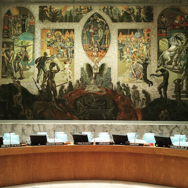
The Tale of Two Modernist Libraries
Johnson Building / Boston Public Library, renovated by Rawn Associates, Architects. Photograph by Robert Benson.
The Johnson Building at the Boston Public Library (BPL), designed by Philip Johnson, and the Martin Luther King Jr. (MLK) Memorial Library in Washington, D.C., designed by Mies van der Rohe, were both completed in 1972, and both share a similar trait: their rigidity. Neither Johnson’s nor Mies’ best work, the two buildings nonetheless exhibit all the hallmarks of the sometime collaborators’ respective styles: in Johnson’s case, the granite wallpaper he favored that decade; in Mies’ case, the dark steel exterior cage. Both buildings feature grids repeated in plan, in elevation, in lighting, and in section, tying the structures together but also limiting movement, flexibility, and sight lines.
As much as the buildings have aged, they have also been undone by fundamental shifts in our expectations for libraries. “That was the zeitgeist: A public library was not really for the public. You were protecting the books from people,” says Francine Houben, Hon. FAIA, founding principal at the Dutch firm Mecanoo. “Today, libraries are about people who want to get knowledge, and you can do that in many ways.”
Curbed Gift Guide: For Your Book-Loving Family Members

As part of Curbed’s first-ever gift guide, I offer up suggestions of nine design books from 2015 for your readerly relatives.
Serious Fun

Set up in what appears to be the parking lot outside the Eames Office, Carton City apes the fictional community of Mayberry, with stop signs, neighborly visiting, even miniature landscaping © Eames Office, LLC
Ray and Charles Eames took child’s play seriously. They invented playthings, furniture, and films to spark, but never limit, the young imagination. Given their own ideas of fun, these toys tended to emphasize composition, structure, and building, giving children the tools of their own adult trades in miniature (and giving some adults the chance to make like children again). Many of their designs embrace what kids and parents have long known: that the box an item comes in, especially if it’s a very large item, can be more exciting than the contents.
So it comes as no surprise that the Eameses improved the box itself, as a portfolio of photographs unearthed from the Herman Miller Archives reminds us. The humble cardboard box offers children their first chance to make space for themselves, whether that’s a racecar, a robot, or a house, sprouting from the shipping container the Eames Office designed in 1951 for the Eames Storage Units (ESUs).
Portfolio | Detroit Modern

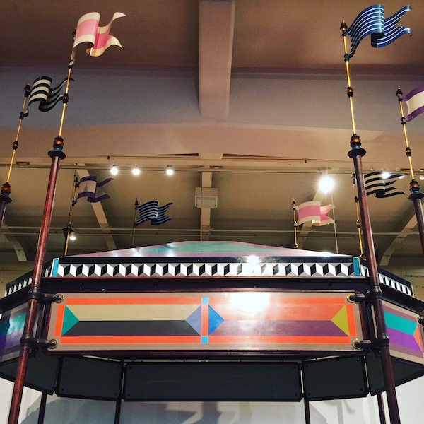
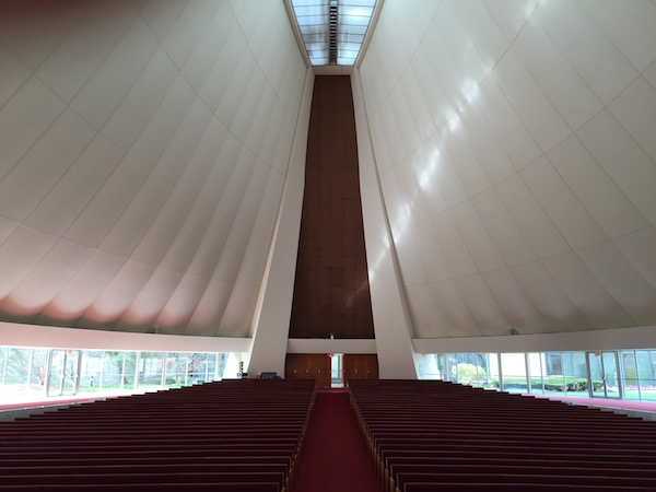

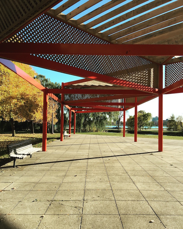
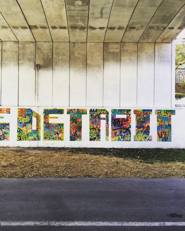
From the top: Yamasaki; Smith, Hinchman & Grylls; Birkerts; Noguchi; Eliel Saarinen; Eames; Yamasaki; Mies; Kiley; artist unknown in the Dequindre Cut.
On X
Follow @LangeAlexandraOn Instagram
Featured articles
CityLab
New York Times
New Angle: Voice
Getting Curious with Jonathan Van Ness