Critics on Criticism
“What’s missing from the discourse? Money.”
Wainwright, Davidson, Jacob, Twemlow, Arieff and many more (including me) weigh in at Metropolis on criticism in our digital age.
The Mayor's Showroom
When Mayor Michael R. Bloomberg redid Gracie Mansion in 2002, it was featured in Architectural Digest. Mayor Bill de Blasio’s redecoration was featured this week on Instagram (2,718 likes by Friday). The medium by which the reveal was made says as much about the changing of the guard as the difference in taste shown by the photographs in question. Federal end tables are out, coffee tables you can rest your feet on are in. For New York City’s first family, the move to Manhattan from Park Slope clearly felt more like an upheaval than a dream realized. The story line was less about being true to the house’s roots than being true to their own.
"There's still one more park taboo to be broken."

Dan Graham’s mirrored glass pavilion on the rooftop of the Met is a beautiful thing. A steel-framed S-curve, set between two parallel “hedges” made of ivy; it invites wandering and looking on a surprisingly small footprint. The two-way glass reflects you, the greenery and the surrounding city in unexpected ways, with the borrowed landscape of Central Park reverberating its leafy walls.
But the pavilion is not the only element that borrows landscape. Graham worked with landscape architect Gunther Vogt on the rooftop; together they surrounded the rectangle of ivy, glass and stone with a padded, brilliant carpet of artificial turf, from edge to edge. On the sunny day I visited, people were lying all over that turf, attaching themselves to the entrance trellis and ivy walls as if they were trees in the park. The soft surface gave them permission to sit anywhere. I couldn’t decide though, was the effect ersatz park or rumpus room? Did it make the rooftop into a greensward or a really groovy basement? After all, the first artificial lawn many of us saw was in the Brady Bunch’s backyard. Mike Brady, paterfamilias and architect, knew a real lawn wouldn’t last long under the kids’ 12 feet.
AstroTurf (or ForeverLawn, or SynLawn – pick your brand name) at the Met felt like a moment. A moment in which we might be able to give up, at least in high-traffic urban settings, on our trophy grass.
Star Wars Architecture
“Rewatching Episodes 1-3 (as I recently did) is a Where’s Waldo of early 20th-century architecture, with references to Frank Lloyd Wright, Art Deco trains, and one of Lucas’s favorite painters, Maxfield Parrish, who never met a neoclassical loggia he didn’t like.”
On George Lucas’s surprising choice of MAD Architects and Studio Gang for the Lucas Museum of Narrative Art.
Portfolio | Orange County Government Center
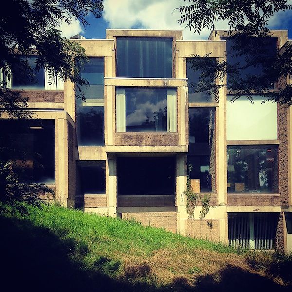
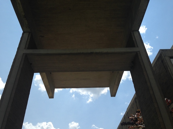
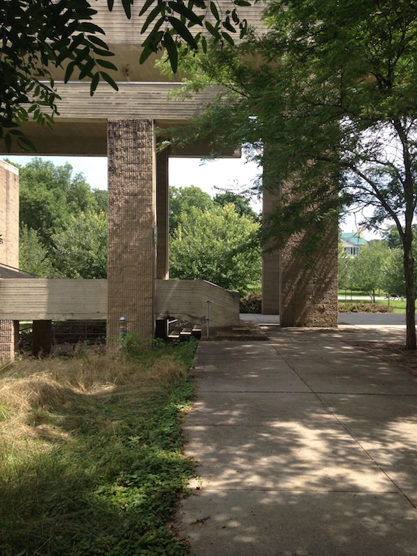
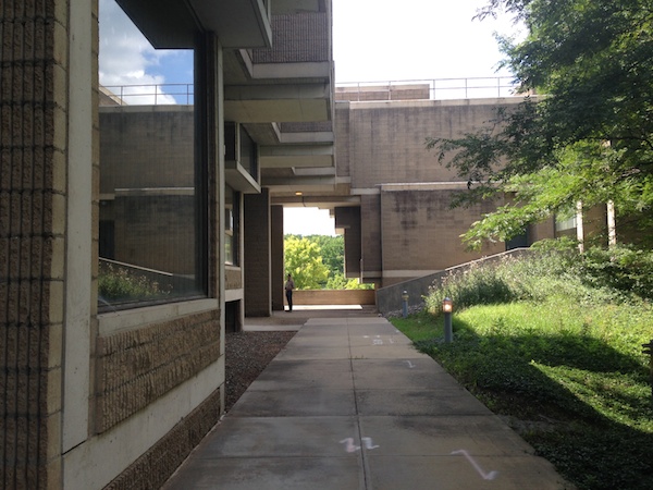
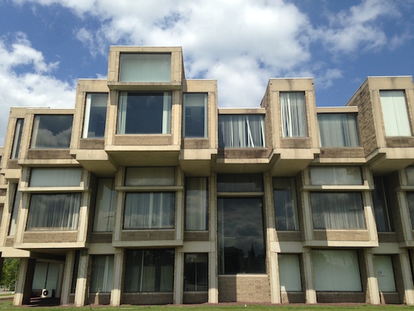
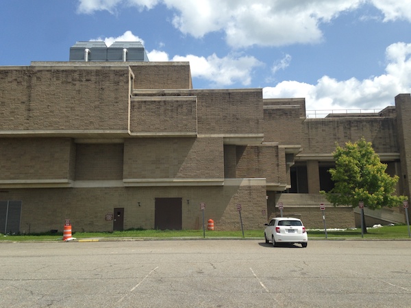
When the exit says “Goshen,” it means only one thing to me: Paul Rudolph’s Orange County Government Center, long threatened with demolition, still standing. (Architect maps of the world light up in some strange places.) Long a poster child for the disdainful way so many Brutalist buildings have been treated by the public entities which own them, this building may yet see new life. As it is, untrimmed summer foliage is giving the building’s courtyard a rare lushness. Walking around the building, one is better able to see its structure, which is a series of long tubes, blank on the sides, windowed on the ends, bundled to make a building. Where they gap or get sliced in two, Rudolph inserted staircases, internal and external, as well as courtyards, ramps, and other multi-level open spaces. Given all the roofs and corners, I’m not surprised it leaks. Seeing it again made me even more sure something amazing could and should happen there. If Bjarke Ingels can populate the world with man-made mountains, we can save the ones we already have.
Sidenote: I wish the New York Times would use more flattering photographs. It feels partisan to portray it as looming and decrepit. I can make it look better with my iPhone.


Review: A History of the Paper Pattern Industry
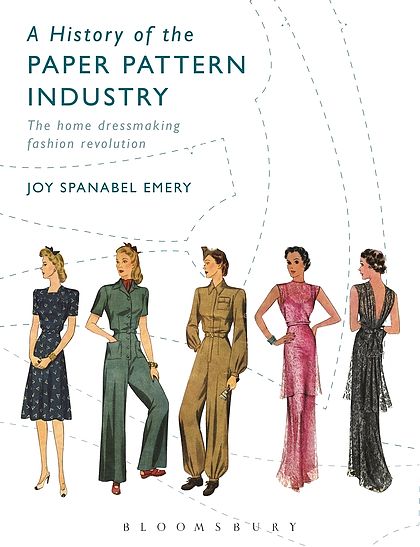
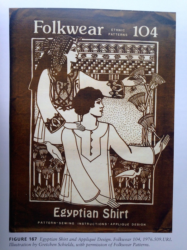
The Commercial Pattern Archive, located at the University of Rhode Island, is a wondrous thing, a visual chronicle not only of the vicissitudes of sewing over the past century and a half, but also a window into home technology, fashion, and the rights and roles of women. A History of the Paper Pattern Industry by Joy Spanabel Emery, the archives’ curator, wends its way through that chronicle’s highlights, offering illustrative examples of the way patterns reflect media, love and war. It’s an academic book, alternately dry and fascinating, so I offer highlights by way of review. I hope others, inspired by this beginning, will take it and run in different interpretive directions, as I did with the 3D printer. Apologies for the home-sewn photography.
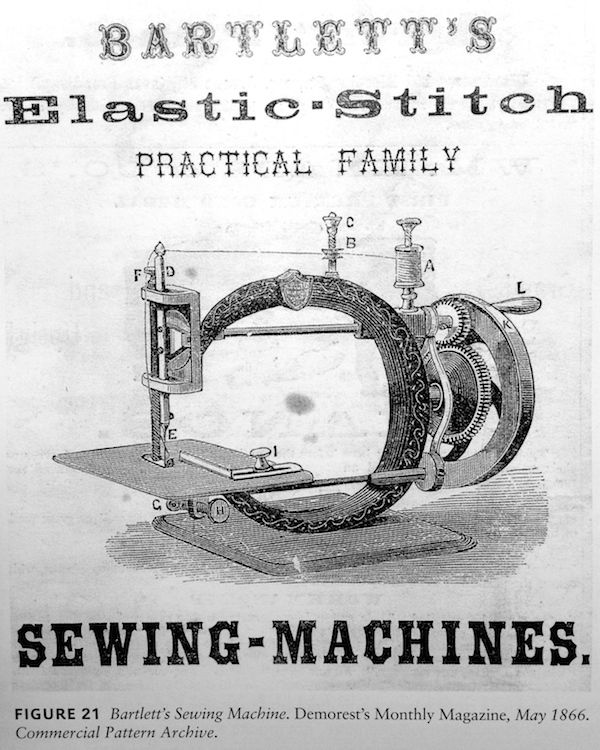
The first home sewing machine was designed in 1856, and cost $125 ($2,997 in 2010 or, about the cost of a 3D printer today). To offset the cost for individuals, Godey’s Lady’s Book suggested that families pool their resources and buy one together (like Techshop for the rural village); others offered rent-to-own plans, $5 down and the rest to be paid with interest.
Women took to the new machines faster than their male, professional colleagues. This caused concern not only that home sewing might put tailors out of business, but also that it might make women’s lives too easy. Betty Williams noted, “many men wanted to believe that women couldn’t handle such a complicated piece of machinery; they feared that if women did perform their sewing duties in less time there would be time left over for them to improve themselves or participate in the suffrage movement.”
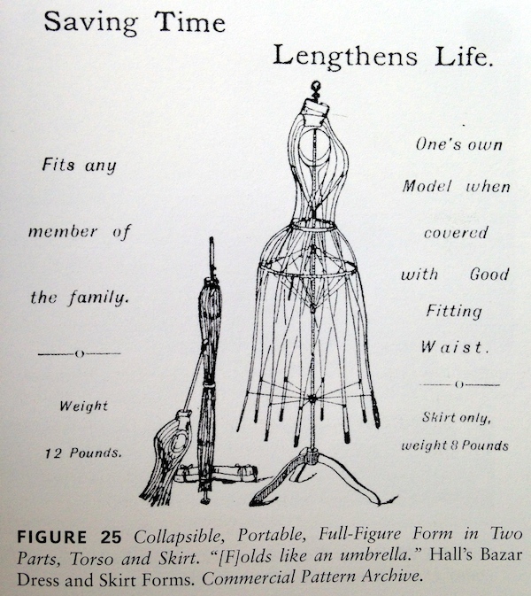
Sewing machines were not the only technology that needed improvement: the dress form was also the subject of design innovation and experiment. Hall’s Bazar Form Company adapted the idea of the umbrella, with metal ribs that can be collapsed or expanded, into a two-part form (torso and skirt) that could be collapsed into a column for storage.
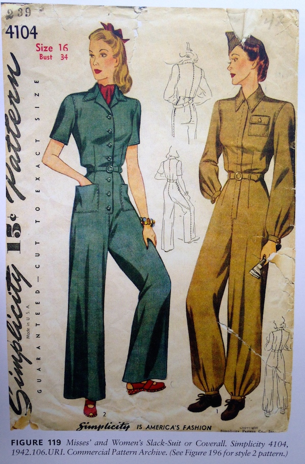
The first World War affected the pattern industry in a number of ways. “The Dress of Patriotism,” published by McCall in 1918, was advertised as requiring only two yards of 54-inch material, saving wool for “over there.” McCall also published a pattern for a ladies’ work suit, as recommended for women in the cavalry corps or defense plants. Other companies created patterns for Red Cross nurse uniforms, as well as operating masks, gowns and hospital robes to be sewn and donated to hospitals.
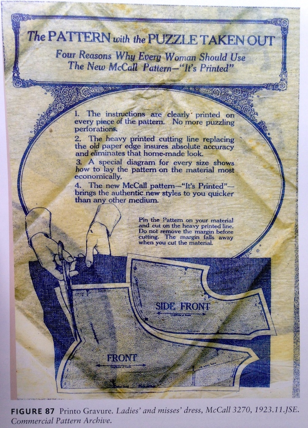
Before 1920, commercial patterns had been machine cut and punched, and home sewers had to learn a common language of punched holes corresponding to different cuts, pleats, and other moves. The McCall Printed Pattern was announced in 1921 as “the biggest invention since the sewing machine.” Pattern pieces were printed in outline, along with all other markings indicating darts, alignment, and the name of each section. The McCall tagline, “It’s printed,” recalls Lucky Strike’s, “It’s toasted,” as a minimalist indicator of a serious difference. McCall rivals came up with ways around their patent; Pictorial Review wrote that the new pattern markings were so clear it “ALMOST TALKS TO YOU and answers all your questions satisfactorily and promptly.”
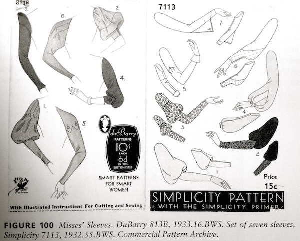
During the Depression, women tried to reuse patterns and recycle clothing, leading to an alternative market for refresher pieces like sleeves, collars and cuffs. I love the abstraction of these covers from DuBarry, which suggest the limited range of our current sleeve choices.
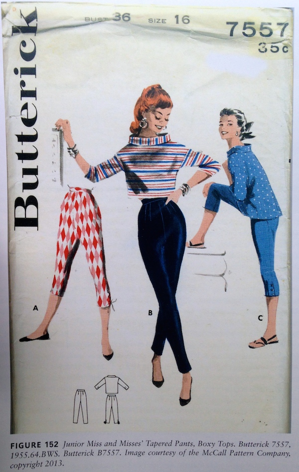
Emery writes, “a common misconception is that by the 1960s women stopped sewing and making their own clothes due to the mass of inexpensive, readily available ready-to-wear options. However, the 1960s were actually a boom period.” Celebrity endorsements, TV advertising and educational programming, plus manufacturer-sponsored sewing classes in schools all contributed to a 40M individual market, averaging 27 garments per person per year. Four out of five teenage girls made their own clothes. “The summer 1967 issue of American Fabrics stressed the growing appeal of sewing to express individuality and as a mark of elegant economy.”

Trends of the past, as interpreted through paper patterns. The minidress.
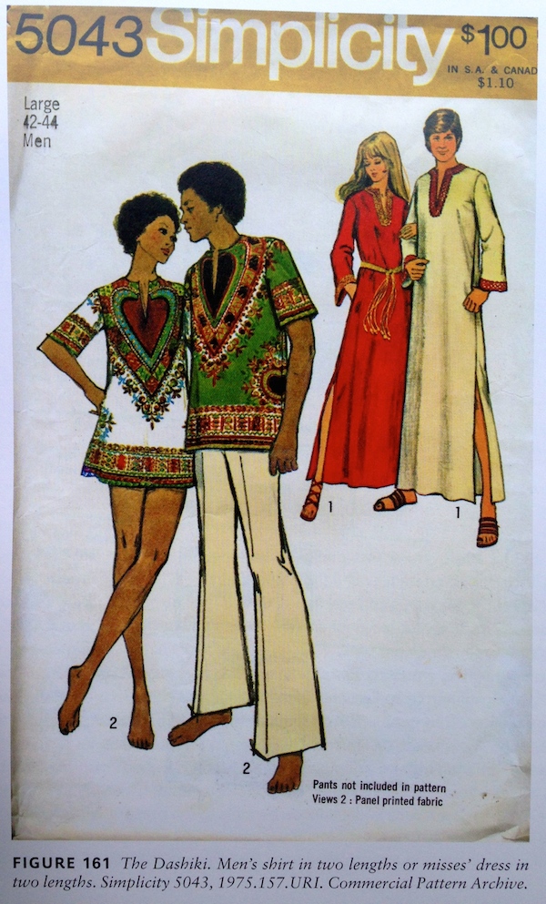
The dashiki.

Dynasty.
By the 1980s, home sewing was shrinking. And yet the history ends on a hopeful note, with a smaller, more focused revival of interest spurred by the combination of digital technology and the sewing machine, through automation, apps, and embroidery at the push of a button. Pattern design focused on parts of the market not served by ready-made clothing, like traditional clothing, historic recreations, and children’s gear. The appendix to Emery’s book offers reconstructed patterns first issued from 1850 to 1960, should you want a pointed basque, a drop-waist 1929 sheath, or a Nehru jacket. Project Runway didn’t hurt either. Digital forums provide the modern-day equivalent of the sewing circle, offering ideas, encouragement and trouble-shooting even when one is sewing alone.
Review: The Architecture of Paul Rudolph

There’s one in every group. A nonbeliever, that is. Most of the people who have shown up on a recent Saturday afternoon for a tour of Paul Rudolph’s Government Service Center (1971) are already convinced there is something to see here. We take photos of the signature “corduroy” concrete at the entrance, as well as the patinated plaque with Rudolph’s name. We look sadly at the chain-link fences walling off Rudolph’s signature banquette seating (not to code). We listen as Timothy M. Rohan, author of the first complete monograph of Rudolph’s work, talks about the theatrical, even therapeutic, components of his Mental Health Building. The sinuous stair that spills, in concrete waves, down onto Staniford Street more than underlines the first point; we have to take Rohan’s word for the second, as the interior, still in use, is off limits. A middle-aged man in a plaid shirt is having none of it. He sputters, he shifts, his body language and his increasingly aggressive mutterings point to just one question: “You like this stuff?”
Airbnb Logo Redesign
I can’t get worked up about these baby logos. LMN when they’re adding highlights to another Paul Rand.
— Alexandra Lange (@LangeAlexandra) July 16, 2014Portfolio | Lisboa 7
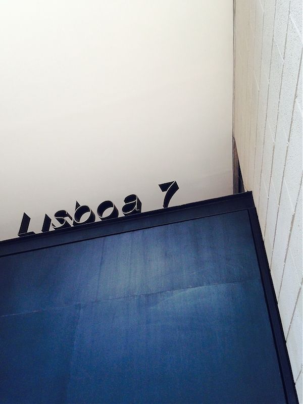
The latest issue of Uncube Magazine, No. 23, is devoted to Mexico City. Mimi Zeiger contributes an article on emerging practices that includes the work of AT103, designers of the fascinating housing project Lisboa 7. As she writes,
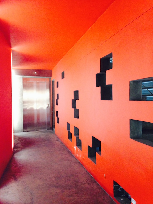
In the 2013 book Architecture Does (Not) Matter, AT103 chronicle their housing project Lisboa 7 through photographs, analytical drawings, and essays. It is an ode to the concrete block, and an investigation into how reducing architecture to fundamentals allowed the firm to radically reinterpret housing. Their scheme breaks down the massing into six narrow buildings, each honeycombed with courtyards and windows for maximum light and ventilation. “Form follows strategy”, Pardo quips. The blocks were left bare to reduce the cost of the enlarged exterior envelope.
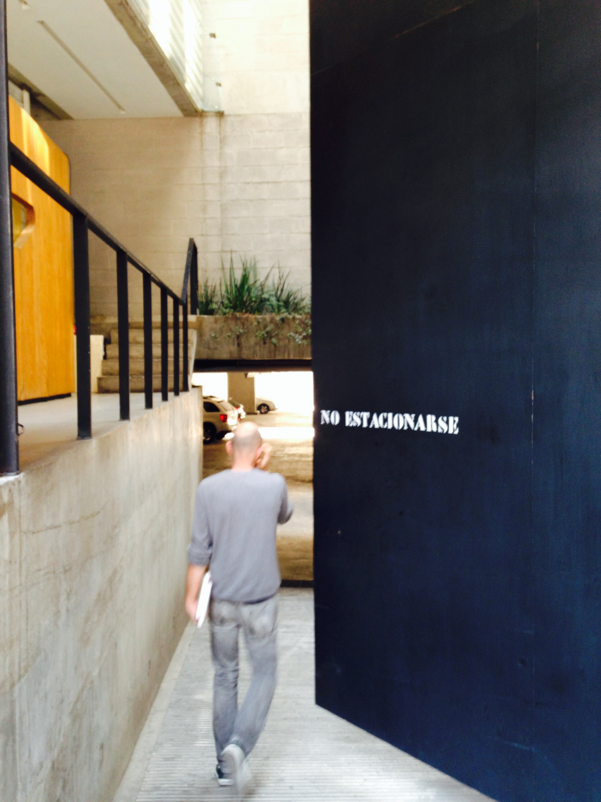
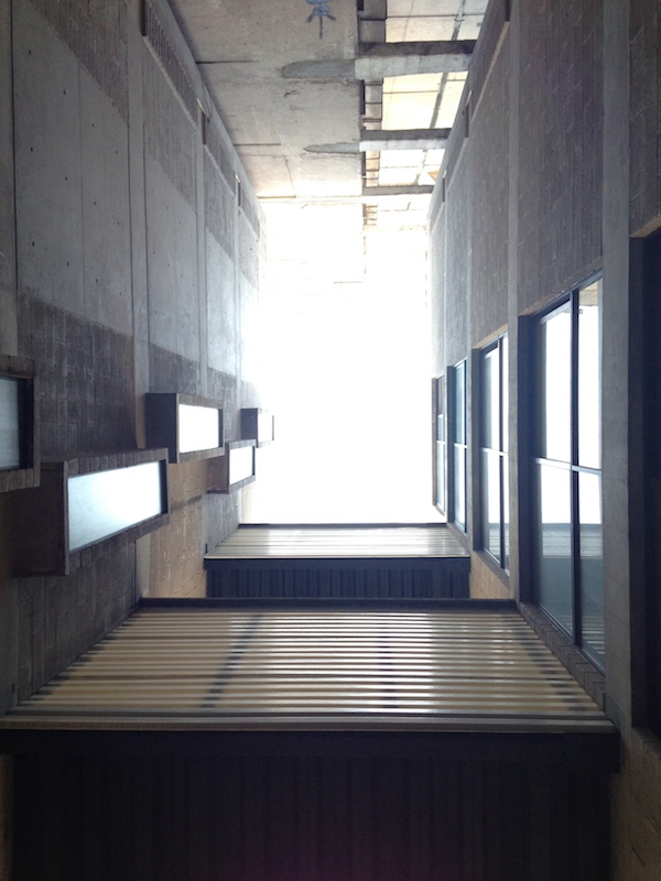
I had the pleasure of touring Lisboa 7 with Francisco Pardo (above) while I was in Mexico City, and I took these photos. What struck me the most, as a visitor from Brooklyn, was the slicing and dicing of the open space on a narrow lot, reorienting most of the apartments to internal lightwells rather than windows only at the front and back of the lot. I’m all too familiar with the brownstone pattern here, and too few architects have attempted to rethink the 20 by 50 multifamily block. I also appreciated the way AT103 allowed for a much broader range of apartment size, from studio to three-bedroom, by creating modules that could be combined up and down and sideways. This seemed to be a recognition of the informal patterns one sees in older apartment buildings, made modular by necessity. It is also an idea raised by Jeanne Gang’s team in MoMA’s 2012 Foreclosed exhibition, anticipating the range of housing choices we need over time all happening in a single place.
If you’d like to know more, check out Architecture Does (Not) Matter and more photos at ArchDaily.


Review: Radical Cities
“Considering ideal conditions is a waste of time,” Alfredo Brillembourg and Hubert Klumpner write in their 2005 book, Informal City. “The point is to avoid catastrophe.” The two architects, partners in the international practice Urban-Think Tank, are known for the cable car system they designed for Caracas, connecting barrios in the hills with the city in the valley. Part of the allure of these cable cars, and U-TT’s work in general, is the way they make a virtue of leftover spaces. A shelter for a football field becomes a “vertical gymnasium”. A shelter for street children, built under an overpass, gets another football pitch on its roof. As design critic Justin McGuirk writes in Radical Cities, his survey of urban experiments in Latin America, in “engaging with the informal city, U-TT developed a methodology of maximising the amount of social activity that a tiny plot of land could deliver”. They went small – “strategic” and “urban acupuncture” are the terms du jour – looking at what the city had become, and what individual neighbourhoods needed, rather than masterplanning a cycle of demolition and straight lines.
On X
Follow @LangeAlexandraOn Instagram
Featured articles
CityLab
New York Times
New Angle: Voice
Getting Curious with Jonathan Van Ness