Portfolio | UNAM
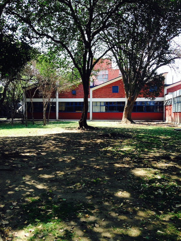
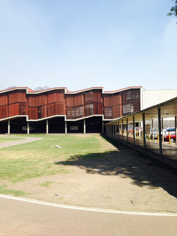
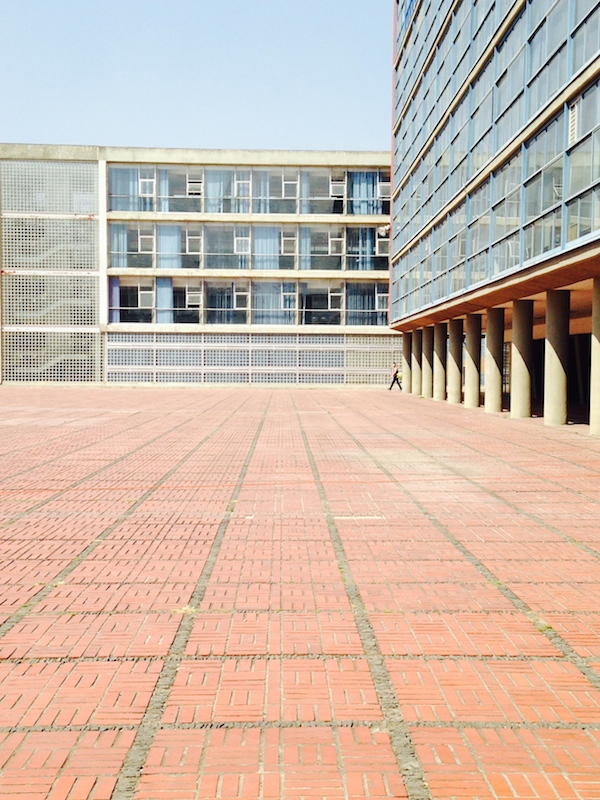
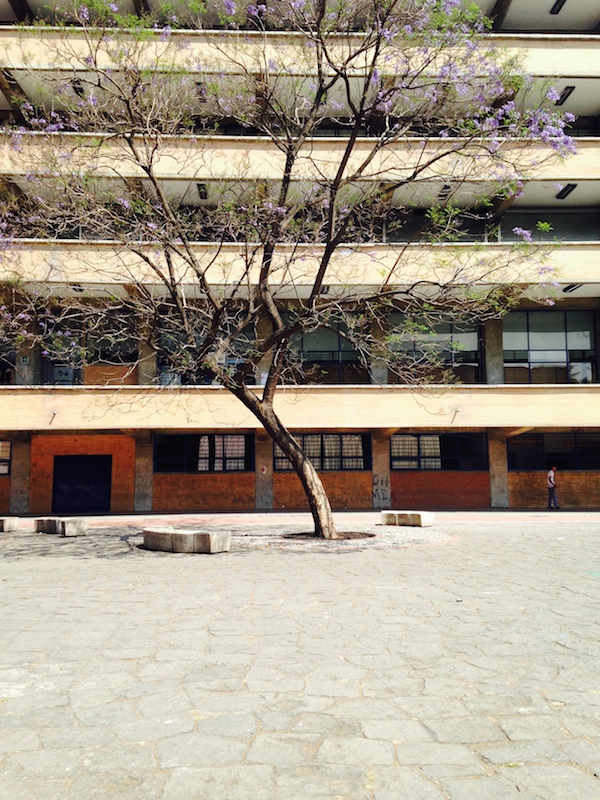
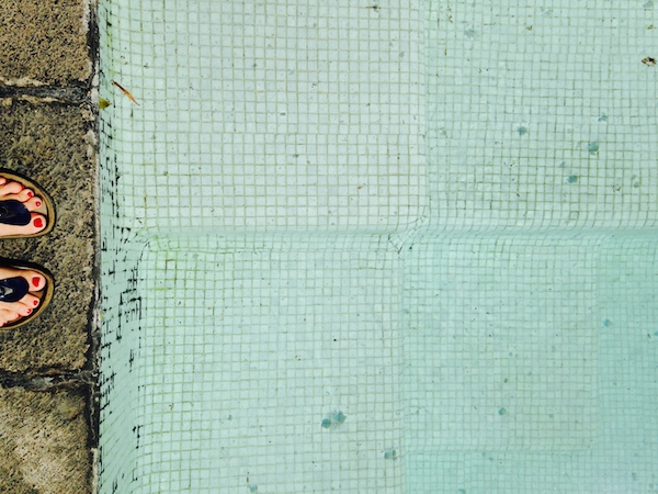
The University City campus of the Universidad Nacional Autonoma de Mexico (UNAM) was built in Coyocan, in the southern part of Mexico City, in the early 1950s. It opened in 1954 and in 2007 was declared a UNESCO World Heritage site. The buildings on the campus were designed by Mario Pani (whose CUPA housing project I posted last week), along with Juan O’Gorman, Felix Candela, Enrique del Moral, Domingo García Ramos, Armando Franco Rovira, Ernesto Gómez Gallardo; the murals were designed by Diego Rivera and David Alfaro Siqueiros. It is a stunning site in multiple senses: huge but intricate, repetitive but quirky. We visited on a hot, sunny day in March and had to scurry around the edges of the vast, flat lawn in the middle. The circulation, via shaded paths and smaller courtyards, pushes most people around the edges except for ceremony (or protest). The enormity of the open space offered its own kind of anonymity: in many parks in Mexico City we happened upon couples necking in odd corners. At UNAM, a few were doing so out in the open, apparently feeling the scale as a kind of cover.
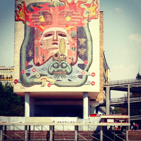
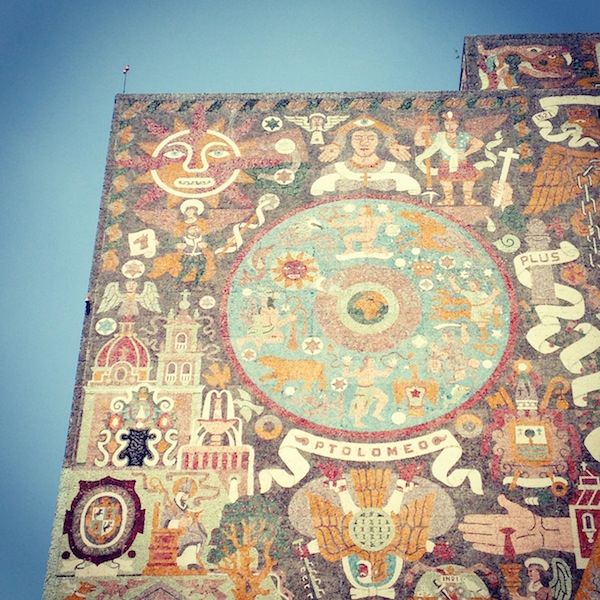
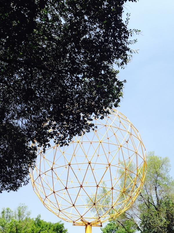
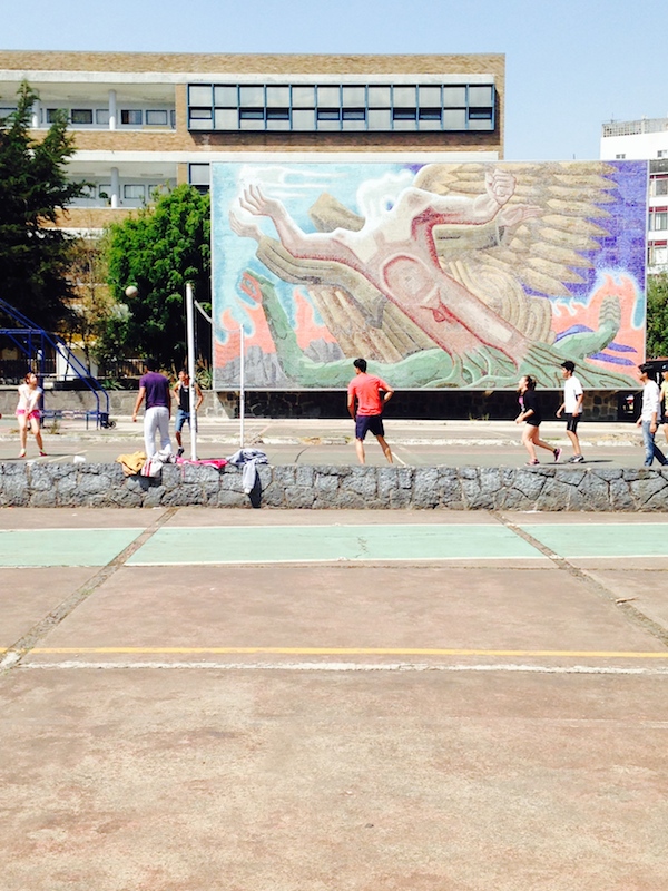
The opening date of 1954 is particularly interesting to me. The North American campus to which I think UNAM most closely relates is the General Motors Technical Center by Eero Saarinen, which began to open the same year. There, instead of a flat hot lawn, the empty center is filled with a lake with dancing waterworks. To give it height, Saarinen added a tear drop-shaped water tower; UNAM has the much smaller yellow openwork sculpture shown below. To give it curves Saarinen added a dome; UNAM has vaults and roofs designed in concrete by Candela. Saarinen specified end walls in various brilliantly-enameled bricks; UNAM had the murals, painted, sculpted, tiled, by the country’s best artists, which serve as their own kind of beacons, and add an even more refined level of detail. At GMTC, the only design of the same delicacy is Harry Bertoia’s cafeteria screen. The murals are stunning at a distance, and one is willing to walk great lengths to get closer to them. But when you reach the buildings they are still high over your head, pitched at the masses crisscrossing the campus. You can actually “see” many of them better when they are brought close through photography. The murals by O’Gorman on the library, at the top of this post, for example, are often used to represent all of the University City. On site, they do not dominate.
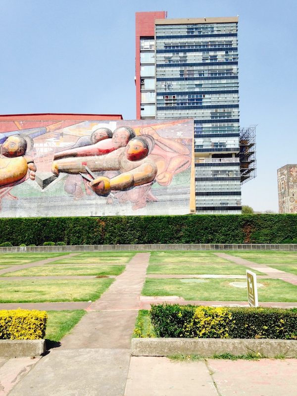
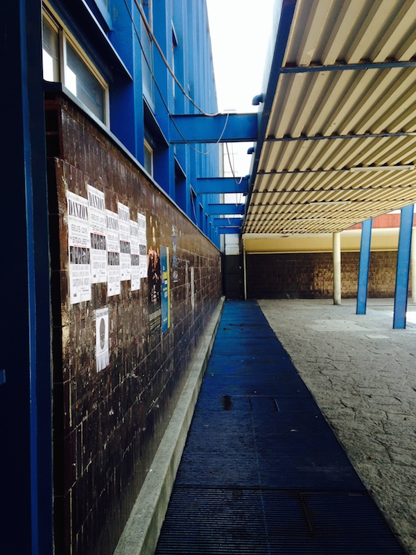
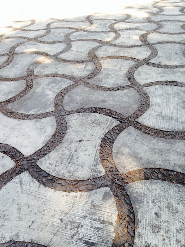
Other details noticed and appreciated: different textured pavements, curvy benches in a squared-off courtyard, shimmering monochrome tiles, touches of paint, like the bright blue on the architecture school. It is easy to photograph UNAM as a classic alienated modernist scene, and indeed, some of the classroom buildings read as endless. But it isn’t all, or even mostly, like that. And the endlessness relates it to many other complexes of the period, when the Beaux Arts axis was abandoned, and architects northern and southern tried to demonstrate their ambitions for the new era through different combinations of long lines, featured curves, and artistic explosions.
Portfolio | Centro Urbano Presidente Aleman
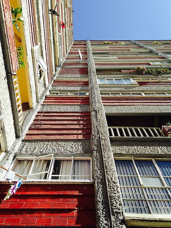
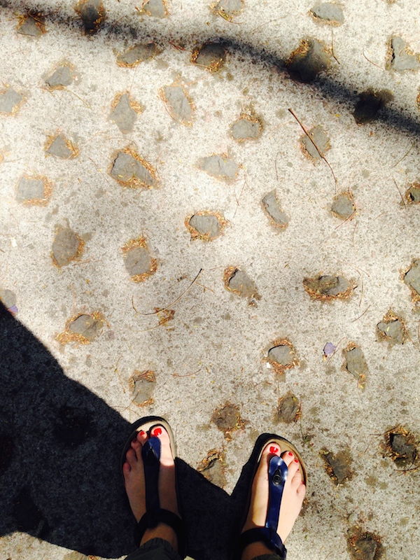
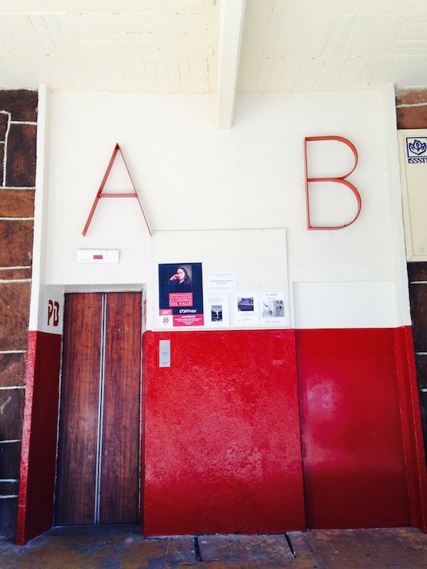
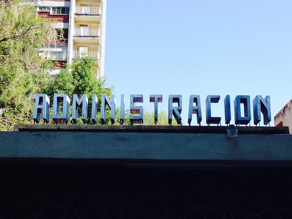
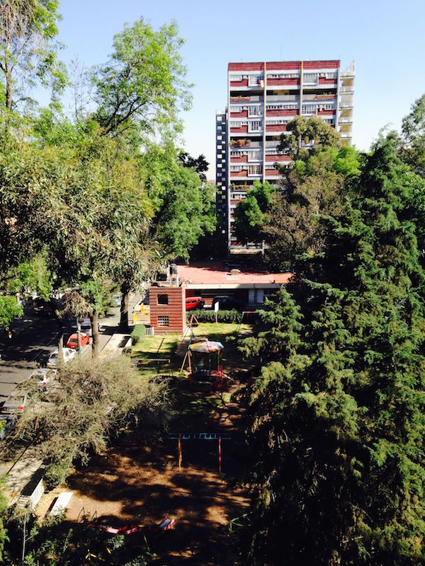
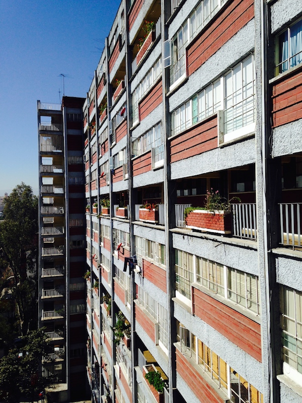
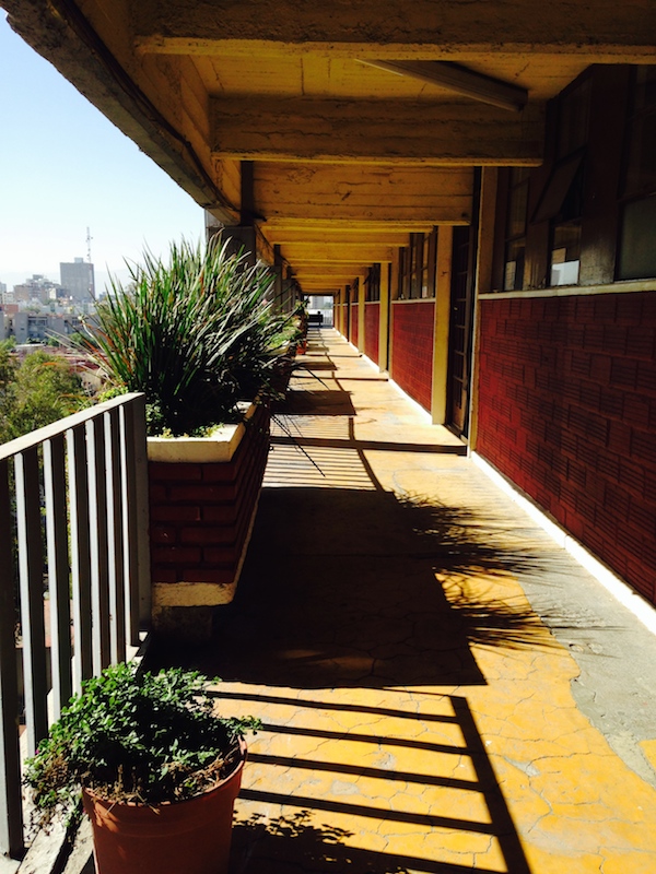
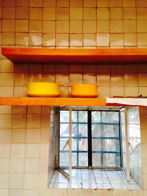
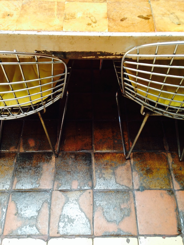
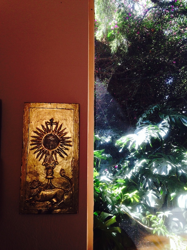
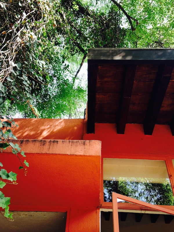
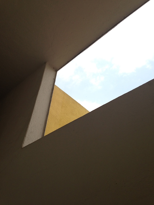
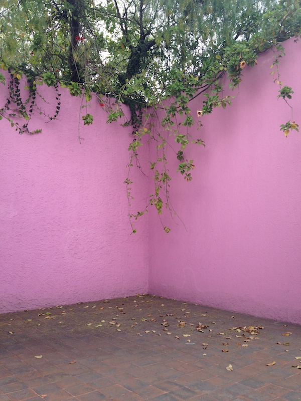
Visiting two Barragan houses was a dream, but the Harvard Graduate School of Design studio with which I traveled to Mexico this spring was exploring different mechanisms for low-income housing. We looked at a number of examples of mass housing, the earliest being the Centro Urbano Presidente Aleman (known as CUPA, coo-pa), designed by Mario Pani and built in 1949. The complex includes six thirteen-story towers, zig-zags rather than slabs, as well as six three-story rectangular buildings and a variety of recreational buildings and open spaces. For those versed in modern architecture, the Corbusian precedents are obvious: bi-level apartments, outdoor streets in the sky, the combination of low- and high-rise, and the buildings a redent. Here are towers in the park, but in Mexico City the park (thanks to the climate) is lush and green, the flower boxes along those open passages are full, and the idea of a public sitting room thirteen stories up doesn’t seem like such a terrible prospect. The exterior language is inflected toward a Mexican vernacular, the concrete frame roughly textured, with infill panels of brick. In the strip windows overlooking the passages, one could see lace curtains and religious icons. As with so many early modernist developments, in Latin America as well as Europe, the complex’s longtime residents had made it their own.
By all accounts CUPA has been the rare stable example of such mass housing in the region; considered “gargantuan” when it was built to house 5000 people on land designated for 200 single-family houses, it now looks far more reasonable. Stable because residents have stayed by choice, stable because it survived the earthquake of 1985, which destroyed a number of the slabs at Pani’s later, more massive, more troubled Conjunto Urbano Nonoalco Tlatelolco. Justin McGuirk starts his new book, Radical Cities, in Tlatelolco, completed in 1964, and describes it thusly: “Tlatelolco took the modernist idea of social housing to its logical, many would say absurd, conclusion. If, in the mid twentieth century, the city of the future would comprise rows of megablocks sitting in parks and gardens, then the future looked like Tlatelolco.”
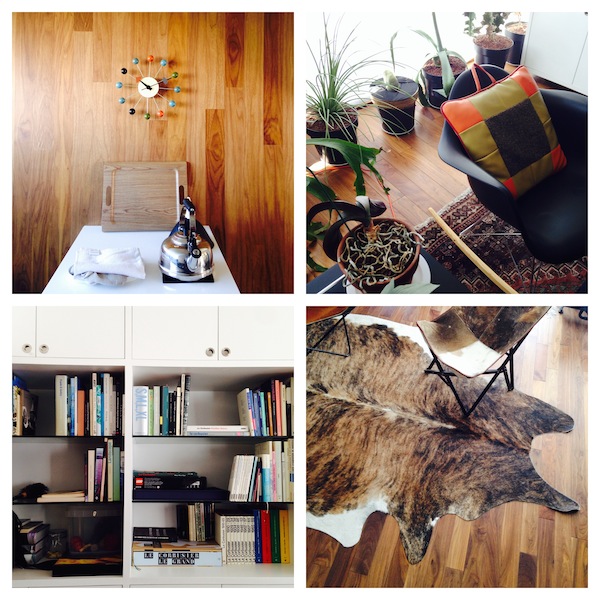
It was interesting to see the complex turned into a modern graphic, as at the laundromat on its first floor, as well as to see it remodeled, by one architect-in-residence, into a true representation of International Style decor, with a George Nelson clock and a Marimekko apron. The one complaint we heard on our (admittedly short) visit was that, at certain times of day, you couldn’t take the elevators: the unionized operators did not want to stagger their breaks. So we walked up the outdoor staircases. For more reading in English, there is Adam Kaasa’s Appearing In or Out of Time and the February 2003 A+U.
Visit: Latin American Photography, 1944-2013
Caio Reisewitz, Casa Canoas (2013), courtesy ICP
Looking at photography, seeing design. The current exhibitions at the International Center of Photography are, of course, of photography, and brilliant, various and devastating images at that. But the work of contemporary photographer Caio Reisewitz and the collected works in Urbes Mutantes: Latin American Photography 1944-2013 also offer a showcase for design in multiple forms. Reisewitz’s large-format images (in whose size, as well as their greens and grays, you can see the influence of his study in Germany) represent “places of power” in Brazil, including Oscar Niemeyer’s Ministry of Foreign Relations in Brasilia. The moody image above is of Niemeyer’s own house in Rio, more commonly seen as a sunny, tropical tribute to the good life. A series of photocollages by Reisewitz introduce informal architecture into the green landscape, symbolizing the push of architecture against nature. His images seemed particularly a propos after reading Justin McGuirk’s survey of urbanism across Latin America in the new book Radical Cities.
Downstairs, the museum’s survey of Latin American photography is broken into themed sections, beginning with one on modern architecture. The New York Times has a thorough slideshow here. We see both the expected straight lines and sharp shadows, as well as more recent photojournalism on the decay and reworkings of modern housing. I was particularly excited by a huge vintage book, simply titled Caracas, on display in one case, as well as a one-of-a-kind album from Mexican architect Mario Pani’s office showing images of his CUPA housing. (I’ll post my own photographs of CUPA in its present-day state next week.) Several other sections of the exhibition also included beautiful examples of period book design, including a limited-printing automobile portfolio in a shiny stainless-steel case. Graphic design made an appearance not only in printed matter, but in a separate gallery on signs, documenting the work of sign-painters, advertisers and store-owners. Packaging turns up too: Susana Torres documents the sad end of the Inca-as-brand in a series installed floor-to-ceiling. There are more themes: identity, nightlife, protest, and many more photographers to discover. If you won’t be in New York before September, the catalog looks excellent.
Portfolio | Casa Prieto
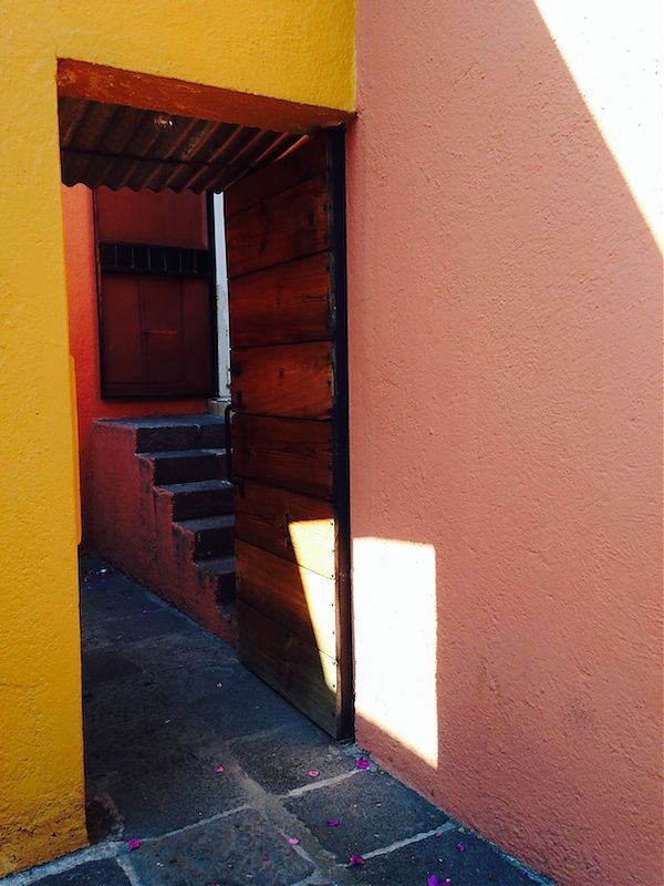
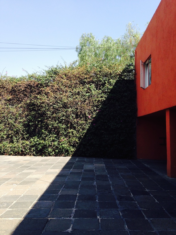
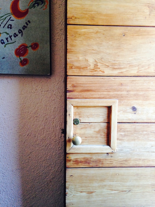
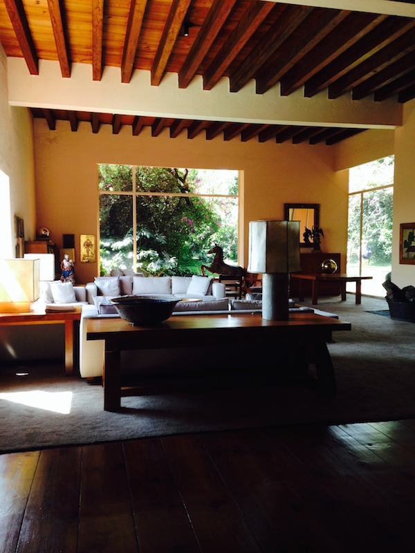
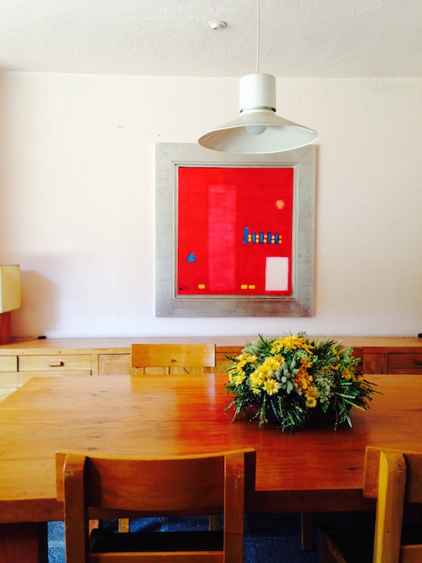
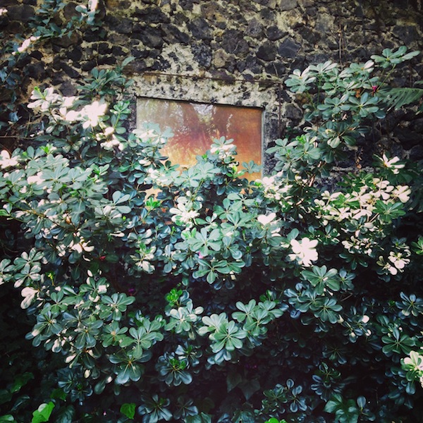
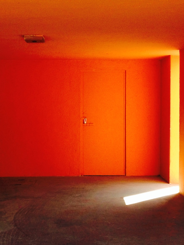
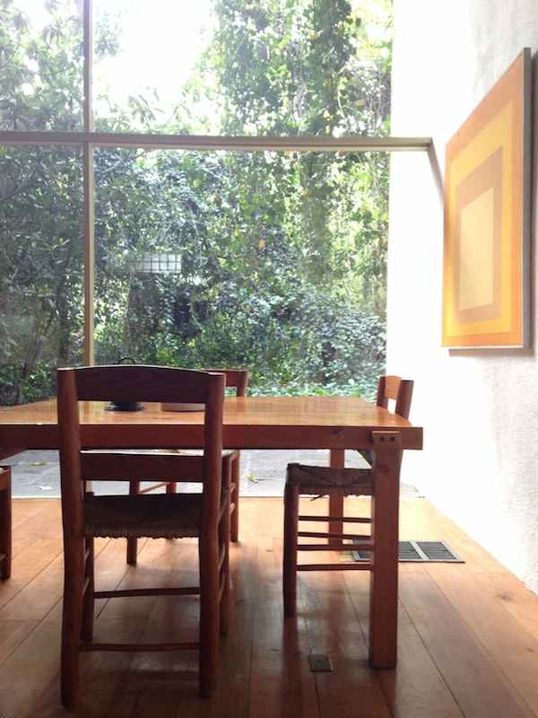
While in Mexico City in March, I was also able to tour Casa Prieto Lopez, designed by Luis Barragan in 1950. The house is part of the luxurious suburb, master-planned by Barragan, called Jardines del Pedregal. The house was then for sale, with some (not all) of its original furnishings and artworks by Mathias Goeritz intact. It is far grander than Barragan’s own home, which is essentially on a townhouse lot. It also feels less fitted to the life of a particular human. One could intuit Barragan’s daily rituals from the spaces he made for them; the family Prieto had numerous children, and one imagined the architect leaving enough room between moments for their banging and flopping and wet feet. That last orange space is, of all things, the garage.


"Making something big happen at an urban scale is more than a popularity contest."

Did you know the Statue of Liberty was one of the first civic crowdfunding campaigns in America? This piece of century-old news made the rounds last year, as readers rediscovered the central role of Joseph Pulitzer’s New York World in raising $100,000 ($2.3M in today’s dollars) to fund the pedestal to receive Lady Liberty in 1885.
As MIT researcher Rodrigo Davies pointed out then, and does again in his recent thesis on civic crowdfunding, it wasn’t just the five-month, centrally organised campaign that makes the Statue a historical precedent. Rather, it was the skilful way Pulitzer’s paper made it seem as if everyone were donating, with daily updates, a reward system, and personal anecdotes underlining the idea that no amount was too small. The World also used anti-elite sentiments to rally the working classes to the cause – traditional, big-donor fundraising hadn’t closed the gap on the pedestal’s cost – mentioning donors by name in daily updates, and used the platform of the newspaper to make the campaign appear to be ongoing national news. Social media requests for backing, frequent emails once you have given, a commemorative tchotchke once it’s all over: all news from 1885.
A Lazy Man's Way
Almanzo asked Father why he did not hire the machine that did threshing. Three men had brought it into the country last fall, and Father had gone to see it. It would thresh a man’s whole grain crop in a few days.
“That’s a lazy man’s way to thresh,” Father said. “Haste makes waste, but a lazy man’d rather get his work done fast than do it himself. The machine chews up the straw till it’s not fit to feed stock, and it scatters grain around and wastes it.
“All it saves is time, son. And what good is time, with nothing to do? You want to sit and twiddle your thumbs, all these stormy winter days?”
“No!” said Almanzo. He had enough of that, on Sundays.
From ‘Farmer Boy,’ by Laura Ingalls Wilder.
Portfolio | Barragan House

I visited Luis Barragan’s house in Mexico City in March. Inspired by Guy Trebay’s Travel story on visiting Barragan, a portfolio of photographs from that day.


Who Pays for the Picture?
Zaha Hadid, Heydar Aliyev Centre, Baku. Photo: Iwan Baan, 2012.
The Harvard Design Magazine relaunched at the 2014 Venice Architecture Biennial with an issue titled Do You Read Me? I contributed this short essay to the Artifacts section.
In late 2013, the White House Correspondents’ Association (WHCA) wrote to White House Press Secretary Jay Carney, protesting its photographers’ lack of access to presidential events. Few people would have noticed—images from these events had circulated via social media. But most were the work of a single photographer, Pete Souza. As the official White House Photographer, his images are often the only documents of historic moments.
“You are, in effect, replacing independent journalism with visual press releases,” said the letter. “Visual press releases” grabbed my attention. What, ultimately, are the majority of the architectural images we consume? Many blogs and magazines feature images by photographers hired not by the publication, but by the client or designer. A striking image used to illustrate a review of the building can become the trademark for that building or an architect’s practice. These pairings demonstrate a disconnect between the processes of making the content we read and that which we see.
Visit: Tara Donovan at Pace
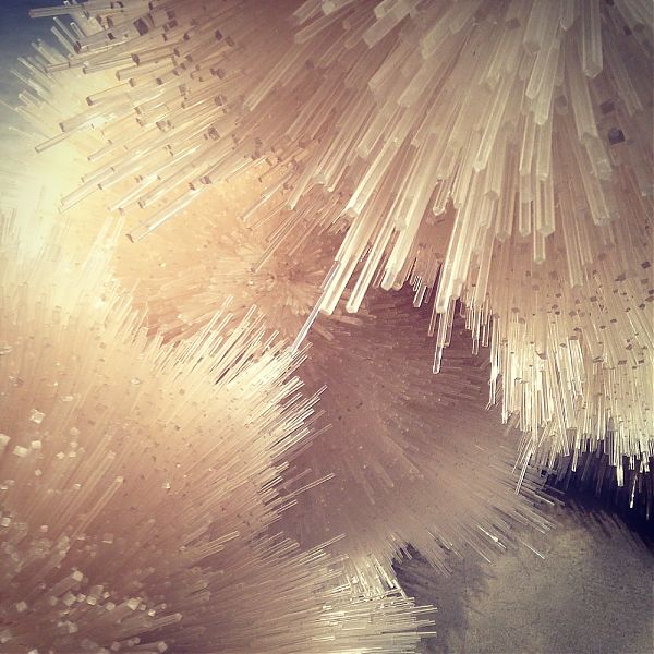
Tara Donovan has been exploring the topographic possibilities of everyday objects for some time, but each new arrangement feels like a surprise. I loved both her mountain range and cumulus of cups. At Pace Gallery in Chelsea, through June 28, you can see what she can do with index cards and cocktail stirrers. I found the wooly piece pictured above reminiscent of the work of Warren Platner, with its whiskey tone and Sputnik heredity.
Four Building Toys for the Ages
We have a lot of building toys. When you are an architecture critic, married to an architect, people tend to give you one set after another of blocks. Soft blocks, wood blocks, blocks that snap together, blocks that all fall down. After the blocks they give you joints. Ball-and-socket joints, hub-and-spoke-joints, articulated joints. And then the brands rush in, and they give you Lego. Star Wars Lego, Ninjago Lego, Chima Lego, Lego knock-offs that light up. I await the onset of the programmable. We’ve already entered the realm of the digital, via Minecraft and the delightful Toca Boca apps.
I’ve now lived with these sets for five years. Here are the four that still get played with almost every day. All plastic, as it happens. Despite the modernist fetish for wooden toys, plastic is lighter and creates easier attachments, two aspects that have proved important to my kids. I’ve arranged the toys in the order you might consider purchasing, starting at age 2.
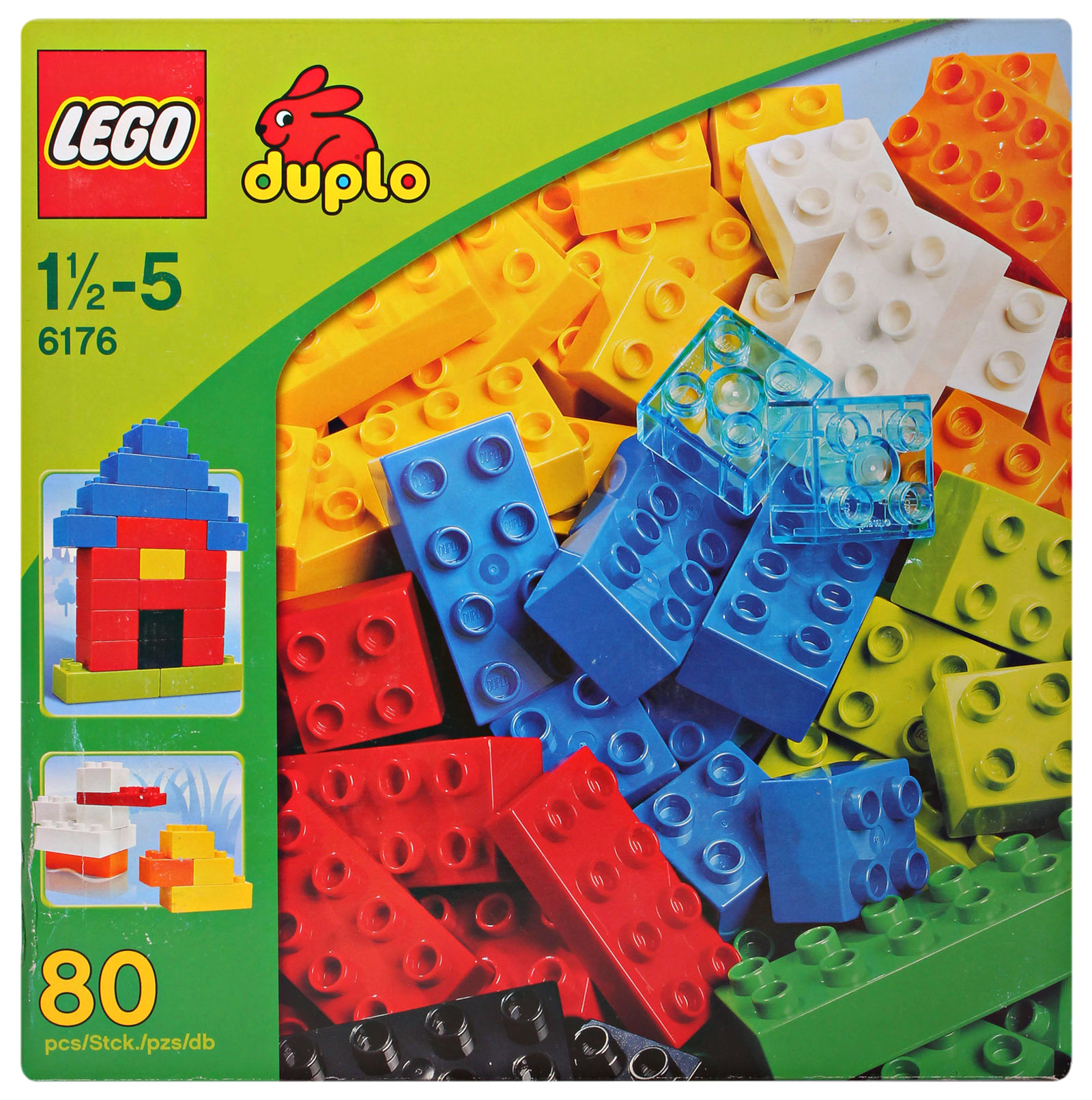
1. Duplo
As I wrote in Living in Lego City in 2012, Lego proper offers a limited number of scenarios, the sets dividing starkly into those “for girls” and those “for boys.” Duplo, sized for smaller hands, suffers no such split personality. There are house sets and vehicle sets, which offer up useful pieces of domesticity like beds and fences, and transportation options like wheel bases. If you are lucky, as we were, you can score a hand-me-down bin of blocks, in rainbow colors, and a set of different-size platforms. My son began building on those platforms at age 2, and he hasn’t stopped. We’ve made houses and Bat caves, the High Line and garages, skyscrapers and mazes. Even though we now have Lego proper, the kids return to the Duplo for its scale and speed. You can throw something together in a minute to house a superhero action figure, or make a sketch of a city as backdrop.
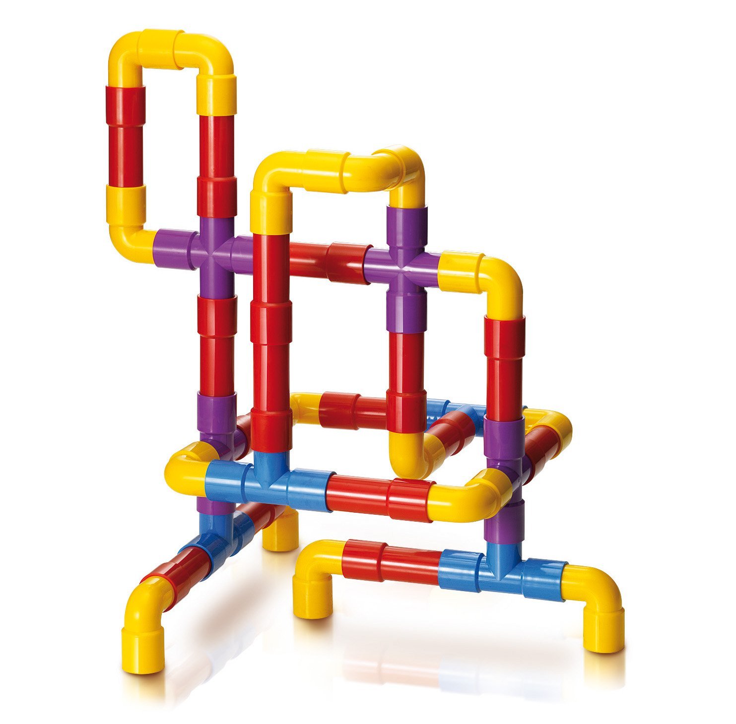
2. Tubation
When we got Tubation as a gift I sort of shrugged. Was it a bath toy? An instrument? We weren’t ready yet for a marble run. But then my son got his hands on it and better things happened. (Sometimes we lose imagination as we age.) Swords, dinosaurs, canopies, bracelets and, yes, a gun or two. Even little hands can put the tubes together and take them apart, and their gross scale makes it easy to create child-size tools. There are specialized sets with instrument add-ons, marble slots and transparent tubes but those are hardly necessary. This toy is like the stick of building toys, and it is inexpensive too.
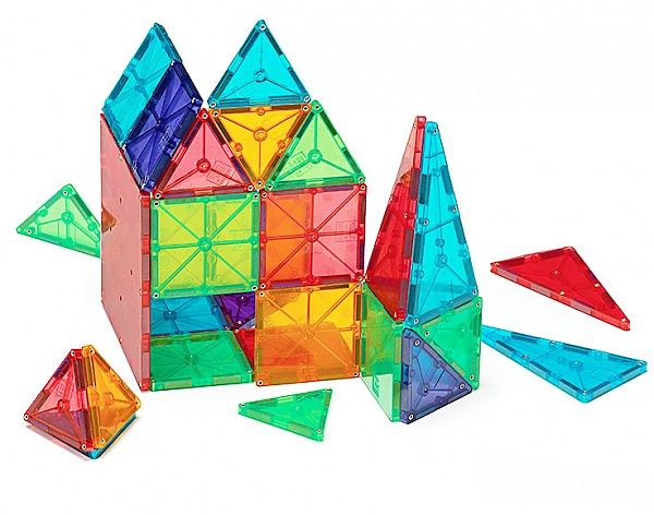
3. Magna-Tiles
This is an expensive toy, about $1 per tile, but I’ve recommended it over and over. We now have 300 pieces, through a combination of gifts, hand-me-downs and purchases. At times, when the castle turned into a skyscraper that needed a multilevel garage that stretched across the windowsill, we needed even more. Magna-Tiles are easier than Lego, and you can make something tall and beautiful in a flash. As kids get older, they move beyond the basic squares (in two sizes) and start thinking about the possibilities of the triangles, matching them into squares when they run out, creating geodesic hovercraft, bugs, spaceships. They teach the possibilities of geometry, and anything you make, even a little 2yo cube, looks beautiful. Since these things tend to hang around, it is nice when the creations are as good as sculpture.
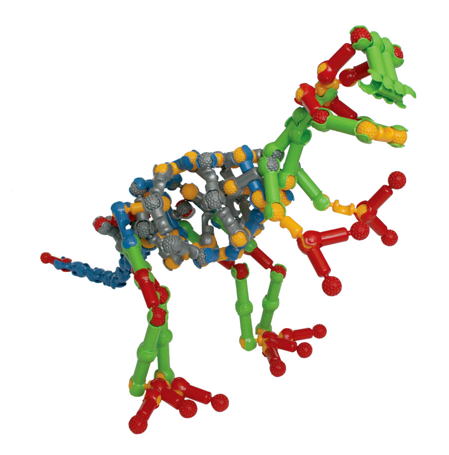
4. Zoob
Zoob comes with directions: totally unnecessary. Zoob is a set of plastic ball-and-socket joints that can be combined in various ways. They are easy to snap together (though hard for little ones to pry apart). If Duplo and Magna-Tiles suggest houses and vehicles, Zoob suggest creatures, manipulable skeletons that can switch from insects to dinosaurs to men in just a few clicks. I’ve been amazed to walk into my son’s room and find the floor suddenly covered in alien beings. The largest is always the leader, simplistic babies in the corner, and something new being hatched out of the pile in the center of the room. Because the individual pieces are small (but not so small as to be choking hazards), the range of possible scale is terrific. As with these other toys, you can watch the progression of your children’s imagination through the increasing number of possibilities they see in the toy.
On X
Follow @LangeAlexandraOn Instagram
Featured articles
CityLab
New York Times
New Angle: Voice
Getting Curious with Jonathan Van Ness