Portfolio | UMass Dartmouth
When you only know about locations from architecture books, sometimes your geography can be terribly off. For years I had mentally placed UMass Dartmouth, the campus designed by Paul Rudolph in 1963, in western Massachusetts. It was only recently that, better acquainted with the facts, I relocated it to southeastern Mass. And only on Friday, en route to a wedding on Cape Cod, that I passed the exit off I-195 marked “UMass Dartmouth.” We had to stop on our way home.
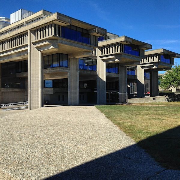
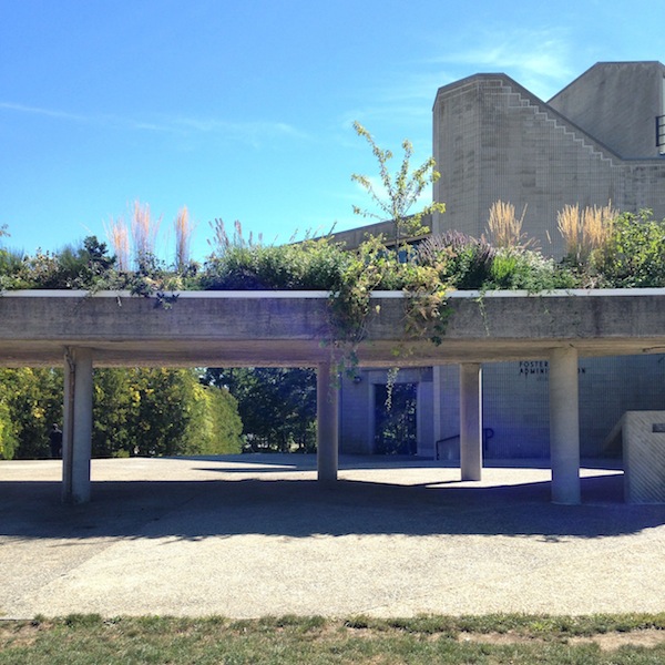
To get to the campus, you pass first through an area of strip malls, then through a set of winding historic streets (complete with picturesque New England cemetery), and then up onto a bald and grassy plain. You see the university’s concrete, sans serif sign before any buildings, and the roadway quickly sweeps you around to a series of radial parking lots. Rudolph, like other campus planners of the era, chose to keep the car out of the quadrangle, creating a moat of parking around his interpretation of the quad. This makes the campus very pleasant once you’re inside its embrace, but everything initially feels very far away.
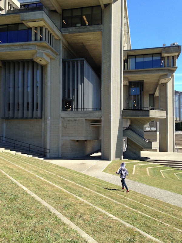
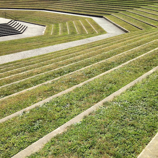
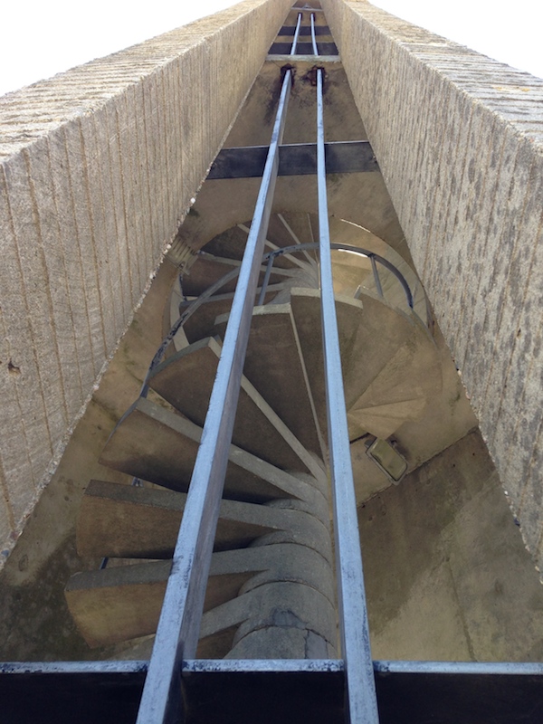
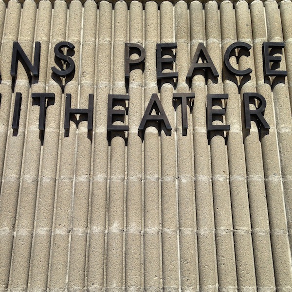
My children were grumbling as I herded them from the car, but the minute we rounded one of the newer campus buildings, and saw the terraced amphitheater, that all changed. Both of them immediately felt that space as theater, as earthwork, as enormous climbing structure, and ran off ahead. Everything is so open within the buildings’ embrace, there was no need to worry about them as they climbed up and down and over walls, sprawled out on benches, tried to get into the campanile. That emotional reaction seemed very telling to me: they were not the least bit intimidated by the materials or the wide-open spaces, and they could intuit the uses of each in turn.
In Tim Rohan’s recent monograph, The Architecture of Paul Rudolph, he writes of the campus design:
Plantings of trees and wide lawns recalled the expansiveness of traditional American campuses; the buildings themselves evoked the picturesque towered skylines of Collegiate Gothic. Two long ranges of turreted buildings, … circumscribed the primary communal space at the campus’s center, a spiral-shaped outdoor mall that widened, pivoted, and changes direction at the foot of a concrete campanile and an adjacent amphitheater to lead out to pastoral views of a pond.
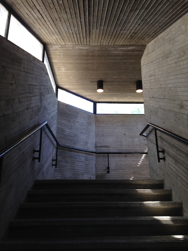
Honestly, I was expecting to have to intellectualize my appreciation of all that concrete (scalloped rather than bush-hammered, it looks even more like corduroy). But Rudolph’s thoughtfulness was so apparent, I didn’t need to think that hard to be excited. Yes, the central spaces are vast, but it’s very possible to work your way around the covered edges in inclement weather. Yes, that’s a lot of concrete, but I could see remains of some stylish plantings, inside and out, and the main plaza is grassy just like at Yale, or Princeton, or any number of classic models. The campanile provides a beautiful focal point for the pinwheel of steps and buildings, bringing you into a tight whirl of ramp and tower, and then spinning you out again. Its simplified form (simpler even than Rudolph’s initial drawings) reminded me of the bell tower on Eliel Saarinen’s First Christian Church in Columbus, Indiana.
More background and quotations from Rudolph about the project are here.
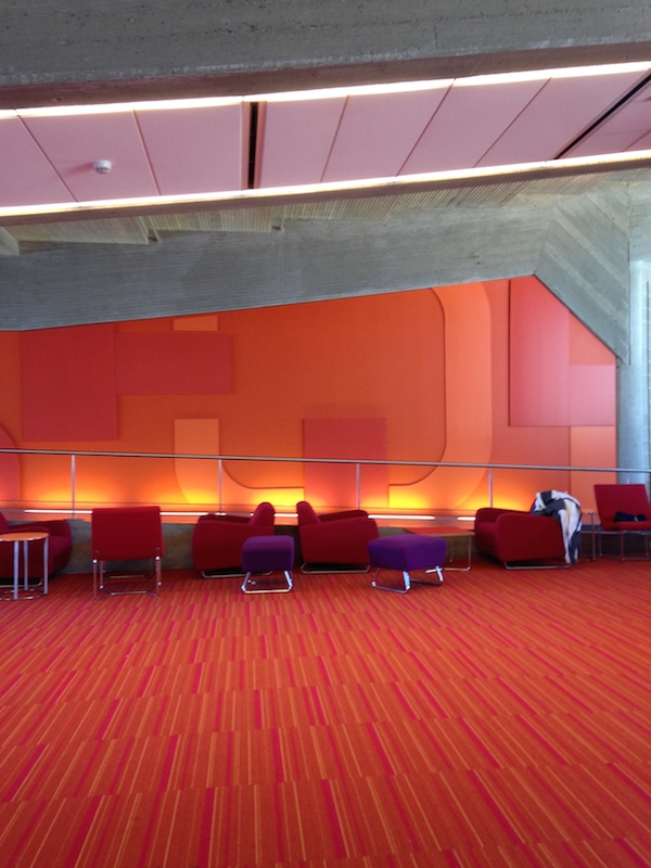
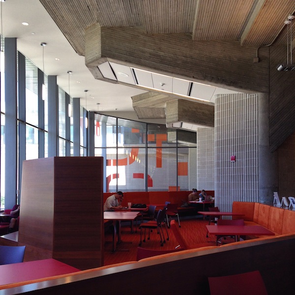
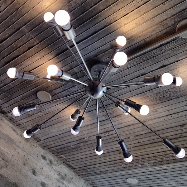
The Claire T. Carney Library was renovated and enlarged in 2012 by Boston-based designLAB, enclosing some outdoor spaces, rearranging stacks, and fitting it out with furniture and workspaces to suit how students study now. From the outside, one can see the twinkling Sputnik lights on every floor. On the inside, the intense reds and purples seem entirely appropriate as a period color choice, and warm up the board-formed concrete hull. I could see many nooks and crannies in which I might like to set up to write.
I also liked this description of the new-old clash, from Robert Campbell’s 2012 review of the project in the Boston Globe:
What I like best are the places where Rudolph’s Brutalism bangs right up against designLAB’s innovations. For example, there’s an area where massive concrete piers with rough gray coats, originally part of the exterior, are now sited in the interior because the building has been expanded around them with much added glass. They look like elephants wondering why they’re suddenly trapped in a glassy cage. There’s a wrinkle in time.
In the unrenovated Engineering building next door, one could see the improvement of warm colors and textiles (always part of Rudolph’s own interior design strategy). A multi-level space containing vending machines, a black-upholstered bench and a sad ficus was not welcoming, but the bones were there. And the quality of the concrete, with board-formed zig-zags operating as wayfinding, as HVAC ducts, as wall decoration, was unbelievably impressive. As my husband said, you could see Rudolph wanting to be Frank Lloyd Wright and figure it all out, from structure to ornament, and everything in between.
I hope UMass Dartmouth continues on with its thoughtful renovations. So many new university buildings feel tinny and cheap. (This is my greatest fear about the new Whitney as well. How can it be as good as the Breuer building they left behind?) This campus is a treasure, and the library, along with Yale’s Art + Architecture Building, a lesson in how to use the modernist past to contemporary advantage.
On X
Follow @LangeAlexandraOn Instagram
Featured articles
CityLab
New York Times
New Angle: Voice
Getting Curious with Jonathan Van Ness