Portfolio + Review | Emerson College Los Angeles
I saw Morphosis's Emerson College LA yesterday and I have to agree w HawthorneLAT</a> review <a href="http://t.co/Lhl0F4BKeH">http://t.co/Lhl0F4BKeH</a> ...</p>— Alexandra Lange (LangeAlexandra) September 18, 2014
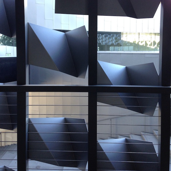
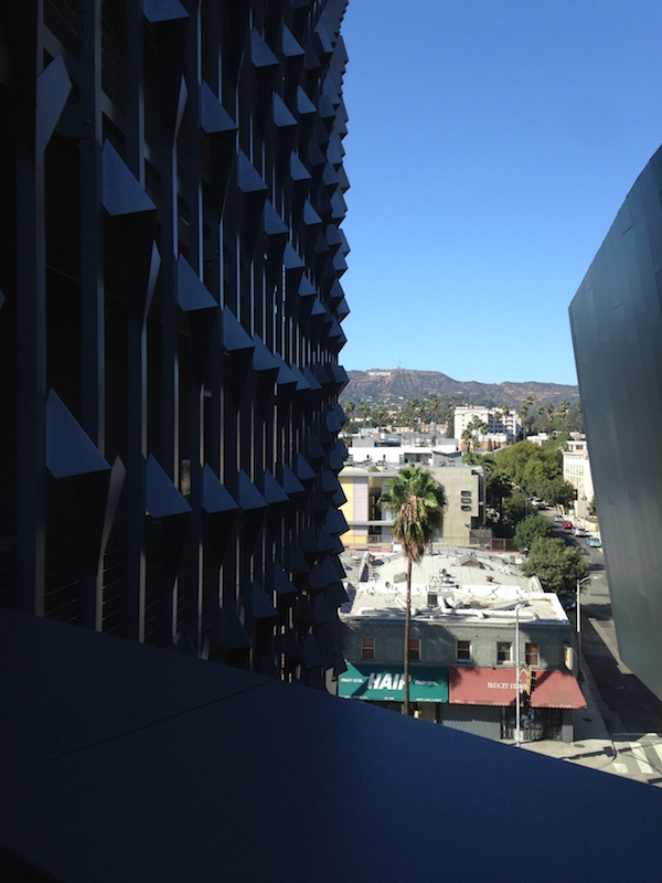
Morphosis’s 2014 building for Emerson College Los Angeles remixes the campus into a single, screen-like building, entirely appropriate to the college’s Sunset Boulevard site and the school’s ambition to have a legible urban presence. It frames the Hollywood sign for the students, there for a semester from Boston to do mostly entertainment-industry internships. It gives the school a marquee on a street lined with them, standing out but not breaking the scale or color palette of the boulevard.
Works as a bill-ding-board, beautiful metal screen but still, every interior space but the kitchens looks cheap + depressing. And idea …
— Alexandra Lange (@LangeAlexandra) September 18, 2014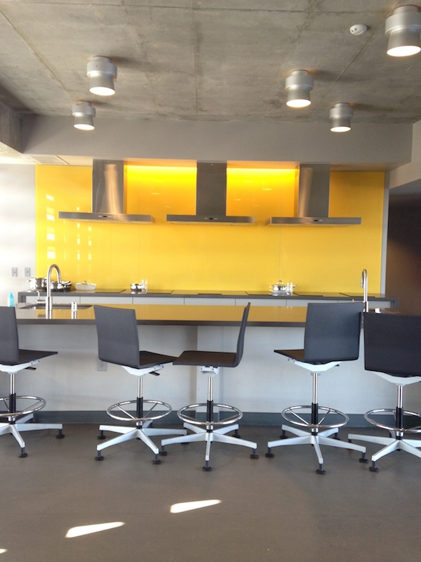
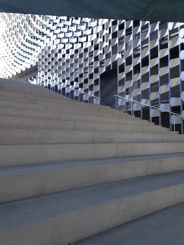
… That stairs = campus, = social life has yet to be proved out, even as M builds for more schools. Glad I know abt helipad zoning too.
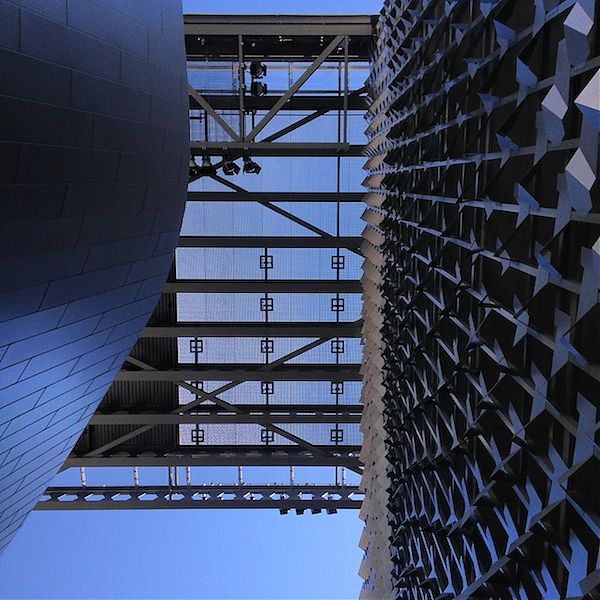
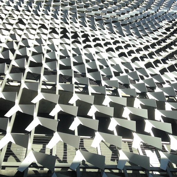
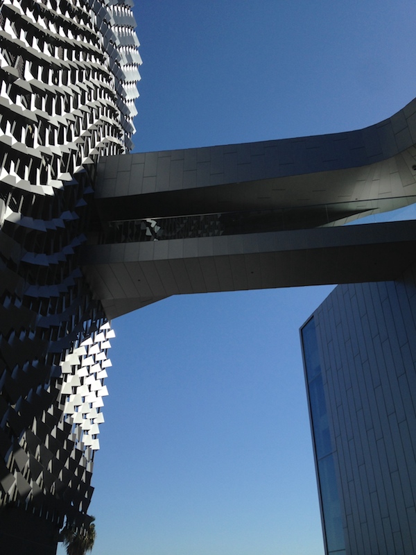
— Alexandra Lange (@LangeAlexandra) September 18, 2014It looked as if 90 percent of the budget was spent on the spectacular flock-of-birds metal screen, the twisting bridges, the helipad that forms the top of the box. The classrooms, the screening rooms, the dorm rooms, even the sittable stairs that are a Thom Mayne academic building signature are all rendered in dull, dead and texture-free materials, mostly gray. The only space with some verve is the communal kitchens, which have wheelie stools and yellow backsplashes. I am told they are wired up in case students want to film their own cooking shows, so that may explain the extra flourish. Yes, LA has a beautiful climate and yes, the students are mostly there for their off-campus internships but still: shouldn’t they have a retreat and a welcoming enclosure? Those spaces made me worry for Morphosis’s Cornell Tech building, where students won’t have as much good weather, and the rhetoric is much more focused on what’s happening inside.
The outdoor steps represent a “quad” at an angle, and were described as both a social space and a potential stage. In my photo you can see how plain they are. Would a little theatricality, in the form of cushions patterned like the screen, been totally out of the question? Even wooden planks, to suggest the idea of the bench, would have added human-scale texture. They could even have been stained gray.
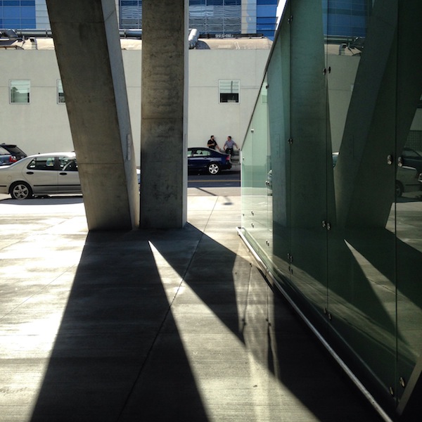
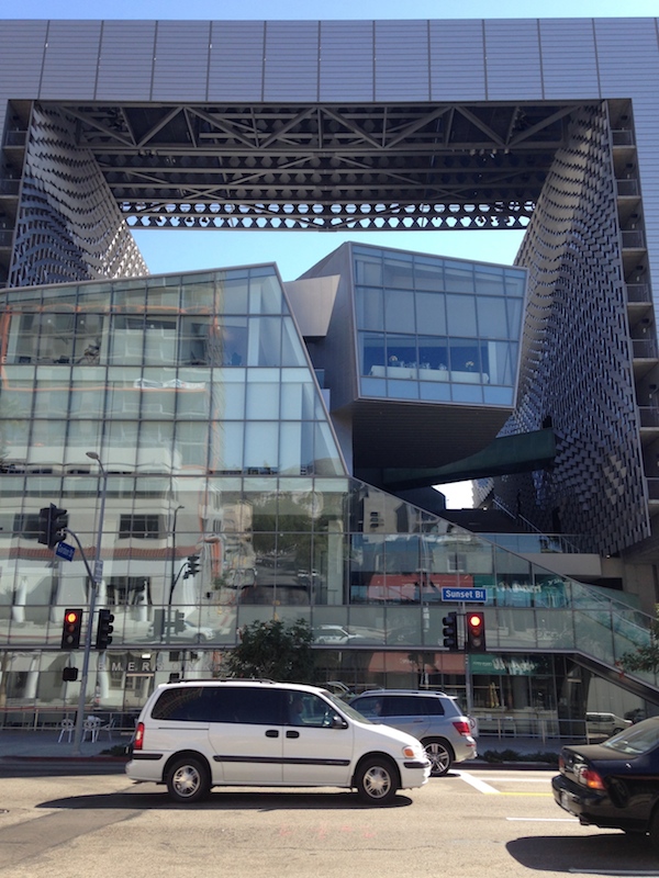
The two sides, formed by slabs of dorm rooms, are ten stories tall with the crosspiece. From the street it looms, but not unpleasantly (see my photo above from across the street, with traffic). It is not a spaceship, like Caltrans downtown or the San Francisco Federal Building, but closer in size to Morphosis’s Cooper Union building in New York. I appreciate the fact that for Emerson, unlike Cooper, Mayne re-articulated its functions, rather than cloaking them in a metal skin with mystery gashes. He also enclosed most of the ground floor on Sunset as a public cafe, perhaps learning from his New York mistake about the relationship of legs to street. As I wrote in my 2009 review of 41 Cooper Square,
At the sidewalk 41 Cooper Square might as well be set in the middle of a parking lot in Mayne’s native L.A. I was thinking of the criss-crossing concrete legs as Breuer-esque (there are lots of big boxes lofted on diagonal columns in his campus buildings in University Heights) when another building, closer to Mayne’s home turf, popped into my head: Eliot Noyes’s 1964 IBM Aerospace Building in Los Angeles, now the Otis College of Art and Design. Almost a cube, clad in precast concrete panels punctuated with windows that suggest a punch card, Noyes’s building lifted its symbolic screens off the ground on shifted diagonal legs and does sit in the middle of a sea of cars. Noyes’s building offered shaded space at the base, before the glass entrance, but in Mayne’s building, the space between concrete and glass is narrow and empty. A strip big enough for some sociability opens up on the south side, where a bookstore is scheduled to open. Maybe they will put out a few tables? In their loneliness the interstices of the legs are filling with bits of trash.
And if you want to see what it looks like in photos not taken by Iwan Baan, I posted a bunch on Instagram. It's smaller than you think!
— Alexandra Lange (@LangeAlexandra) September 18, 2014Finally, the mention of Iwan Baan’s photographs. Look at his first photograph of Emerson College LA on that review by Christopher Hawthorne. Doesn’t it look icy and removed? That’s a view few of us will ever see, and actually undercuts the accompanying critical praise. The questions asked in making that photograph are completely different from those most architecture critics are asking. Baan’s aerial views are heroicizing (and isn’t that what most architects want), but I remain uncomfortable that this is the way we see so much of the world’s “best” architecture. In 2010, I asked almost the same question of the Museum of Modern Art’s use of Baan’s photograph of Michael Maltzan’s Inner City Arts building, “Is it really community-minded to present your building as a sort of secular white temple in the middle of a gray city?”
When there is a description of experience of the building attached, the disconnect matters less; in the Los Angeles Times there were two interpretations of a building, side by side. But more often you have photography without commentary. Or commentary led by photography. Let’s mix it up a little more, image-wise, and not abandon the street-level view for the more glamorous skies.
On X
Follow @LangeAlexandraOn Instagram
Featured articles
CityLab
New York Times
New Angle: Voice
Getting Curious with Jonathan Van Ness