Portfolio | David Adjaye's DC Libraries
As part of my two-day modern architecture tour of DC last week (images of Philip Johnson’s Kreeger Museum and other landmarks to come) I visited David Adjaye’s two community libraries, both completed in 2012. I hope to review Adjaye’s Sugar Hill housing complex in Harlem when its museum component is complete this fall, as well as Freelon Adjaye Bond/SmithGroup’s National Museum of African-American History and Culture, in 2016. I wanted more context. After seeing both I would recommend the trip with one caveat: while it is possible to get to both libraries via public transportation, getting to both in an afternoon was time-consuming, and much easier to do in a car. For background, I point you to Philip Kennicott’s 2012 review of both with which I am (mostly) in agreement.
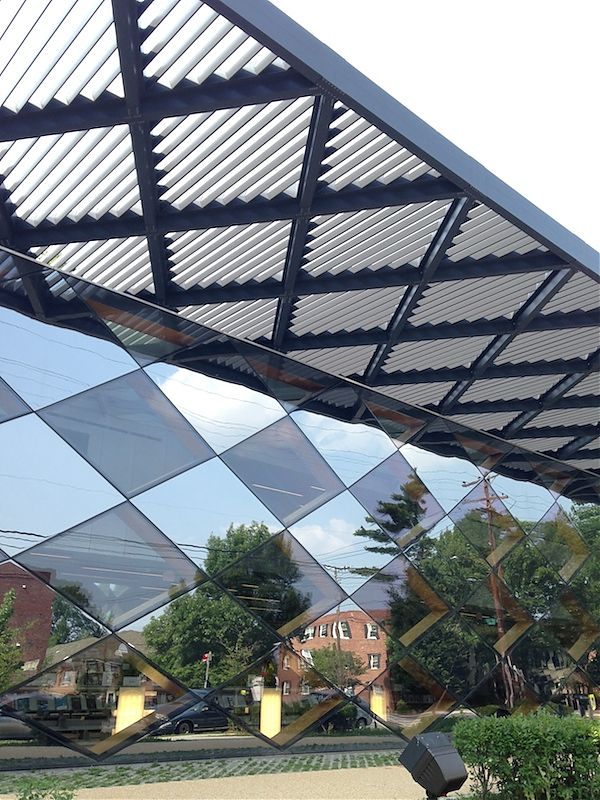
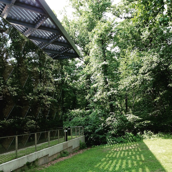
First I visited the Francis A. Gregory Library, located about a mile from the Naylor Road Metro stop in a modest, green residential neighborhood. Traveling up the street toward the library one has the illusion, for a moment, of a building that isn’t there. The library’s faceted exterior, made of tinted and reflective glass diamonds, fades into the trees of the forest behind it so that the plain brown box that marks the entry can look like it is fronting nothing.
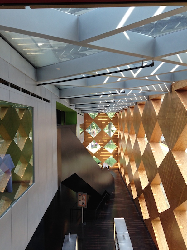
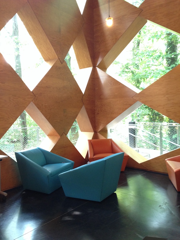
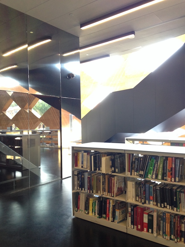
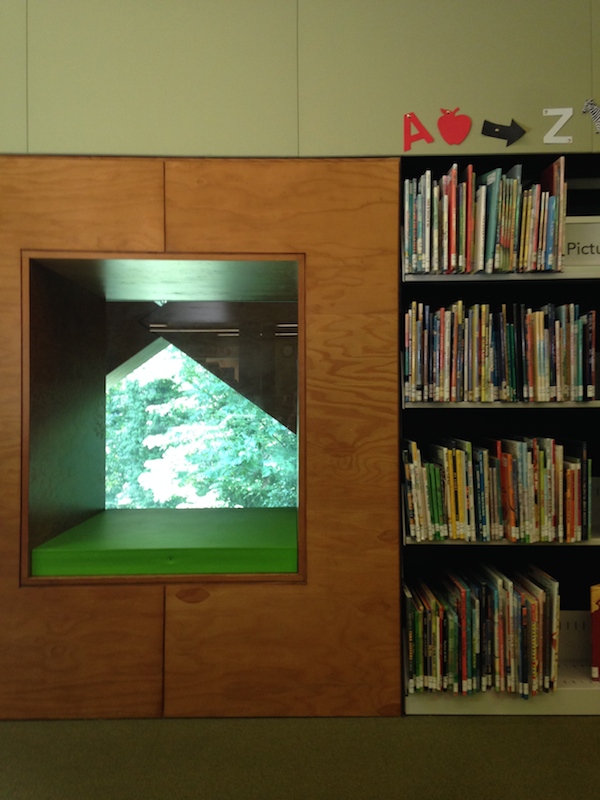
The Gregory Library has the simpler idea, beautifully executed. In plan it is a long box, tucked under a gridded roof that continues the diamond motif. Inside, stacks and reading areas reach from wall to wall, and the inside of the diamonds are faced in blonde plywood, crude but effective. It feels like being inside a sculpture; you are dwarfed by the scale of the diamond openings but not made to feel insignificant. As you move toward the back the diamonds all show the green of the trees, and you get the sense of moving into the forest. The upper floor, a box within the box containing the children’s areas and community rooms, is reached up a dark, diagonally-placed staircase. It is colorful and busy up there, including little reading nooks with green cushions. I only wished these had also reflected the diamond motif. The service areas on both levels were coated in a reflective plastic, effective at breaking up their bulk and bouncing more sunlit diamonds around the room. In a few corners the plan did start to feel cluttered — like where an oval-shaped quiet workspace, faced in angled glass, was stuck between the core and the wall. It felt like a good idea shoehorned in after the footprint had shrunk, and should perhaps have been saved for another project.
Break here for a walk plus Metro plus bus to the Bellevue Library, south of the Anacostia Metro stop.
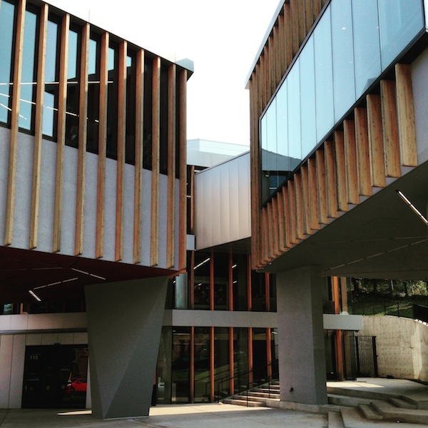
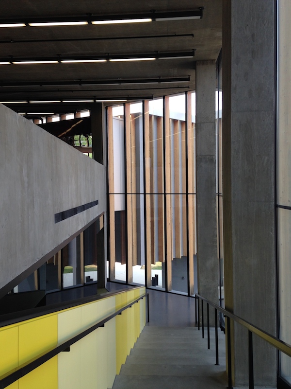
It’s quite a surprise to move from the Gregory to the Bellevue Library; as Kennicott notes, you would no know they were by the same architect. Bellevue is set on a primarily paved site, its bulk raised on concrete stilts. The exterior is gray concrete with wooden slats running up and down over the concrete and the large wraparound windows. I thought the combination of wood and concrete was odd. The wood felt residual, like an older, more expensive woven covering had been value-engineered down to Home Depot lumber. Some of the stilts are shaped in an obvious Breuer homage, others were basic rectangles (why?). The terraced ground also seemed like a Brutalist reference, perhaps to Paul Rudolph’s shaped surfaces, but I wondered how often it was occupied. There, and around the back where desks have a view of a lattice bare of ivy, it seemed like some landscaping had yet to be paid for.
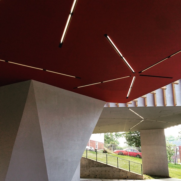
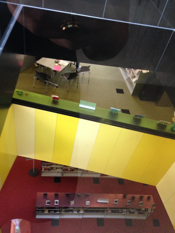
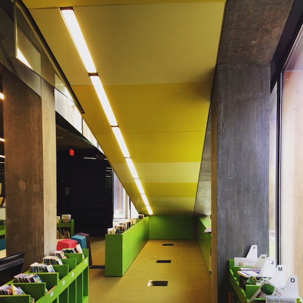
The Bellevue Library, like Gregory, seemed well-used and well-loved. The top floor, with its differently-shaped daylit spaces for reading and typing was elegant and serviceable, reached up a graceful stair highlighted by a yellow railing. But the first floor was cramped, with no place to sit, and the children’s spaces were choppy and incoherent except for the bright reading nook under the stair. I wondered again if, in his desire to make reflective shapes and cuts indoors, Adjaye hadn’t undermined some basic plan functions. The starburst tube lighting repeated on the exterior and the interior was a nice use of a simple material, as were the many hits of color throughout. If you go, be sure to visit the ground-floor bathrooms, and look up.
On X
Follow @LangeAlexandraOn Instagram
Featured articles
CityLab
New York Times
New Angle: Voice
Getting Curious with Jonathan Van Ness