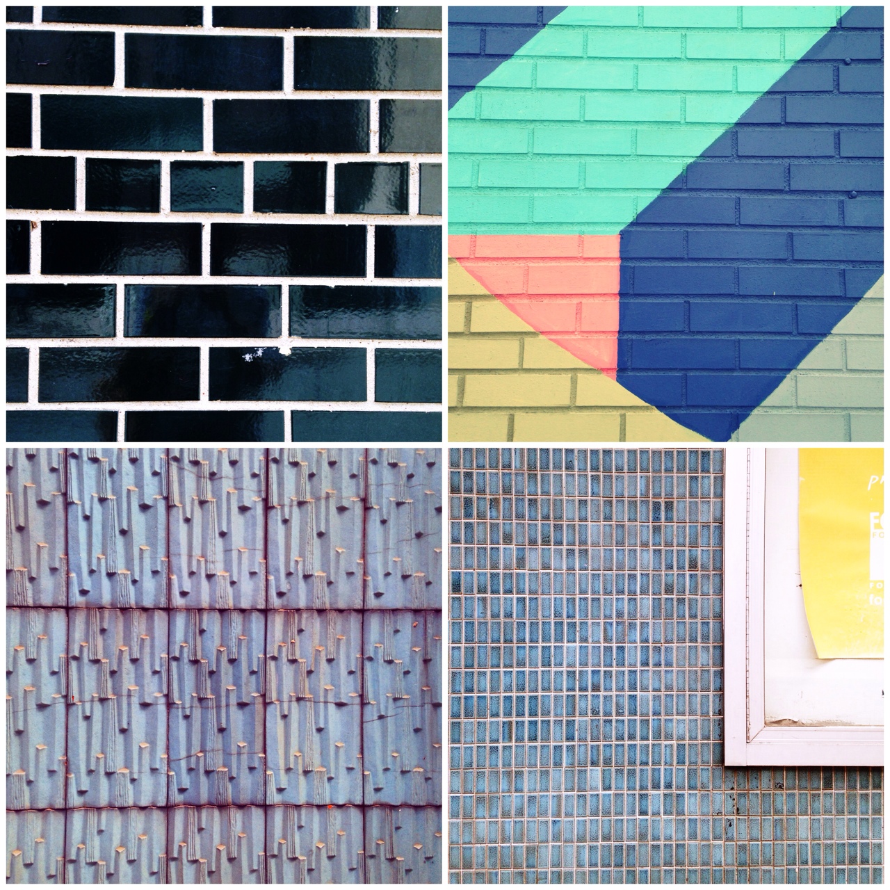
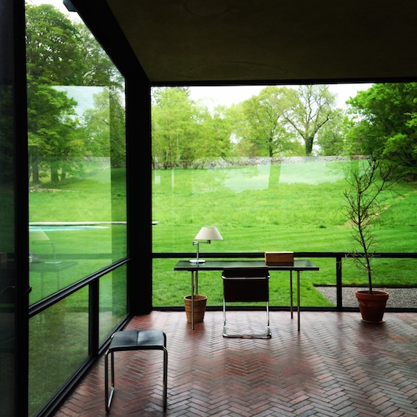
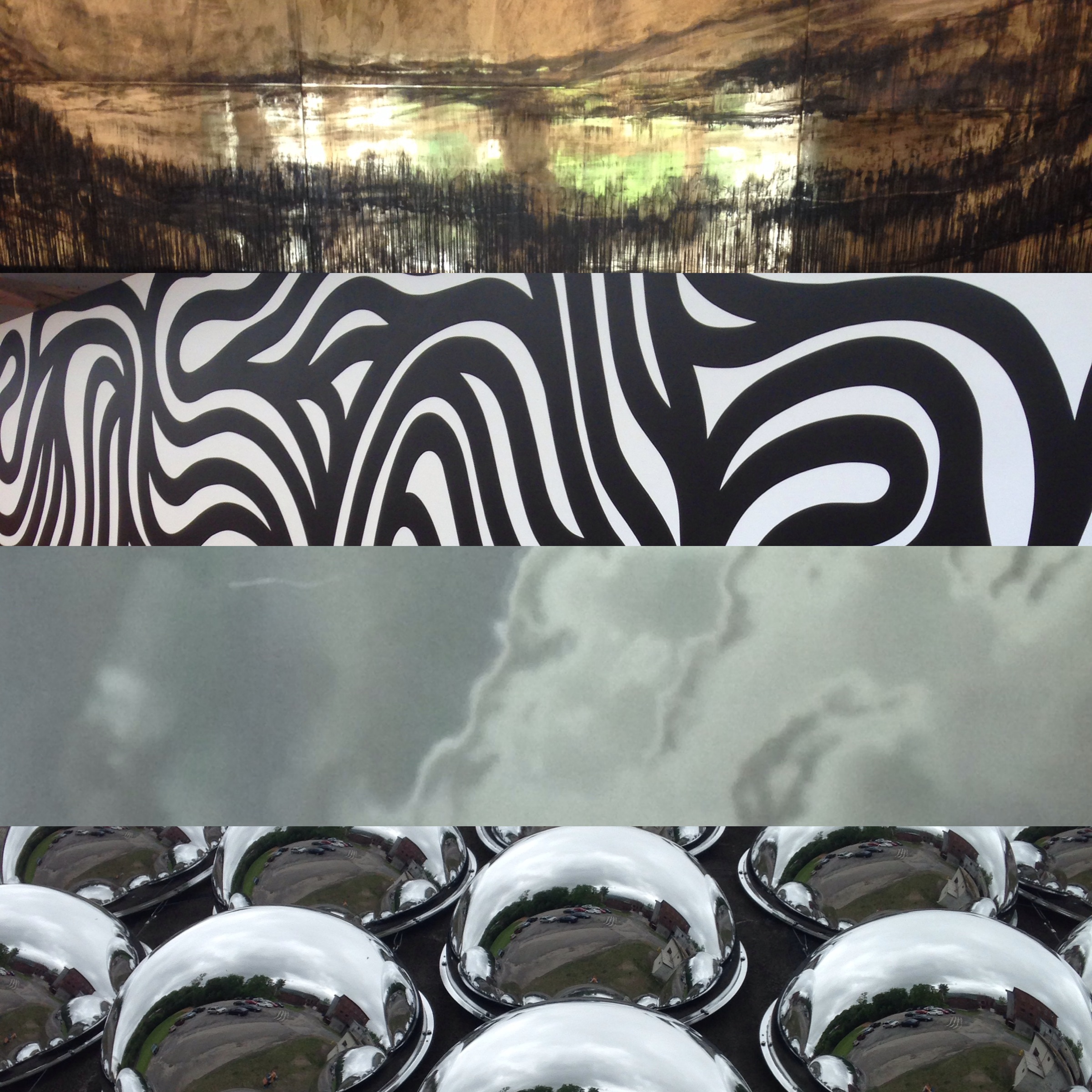
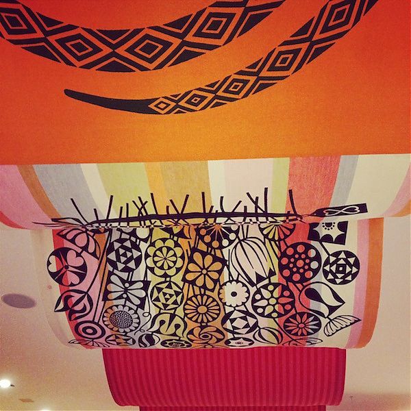
100 Days of #PicFrame
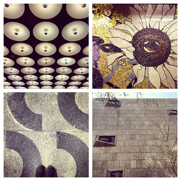
When I got back from Mexico City in March I felt energized. Every day of that trip brought new wonders, colorful, architectural, transportational. I had so many photos I was forced to PicFrame them, creating small digital collages that pointed to the overlaps and contrasts in the floors, walls and structures we saw. Travel forces me into a higher state of noticing, and I wanted to bring that energy back to my own city (or rather, cities, as I was then in the last months of my Loeb Fellowship). Inspired by Michael Bierut’s 100 Days assignment, I assigned myself to make a PicFrame each day for 100 days, using photos taken that day, hashtagging them #picframeaday on Instagram and Twitter, and storing the whole set on Tumblr.
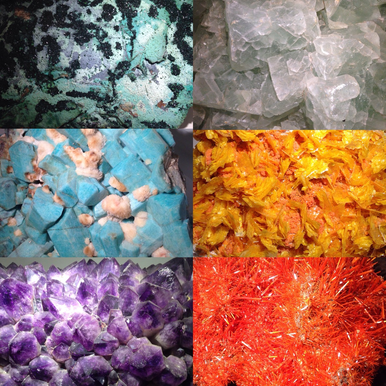
I made it. Yesterday was my 100th PicFrame. Today I am going to rest, though I am thinking about a new assignment, and open to suggestion.
What did I learn?
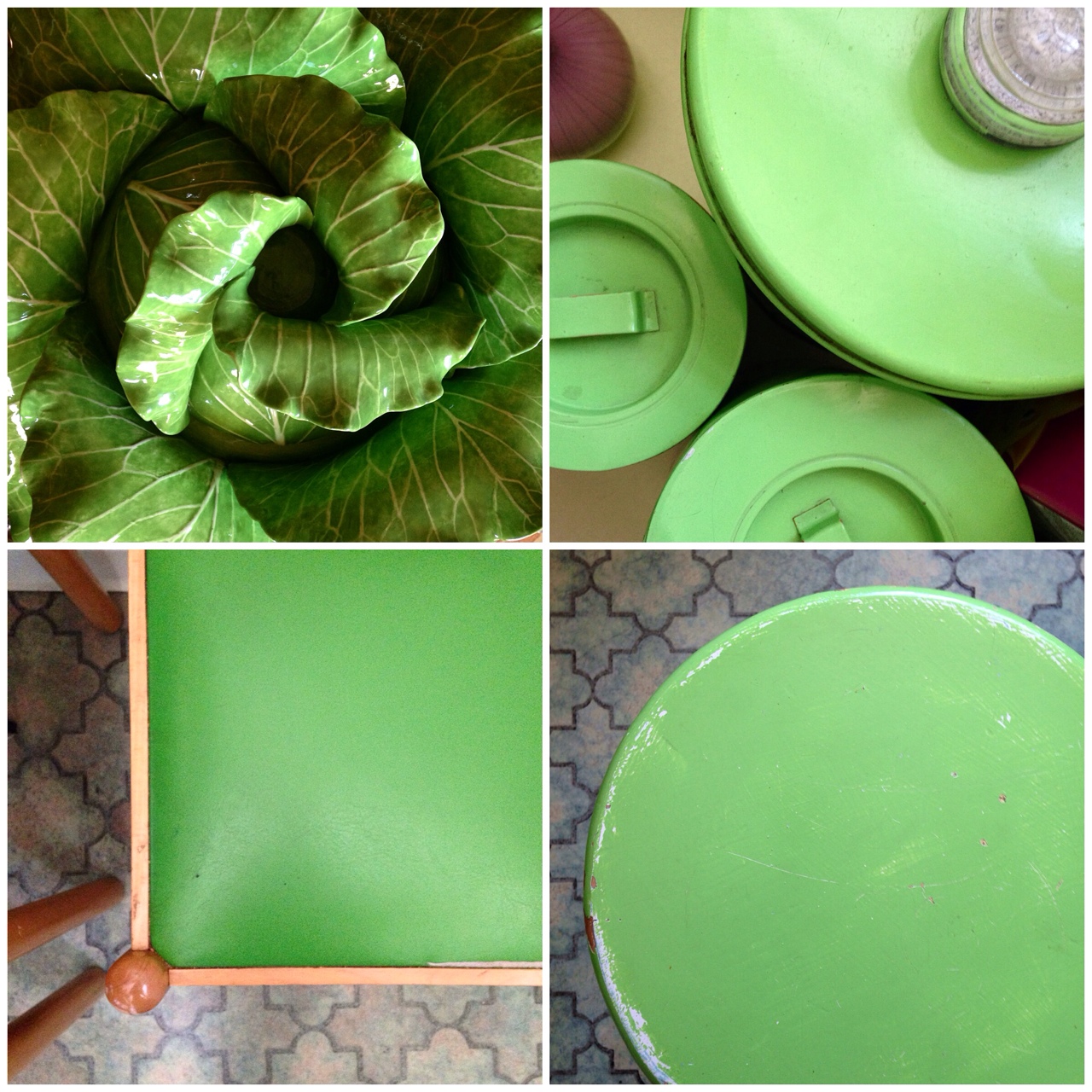
Some days are bursting, some days are not. I tend to alternate between days at my desk, getting to 1000 words (the average length of one of my draft essays), and days out and about, going to sites, traveling between Cambridge and New York, visiting parks. Some PicFrames are packed with interesting architecture, and some are made of up things around my house. But I enjoyed looking for those patterns, joined by theme (City) or print (Marimekko) or color (red). It was even more fun to look for patterns in other people’s houses (green).

Some days I only saw one thing I wanted to photograph. Those desperate days, however, provoked more creativity on the app end of things, resulting in pinwheels and stutter-steps that were as interesting as a 3D effect. Monkeying with its frames, rules and effects was also instructive, and inspired my 6yo to make PicFrames too (albeit with more radical image manipulation, and nonsense captions).
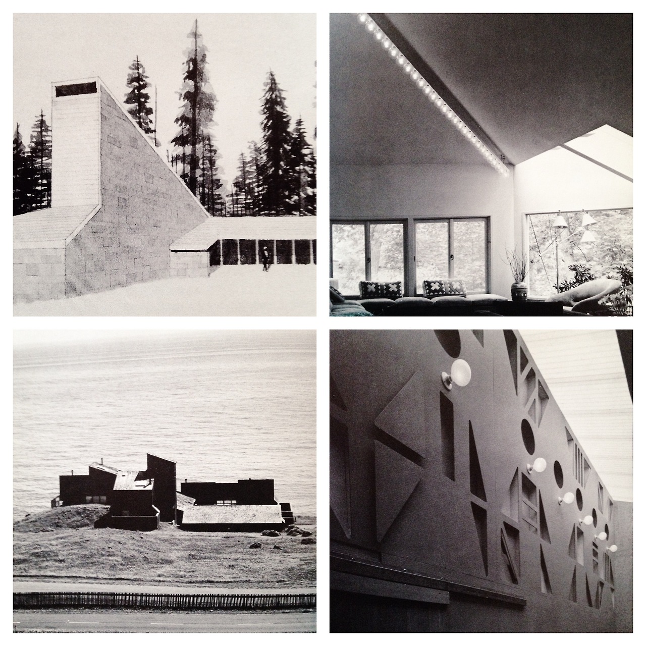
Old is OK. I felt guilty when I went to the archives, online, in books, but the response to those PicFrames was often more enthusiastic than to some other experiments.
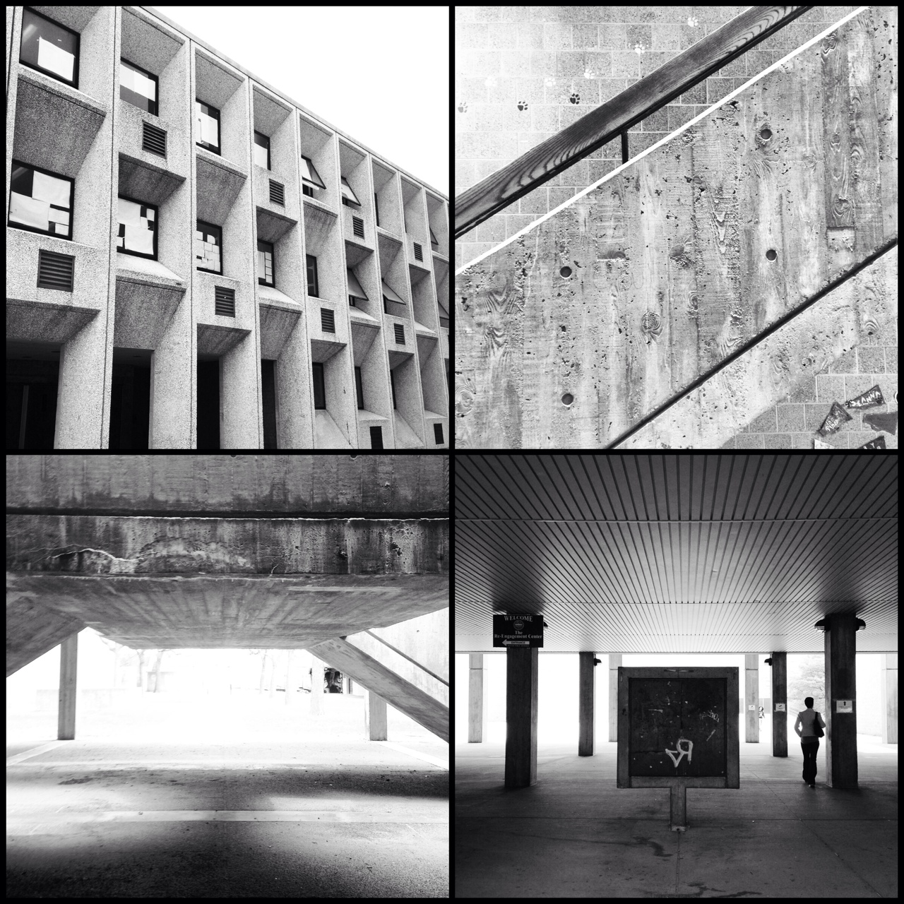
Even when you set your own homework, you still feel guilty. So I will confess to you: I cheated on the assignment 1.5 times. One Friday I spent all day on the train, when the day before I’d seen a number of amazing modernist sights. I was tired and grumbly, so I posted Breuer the day after I photographed it. One Sunday I photographed some things around my house, then happened upon a better visual idea. I used them the next day, but felt too silly photographing them over again.
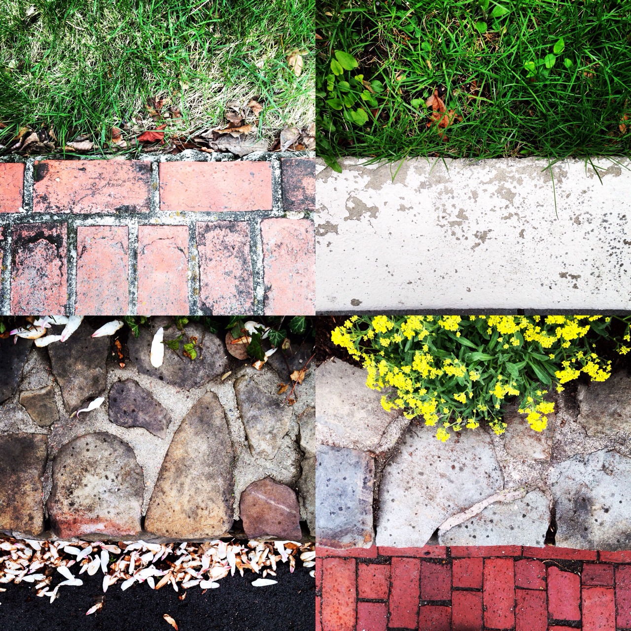
Above all else, the exercise confirmed what my eye is drawn to. Mexico City had it in spades, but bright hues, contrast graphics, and intense texture are also to be found up north. I felt on my toes the whole time, which refreshed some commonplace walks, and inspired me to take detours. Whatever visual task I give myself next, it has to provide the same prompting to look at my life a little more closely, if not necessarily in squares.
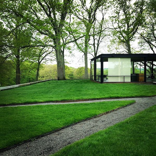
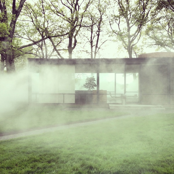
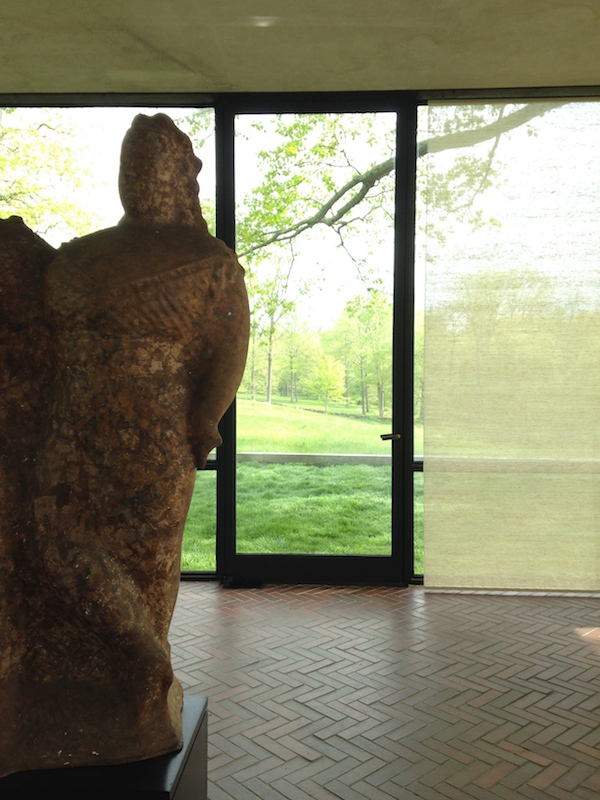
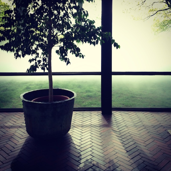
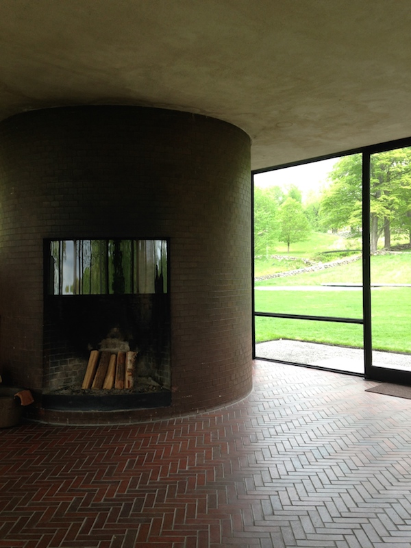
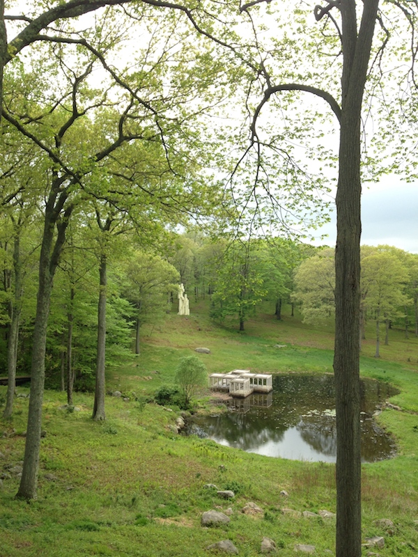
Glass House Stages Fujiko Nakaya's "Veil"

Credit: Richard Barnes
There are dandelions on Philip Johnson’s lawn. It is thick and green, mown on a diagonal following the gravel paths between the Glass House and the Brick House in New Canaan, Conn. But still, dandelions! Interlopers into this realm of single-material planes. I can’t help but imagine Johnson pointing a bony finger at the yellow flowers, leading to their immediate beheading.
I’m here to see a different kind of interloper: the first site-specific artwork to engage Johnson’s iconic 1949 house. Unlike the dandelions, it’s the perfect modernist houseguest. No muss, no fuss, no smell. Fujiko Nakaya’s “Veil” manages the difficult trick of creating a new frame for a familiar architectural monument (think of James Turrell at the Guggenheim Museum, on a much larger scale), while leaving only a spatter of raindrops on the landmark. “It alters it greatly but only momentarily,” says Glass House Director Henry Urbach.
I am a GIANT on Section Cut

A few weeks ago, Dan Weissman and Kyle Sturgeon of the design resource blog Section Cut came to interview me at Doebele House in Cambridge, semi-official home of the Loeb Fellowship. We had a great conversation about my life as a design critic and its many way stations. That interview, edited for length, is now available on their site. You can listen or download it here.
During the conversation, she shares some best practices and sheds perspective on her journey to becoming an influential architectural critic, journalist, and social media maven with over 10.4k Twitter followers to date.
Though not explicitly a designer, Lange’s work takes a critical eye to the built environment, design culture, and our fields’ positions relative to contemporary societal concerns. This work is executed with such care and precision that she is often invited to speak at prestigious institutions and write for some of the most respected publications in the world. And, even with such accolades as these, Alexandra manages to be unpretentious, approachable, and generous enough to sit down and talk with the likes of us.
Take a listen above to see what we mean, and make sure to explore some of Alexandra’s top resources below. Consider her challenge posed to Team Section Cut – GAME ON!
Among those resources: Lydia DePillis’s Tumblr 100 Percent Men, Ada Louise Huxtable’s On Architecture, Nicholson Baker’s The Mezzanine. No excuses, especially since a used copy of On Architecture is a mere one cent.
Social Media for Architects in Five Easy Steps
On May 22 I participated in the panel More than 140 characters: social media + architecture at the Boston Society of Architects. You can read a write-up of the event on the Payette blog, More than what you ate for lunch. For everyone else, here’s what I said were the three reasons architecture needs social media, and the five things architects should be sharing.
In January, I made fun of Bjarke Ingels’s Instagram. After my article was published his Instagram went dark for a few weeks, but then it started up again. When I checked in on it in May, these were his last few posts: blurry photo of New York City from a plane, BIG’s LEGO House project rendered in LEGO, construction selfie, Bjarke and Martha. So basically, more of the same.
The only signs that he might have listened to me were a newspaper clipping from his childhood, heralding the first design competition he won, and a nice, clear photograph showing the first few completed stories of his building on West 57th Street. The first nods to an Instagram hashtag game known as Throwback Thursday (#tbt) – everyone posts embarrassing photos from their youth – the second provided insider news on one of his projects from an angle most of us can’t get. They show understanding of how social media can be used for conversation, rather than simply self-promotion, and how it might illuminate the life of the working architect in useful ways.
As I said then: you don’t want to be boring, do you? I’m going to use my ten minutes to explain why architecture needs social media, and to give you some ideas of ways to get started. It’s also supposed to be fun. If Twitter is a chore on your to-do list, you’re doing it wrong. Social media should have personality and playfulness, introduce you to new people and let you see new things. Let me try to explain how.
Why architecture needs social media.
Because people don’t understand you. What do architects do all day? Nobody knows, least of all your clients who probably think they pay you too much, when the opposite is true. Judging by the movie portrayal of architects, they are men, who are sensitive, who design pretty houses, who wear white shirts and carry rolls of drawings. Social media offers an opportunity to show and tell more. Not your lunch, but the sketch you made at your meeting. Not your shoes, but the new paving that just went in. Whether with pictures on Instagram or words on Twitter, you can provide signposts.
Because you are at your desk all day long. Many architects spend all day at their desks, just like writers. For you, social media can become the water cooler. What are people talking about, not just in architecture, but in culture? What are people buying, making, cooking for dinner? You need to stay connected to wider streams, streams that are broader than the architecture magazines you subscribe to. Your family needs you to have good ideas for meals as well as flashing details. Social media has the right mix of high and low to allow you to dip in.
Because architecture should be part of the conversation. Which conversation? All of them: news about cities, news about culture, news about Mad Men. (I laughed out loud on the Sunday when one character gave another an Erector Set, “America needs engineers,” he said.) Architects have a specific lens on all sorts of projects and prospects for the future, and by meeting their audience where they are – hanging out on Twitter, posting vintage architecture photos on Instagram – you can add that perspective.
What architects could share on social media.
1. Self-promotion. I know, I said you shouldn’t do this, but really, you shouldn’t do this too much. One quarter to one third of your posts should be about the lectures you give, the awards you win, the projects you complete. Try to make those posts useful: link to the video or the live feed, to new construction photos, to the list of everyone who won. People wouldn’t follow you if they weren’t at least somewhat interested in what you do.
2. Influences. What building did you make a pilgrimage to on your last vacation? What new design book did you buy? What classic text are you listening to on audiobook while you draw up that set? Do you have a real inspiration wall? An inspiration tote bag? All of these are interesting to other people – really – and tell us more about what goes in to your design. It’s also a chance to tip your hat to what you consider excellent in other fields. Or even your own. It would be nice if architects could compliment each other.
3. Details. When I started talking about architects using Instagram a friend joked that her feed would just be handrail details. Every time she goes to a museum, a park, a transit hub, she is checking out the hardware and the miter joints. Well, I responded, that would be a great Instagram feed. Obsessions, rendered in artistic photos, are just what Instagram was made for. It’s no sillier than bouquets or fancy coffee foam. Show us the city (or the country) through the eyes of the architect. It’s funny what you can become known for. I get tagged for anything Marimekko, and outrageously bright floors. What aesthetic choice would you like to be known for?
4. The critique. What needs improvement? Show us that sad public space, that neglected modern monument. Think about what architecture can do and show us where it is needed. Maybe such a project is beyond your scope right now, but by sharing it, thinking about it, making digital connections, you may be able to expand your territory.
5. Protest. We make architecture. Can we also protect it? Architects need to be out in front articulating what can be saved and why. Social media gives you a platform in the larger marketplace of ideas to share what’s important over the long term.
Live Tweeting LeWitt
The Sol LeWitt installation MASS_MoCA</a> really is my happy place. <a href="http://t.co/rZERLYJ0SL">pic.twitter.com/rZERLYJ0SL</a></p>— Alexandra Lange (LangeAlexandra) May 28, 2014
I paid my second visit to the Sol LeWitt: Wall Drawing Retrospective at Mass MoCA on Wednesday. Both times it has been a meditative experience to walk the three floors of his work, journeying from color to black-and-white, graphite to marker, two dimensions to three. The light, the space, the layering of works on parallel and perpendicular walls within the space: all the elements combine to make LeWitt’s “recipes” stronger.
LeWitt + Kahn, Yale University Art Gallery. pic.twitter.com/h2O43cdXfm
— Alexandra Lange (@LangeAlexandra) May 24, 2014Oddly, this was my fourth LeWitt experience of the week, including the Yale University Art Gallery, Dia:Beacon, and LeWitt + Charles Moore at the Williams Museum of Art. Yale’s several black-and-white LeWitts similarly gain strength from architectural juxtaposition. There’s one in the lobby, its grid contrasting with Louis Kahn’s triangular concrete grid ceiling, and one in the new/old wing, orthogonal against a set of neo-classical arches. As I wandered, I began to tweet.
One of the things I love: way each drawing becomes wall then distant landscape, in turn, as you stroll slowly past. pic.twitter.com/9cTiC8MDs2
— Alexandra Lange (@LangeAlexandra) May 28, 2014
Some pieces correspond, others conflict. pic.twitter.com/ZtYW3M4H4I
— Alexandra Lange (@LangeAlexandra) May 28, 2014
After all the color, the early pencil drawings look like air. pic.twitter.com/U4HcIWfQkt
— Alexandra Lange (@LangeAlexandra) May 28, 2014
No. 797 is my favorite. "The first drafter has a black marker…" Marker and human frailty. pic.twitter.com/N6JQwFb2nj
— Alexandra Lange (@LangeAlexandra) May 28, 2014
The rest of the museum had several new and beautiful exhibits too.
Another topographic artist: Teresita Fernandez MASS_MoCA</a> cc <a href="https://twitter.com/alexismadrigal">alexismadrigal pic.twitter.com/hqViYskvRJ
— Alexandra Lange (@LangeAlexandra) May 28, 2014
This Marko Remec tank MASS_MoCA</a> is quite spectacular. <a href="http://t.co/on21TbnUN8">pic.twitter.com/on21TbnUN8</a></p>— Alexandra Lange (LangeAlexandra) May 28, 2014
The town of North Adams itself is not without art interventions. This bus shelter, a 2012 installation by Victoria Palermo, seems inspired by LeWitt.
North Adams bus shelter. pic.twitter.com/uFekSMtYcz
— Alexandra Lange (@LangeAlexandra) May 28, 2014At the end of the day, the common ground between Fernandez, Remec and LeWitt was clouds.
Listen: Civic Crowdfunding
I was interviewed for the ABC radio program Future Tense on the perils and promise of civic crowdfunding, along with Bryan Boyer and Rodrigo Davies.
Crowd-funding is all the rage. Online, people donate to all manner of projects and inventions. But could the crowd-funding approach be scaled up? Could you, for instance, crowd-fund the construction of a community hall or a public swimming pool?
Well, they have with the former and they’re trying with the latter. It’s called ‘civic-crowd-funding’ and its proponents see it as a way of meeting community needs in an age of shrinking government expenditure.
But how realistic is it? And does it simply allow governments to abrogate their civic responsibilities?
For my previous thoughts on the topic read Against Kickstarter Urbanism and Why Building A Park Takes More Than Crowdfunding.
Why Charles Moore (Still) Matters
Barbara Stauffacher Solomon supergraphics at the Sea Ranch Swim Club (Jim Alinder/Princeton Architectural Press)
“Stop work. It looks like a prison.” That was the telegram from the developers in response to Moore Lyndon Turnbull Whitaker’s (MLTW) first design for the Sea Ranch, which celebrates its 50th anniversary this year. Architects Charles Moore, Donlyn Lyndon, William Turnbull, and Richard Whitaker, working with landscape architect Lawrence Halprin, had used sugar cubes to model the 24-foot module for each of the condominium’s original ten units. And that boxy choice, combined with the simplest of windows and vertical redwood siding, produced something more penitentiary than vacation (it’s sited on a choice stretch of Sonoma coast).
After a pause, the team scrambled to add texture: bay windows to break up the flat facades, private courtyards to differentiate a few units, and adjustments to the tower. Halprin imported a redwood stump to punctuate the main courtyard and, when MLTW’s “wooden rock” was completed, Barbara Stauffacher Solomon painted supergraphics on the monochrome interiors: numbers, stripes, dots, and arrows, adding a layer of pop iconography within the still-sober weathered form. The combination of timelessness and whimsy, landscape form and antic decoration, made the Sea Ranch highly photogenic and instantly influential. It was identified with a new Bay Region aesthetic, winning the AIA Twenty-Five Year Award in 1991, and ensuring (one might speculate) Moore would never straitjacket his work again.
Still Too Soon: On the 9/11 Memorial Museum

The National 9/11 Memorial Museum, trident on the left, looking up into the entrance pavilion.
I thought I could review the National 9/11 Memorial Museum, which opens Wednesday, May 21. I can’t. It’s too soon. So I am just going to tell you what I saw and how I felt.
I walk in to the auditorium in Snohetta’s entrance pavilion. I signed up for an architecture tour, so I am dutifully taking notes. Very Scandi, I scribble. Neutral without being beige. Nice view of Calatrava’s transportation hub out the northeast corner. It’s a few days before President Obama’s visit, so they are running a test of a documentary about the day on the big screen. President George W. Bush is up there, then former Mayor Rudy Guiliani. They are talking about people jumping out of the windows of the World Trade Center. The hair on my arms stands on end. I have to sit down. They don’t even have to show the pictures. The words alone send me back.
I was at home in Brooklyn. I heard the thud of the first plane. My neighbors and I watched the first tower fall from the roof, though I have no memory of the moment. We all rushed downstairs to shut our windows against the ash. My apartment was burgled and the police actually came. I think they wanted to have something to do. I didn’t know anyone who died. My 9/11 experience may seem like nothing. And yet I would never go to this museum.
The memorial plaza had been fine. I had no name to look for. It was a sunny day, the trees were growing in to make a horizontal canopy, lacy against all that vertical glass, the tourists were in shorts and it hardly felt solemn. Now, a week later, the barricades are down and the plaza is finally open to the street. It’s only going to get less solemn.
Snohetta designed the entrance pavilion, a faceted three-story structure of striped metal and reflective glass dwarfed by 1 and 4 World Trade. It was once supposed to have profane, city-oriented functions too: The Drawing Center, a performance space, but it lost those purposes along the way. Now it is an elegant carapace for a grab-bag of necessities: ticketing (seeing the $24 price tag on the booth shocks again), security, a café and that auditorium. The top floor conceals the mechanical systems for the museum, the PATH station, everything below. It’s all very soothing – Snohetta principal Craig Dykers points to the baffling behind the wood-slat ceiling as an acoustic response to the transition from plaza to museum.
The first artifact from 9/11 you see on the site is a forking steel column from the north tower, its neo-Gothic points immediately recognizable. The trident is embedded in a skylit corner of the pavilion, drawing down the side of the staircase leading to the museum. It seems odd that this essential piece of the real thing is accessible only to paying visitors. Dykers mentions the constant parade of people “pressing the flesh” against the western façade of the building. During the day you have to put your palms to the glass to see the crook. The column is rawer and more direct than anything outside.
Down the stairs, below the lip of the plaza, you enter the museum proper, designed by Davis Brody Bond. There’s a broad desk, dark wood. It looks like a hotel lobby on the Death Star. A total aesthetic jump cut from Snohetta’s pavilion and Michael Arad and Peter Walker’s memorial above. On the left, through a triangular dip in the wall, you can see the hovering form of the south footprint. The whole multistory solid has been clad in spun aluminum, but at this distance it looks like granite, and like a monolith.
This underground lobby is a good place to assess what the process of making the 9/11 memorial has done to the architecture. It has broken it into three parts, which can’t and don’t relate. The above-ground memorial is like a pancake, a surface treatment that follows in the design traditions of the best modern places of remembrance but, because it is in New York City, because it is surrounded by office buildings, was found wanting as a sacred site. The dramatic plunge of water into the memorial pools, which, if revealed underground, could have connected sunlight to shadow, one architecture to another, is hidden from sight behind those aluminum panels. That forking steel column is isolated, far from its brother artifacts that appear, at odd intervals, along the ramp which leads you through the museum and down to bedrock. I wanted their positions to relate to their original location at the Twin Towers, to form a geography of remembrance. Even the slurry wall, the centerpiece of the Foundation Hall, would be more powerful connected to the surface, glimpsed through the memorial plaza, touched by daylight. Underground, carefully framed, artificially lit, it seemed robbed of the toughness that made it an unlikely engineering icon.
As I descended the ramp, past the map of the routes of the planes on 9/11, under the sound cloud of voices telling the story of the planes, overlapping, an international chorus of narrators, past the map made of words projected on panels, all I could think of was Orpheus descending into the underworld. It was dark, one could only go down, and one had the sense of steeling oneself for what was to come. I wondered if that ramp would be a trail of tears: how long could you last without crying or feeling faint? The jumpers? The slurry wall? The faces? I read every one of the New York Times profiles of those who died on 9/11. It felt, in those weeks after the attack, like the least a person could do. But would I want to enter the south footprint and dwell among those faces, those stories, again? Not now.
Turn the corner of the ramp and you see projections of the Missing posters on the wall. One has the sense of shifting gears from the historical to the personal, from place to people, though the line is not exact. Local Projects designed the multimedia exhibitions: the sound cloud, the maps, the algorithmic presentation of news stories about 9/11, with the idea that nothing about the history of the site was set in stone. History is in the making, and so the museum is programmed for change. And yet, the size, tone and materials of the architecture make the museum feel anything but provisional. The architects from Davis Brody Bond said the scale of the footprints, which gave them the outlines of their site, are commensurate with the scale of the event. But are they? We don’t know that yet. The scale of historic events is one of the most changeable factors. The 9/11 Museum feels scaled to the excess of public emotionality in the aftermath of 9/11 (which is different from the emotion, grief and trauma of those who were there or lost loved one). It feels like a tomb as big as the Met.
A final frustration. It would have been moving if the Survivors Staircase, which carried so many to safety, now helped to lead visitors back to the surface, back toward the light of day. Instead the Survivors Staircase goes only down, embedded beside another set of stairs that lead you at long last to bedrock. It is redundant. It is subsumed. It is robbed of its strength as a piece of ordinary architecture transformed by experience into a symbol of something more. At the 9/11 Museum there were so many opportunities to let the remains of the Twin Towers speak, but it felt to me as if more architecture and more design were instead laid on top.
The architects said we were to find optimism at the bottom of the ramp, where you find this quote from Virgil: “No day shall erase you from the memory of time.” To me, claustrophobic after 90 minutes underground, this seemed the opposite, like my arm was being twisted to remember better. My 9/11 experience was of New York, as a whole, dusting itself off and moving on. That relentlessness was a balm and, I believe, a strength. The grandiosity and redundancy of these vast spaces (memorial/museum, history/experience, telling/retelling) points in the opposite direction. I’m not going to go back to see the rest and I suspect, if you lived here on 9/11/01, you shouldn’t either.
Visit: Alexander Girard, An Uncommon Vision
As part part of NYCxDESIGN (which used to be Design Week, which used to just be the International Contemporary Furniture Fair), Herman Miller and Maharam have created a special installation of new and old work by Alexander Girard in a storefront at 446 West 14th Street. It celebrates reissued fabrics by both companies, as well as new ottomans, side tables and pillows produced by Herman Miller. I suspect we will be seeing the Environmental Panels, in stars and hearts, in a lot of designer kids bedrooms next year.
For Girard superfans like me, the treat was seeing an homage to his own showroom designs in white-painted metal, and archival treasures including neckties, sample books, Braniff brochures and a couple of rare two-tone Girard chairs. I loved the juxtaposition of vintage photographs, blown up so you could seen the dots, with to still-spectacular colors of Girard-designed tableware, textiles and graphics. The coffee tables are also helpfully stocked with books by and about Girard’s friends George, Eero, Isamu, and so on. The brand-new Apartamento #13 includes a lengthy interview with Girard’s son and grandchildren, along with an extensive photo portfolio with special emphasis on his own house in Santa Fe. Maynard Parker’s photographs of that adobe house can be seen online at the Huntington. The storefront exhibition is free, and up until May 28.
For more on Girard, read Designing with Folk Art or watch Beyond Gorgeous.
On X
Follow @LangeAlexandraOn Instagram
Featured articles
CityLab
New York Times
New Angle: Voice
Getting Curious with Jonathan Van Ness