Tweets from the DCrit Conference
On Friday I had the pleasure of attending the DCrit Conference at the School of Visual Arts, presented by the graduating class of the master’s program in design criticism in which I teach. Along with the student presentations, there is always a roster of invited guests, who this year included Nicholson Baker, Justin McGuirk, Emily Stokes-Rees, Aric Chen and Peter Lunenfeld. The highlight for me was Baker, an author whose writing has always seemed design-adjacent, and who revealed himself to be part of a multi-generational design family. (Which means he might one day write the architectural novel I once imagined for him.)
I live-tweeted during part of the conference. I’ve pasted a few moments below, along with links to video of the presentations to which they relate. It was a rich stew of fonts, futurisms, tiny houses and nation branding.
Nicholson Baker, Wrapping Sentences Around Things
Nicholson Baker: “Everyone here has been to Crate & Barrel, right? There’s a big, beautiful stack of paper at the checkout…”
“We’re just wrapper-uppers at Crate & Barrel… We are talking about an object that lives in the eye… We are cheerleaders.”
“We are the excelsior they come bundled in when we write about them.” Nicholson Baker on writing about objects.
In 1966 Baker’s father commissioned Wendell Castle to make the family a table without legs. It was in the NYT.
The table dried out. They eventually had to remove it because the wood couldn’t do what Castle wanted. It self-destructed.
Anne Quito, Designing A Nation from Scratch
“I had many critical questions, like … Is that Times New Roman? Does the nation-branding flock of eagles need another member?”
Anna Marie Smith, Materializing Miniature Living
“The most impt aspect of micro-living is not the architecture but the inhabitants.”
Lynda Decker, Sex Wax on the Subway
“Each cover shows a young man on a large wave.” Lynda Decker on Surf, Surfer, Surfing and their “dudes in the tube”
And final thought from Peter Lunenfeld:
“One button says Buy Now, the other button says Buy Later.” On the future of interaction design.
Get To Work
“We have had nothing but conferences. The thing to do is to get architects and engineers and start building houses.”
Mayor Fiorello LaGuradia, as quoted by Mayor Bill de Blasio as he announced this ten-year affordable housing plan.
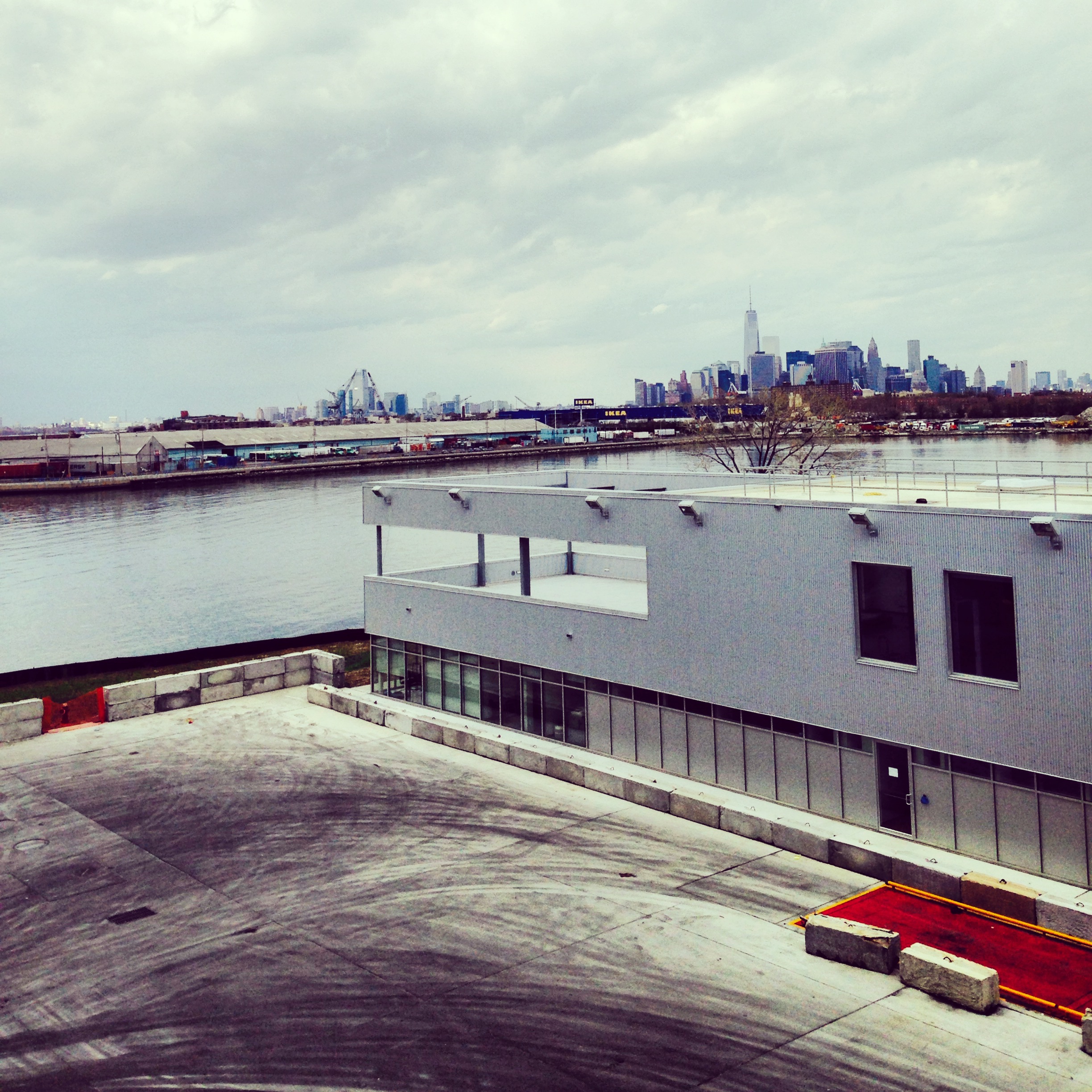
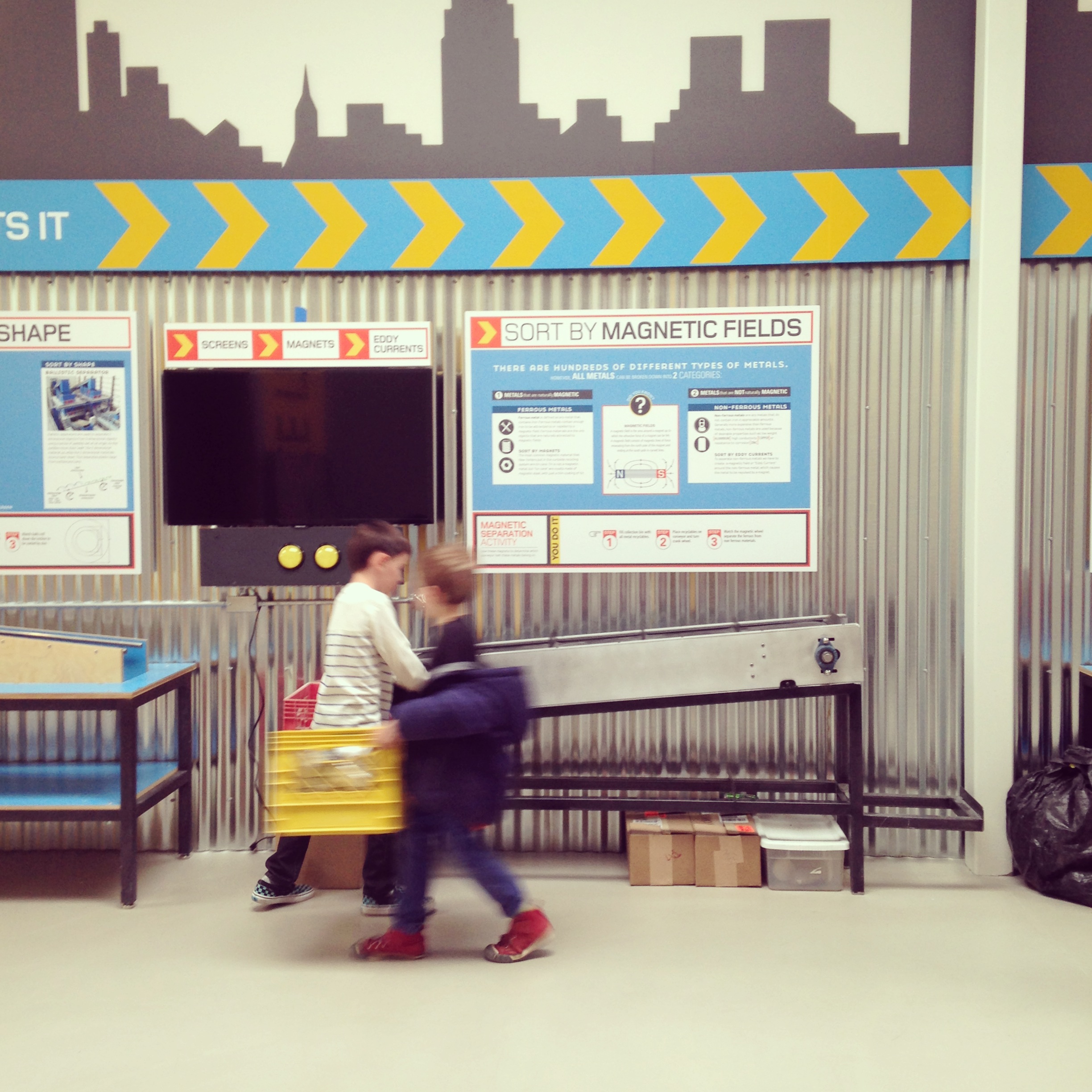
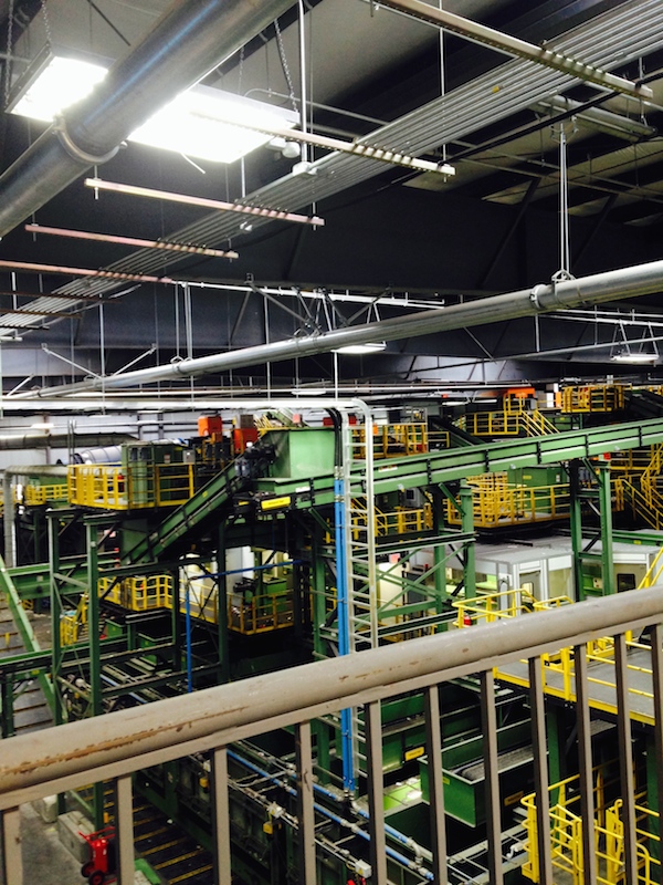
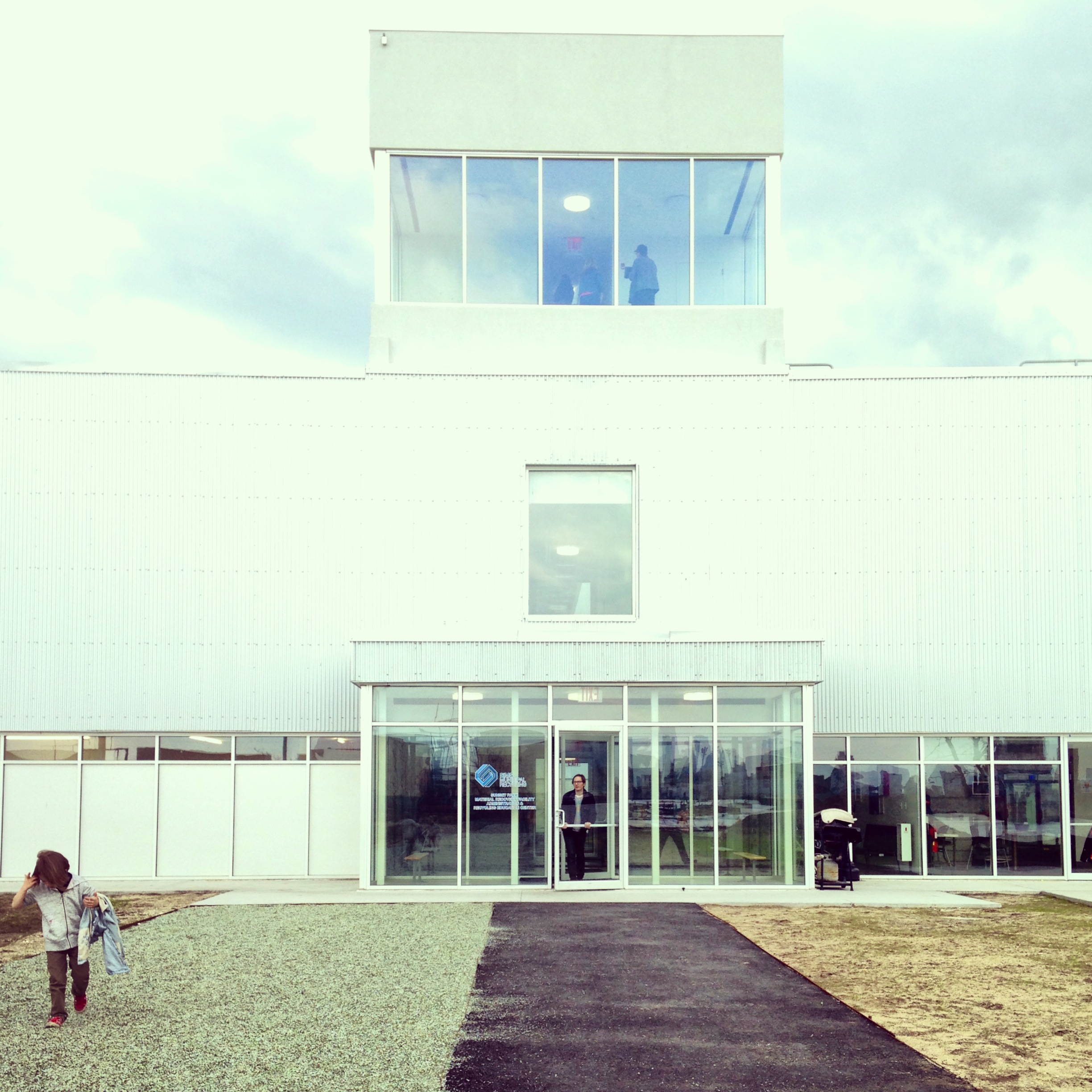
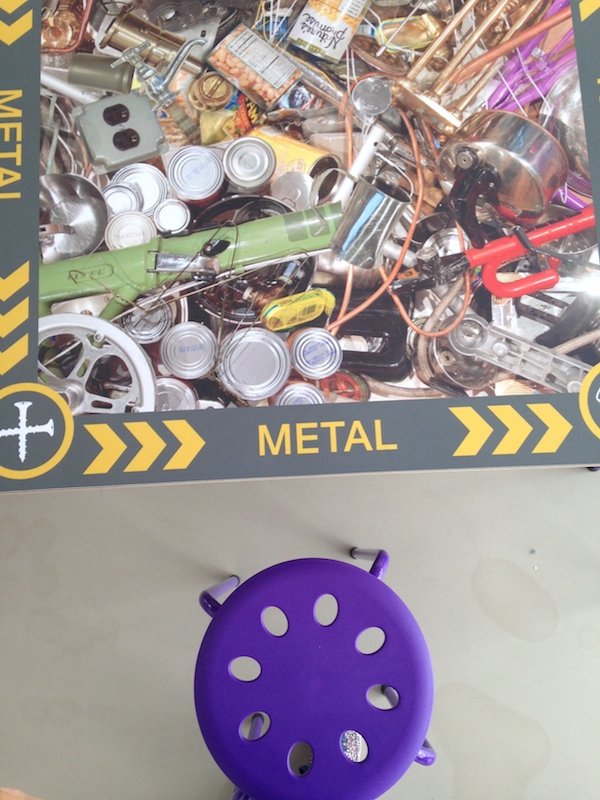
Portfolio: Sims Municipal Recycling Facility

Sims Municipal Recycling Facility opened late in 2013 on the industrial waterfront in Sunset Park. Designed by Selldorf Architects, it consolidates city recycling efforts and allows recyclables to arrive by barge rather than truck. An education center, not yet complete, will also introduce New York City schoolchildren to environmentalism. (It was amusing, on the day of our visit, to hear children still in diapers complain about the strong smell of diapers in the Wall-E-like storage hangars.) I especially liked some of the design with recycling: tables in the education center, and glistening beds of tumbled glass, typically used as concrete aggregate, out front. My kids put handfuls in their pockets as a souvenir. To forstall an obvious question: Yes, it is on the waterfront, but the under-construction facility weathered Hurricane Sandy with feet to spare. Michael Kimmelman reviewed the building here.

Letter to the Mayor

"New York Mayor," Google Image Search
On April 29, Storefront for Art and Architecture in Manhattan opened the exhibition Letters to the Mayor. I was pleased to be one of 50 international architects asked to write a letter to the mayor of her/his city about “the collective aspirations of society, and specifically of those not able to sit at the decision-making tables.” Congratulations to Lee Dykxhoorn, whose team won the Competition of Competitions, announced last night.
Dear Mayor de Blasio:
When you introduced your new transportation commissioner you spoke of safety. When you introduced your new planning commissioner you spoke of affordable housing. When you introduced your new parks commissioner, you spoke of equity. When you introduced your new cultural affairs commissioner you spoke of art for everybody. There was one word you didn’t mention: design.
Design can make New York’s intersections safer for everyone, by slowing traffic with bump-outs, creating divided lanes for bikes and cars, by staggering lights so pedestrians do not have to cross turning cars. Design can fit more apartments, sized for the families of today rather than 1950, in a broader array of neighborhoods. Design can make the parks we have safer and more functional, and the parks we need more diverse and easier to maintain. Design is art for everybody, the art, as Ada Louise Huxtable wrote, “we cannot afford to ignore (but do).”
Perhaps you think design is too Manhattan, too international superstar, too Museum of Modern Art to bring the two cities together? But I don’t see how you can get reelected without it. Design is not the icing on the cake, or the tourist attraction, but the solving of problems. The Queens Public Library is using design to make its branches better, and we’d rather see Foster + Partners at work there than on Fifth Avenue. The Edible Schoolyard is using design to teach public school students in Brooklyn and Harlem about food, and make their blacktop playgrounds more enticing in the process. Design might tear down the Sheridan Expressway, and make room in the Bronx for a lot more affordable housing and a lot more open space. Design could squeeze a real BRT line down the length of Atlantic Avenue, providing (among other things) a one-seat ride for Brooklyn and Queens to JFK Airport.
Design does not need to be big. You’ve already shown concern for the education of the city’s smallest. Those children also need better parks in which to play, libraries in which to read, lanes in which to ride. Schools exist as part of a network of spaces that teach and strengthen. The people doing the teaching matter a great deal, but the floors, walls, and backstops do too. A city for the smallest will be a city better for all, a city easier to work in, to move through, to stay in. Older students, too, need spaces to link them to skills, to jobs, to ideas. Take a look at the plans for Cornell Tech on Roosevelt Island, and consider how what’s getting built connects to Queens, to high schools, to the other end of the F train. The Silicon Subway runs both ways.
I’m a few months away from 20 years in Brooklyn. I have seen tremendous physical change in the borough during that time, activating the waterfront, opening former industrial sites, and connecting the gaps. The best of those changes came by design. Yours should too.
Alexandra Lange, Critic
That Memphis Moment
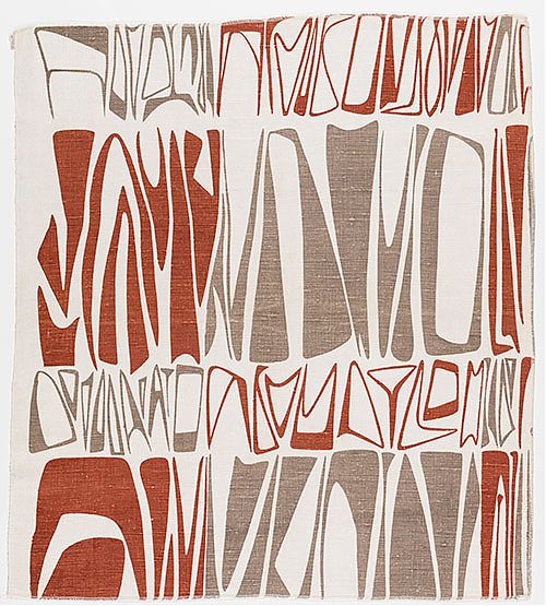
Nathalie Du Pasquier placemat, Third Drawer Down
Memphis, the 1980s design movement, is having a moment. The work of Nathalie Du Pasquier appeared on the cover of the Milan Design Week issue of Disegno, and at multiple installations there. Her graphics have been applied to a variety of unwearables by American Apparel. For those over 25, may I suggest the placemats by Third Drawer Down as an alternative. In Memphis (the city), the Dixon Gallery is showing Dennis Zanone’s collection of vintage Memphis, the first US exhibit since a major display at the Cooper-Hewitt in 1986.
1986 was when I first discovered Memphis, in Milan. My family lived there during a seven-month sabbatical and those totemic shapes, those brilliant patterns, turned up everywhere. They remain wrapped up in my mind with the OTT cherubs on sale at Fiorucci, tucked into the historic Galleria, and the more measured prints at Naj-Oleari, where the laminated bookbags featured tiny cars rather than Du Pasquier’s squibs and squiggles. In a bid for most sophisticated high school junior in North Carolina, I wrote a paper on Memphis (I can still visualize the hand-cut cobalt cover), drawing heavily on Barbara Radice’s book.
My favorite Memphis piece, then as now, was leader Ettore Sottsass’s iconic Carlton shelf Its crisp outlines work against the sweetly pastel laminates in a way that is obviously knowing. It walks right up to the edge of tacky and turns up its nose. It is a shelf that, like its right-angle modernist predecessors by Prouve and Perriand, needs to hold nothing.
Why now? Pungent artificiality. Patterns that aren’t supposed to look like anything. Colors not found in nature. The return of Memphis feels like a rebellion against the neo-handicraft era, the fetishization of the hand, the wood surface, the stitch. When even your iPhone cover is meant to look hand-painted, you know the time is ripe for rebellion. Back to plastic! Back to pattern, already creeping (like a fungus, like a vine, like a relief) over architectural facades, basic Gap sweatshirts, sneakers. It’s an admission and exploitation of what is simply a surface. Formica moved from being a tougher imitation of life into an original, often richly referential canvas in the 1950s, Memphis pushed that idea further in the 1980s. Brighter colors, crisper printing, exploitation of the revealing black edge. Memphis, in its own way, was true to its materials. We need a break from our own good taste; Memphis provides an out with intellectual credentials.
Throw off your Breton striped shirts! Embrace the squiggle.
Visit: Jews and Midcentury Modernism
Ruth Adler Schnee, "Cuneiforms" (1947-48). Courtesy Contemporary Jewish Museum.
A new exhibit at the Contemporary Jewish Museum in San Francisco, Designing Home: Jews and Midcentury Modernism focuses on the work of Jewish designers, architects, patrons, and merchants in the creation of the postwar domestic landscape. Curated by Donald Albrecht, the exhibition features work ranging from textiles to photography, graphics to influential developments like the Eichler homes. It should offer a different lens on work that has grown familiar, offering a new interpretation of the networks of schools, museums and corporations that employed Jewish emigres from Europe after WW2.
Love + Architecture
Courtesy Subtle Designer
On February 14, I participated in the symposium What Criticism? at Harvard’s Graduate School of Design, organized by fellow Loeb Florencia Rodriguez. My panel was titled Criticism = Love, after my essay of the same name, and I decided to expand on the theme of hearts and architecture. (It was Valentine’s Day, after all.) You can now watch that video on the site of PLOT, the magazine Florencia founded.

Links: 4.22.14
Photo by Alyse Emdur
“Right, as if the community is this wounded bird.” Rosten Woo in the Los Angeles Review of Books on his new book Willowbrook is …/es…
As I said to my kids this weekend: There are no boy toys or girl toys. There are toys you are interested in, and those that you are not. Antonia Ayers-Brown took this battle to the CEO of McDonalds.
New nomenclature: Usual Landscape Suspects (ULS), attrib. Javier Arbona. With regards to the short list for San Francisco’s Crissy Field parklands.
On X
Follow @LangeAlexandraOn Instagram
Featured articles
CityLab
New York Times
New Angle: Voice
Getting Curious with Jonathan Van Ness