Not Afraid of Noise: Mexico City Stories
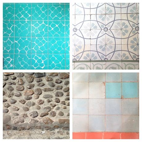
In Mexico, everyone seems to be Alexander Girard. Not afraid of color, of two colors together, of tiles and stripes, of patterns on pattern, of humble materials made noble by aggregation. The Loeb Fellowship took me to Mexico City for a week in February, and there I found the roots of Girard’s “opulent modernism” still growing. Everywhere I looked — underfoot, on the walls, over the doors — something particular was happening. I understood why he had been so inspired to collect and reinterpret Mexican precedents; more importantly I also saw Mexican designers and everyday people reinterpreting for themselves. Design with a small “d” was everywhere, reflecting a culture that seems to understand the small gestures that make a room, a building, or a city special. A church in Queretaro with checkerboard floors, a neo-classical facade, and a golden altarpiece of many doors. A museum in Mexico City with real Mayan artifacts, reconstructed Aztec facades, red-and-purple upholstery, bowls floating on plexiglass mounts. Girard distilled the elements of Mexican style, transforming them into an American modernist idiom, but it is not as if Mexican modernists weren’t doing the same. Architect Luis Barragran spotlit a golden angel with a perfectly placed skylight. Artist, architect, designer Mathias Goeritz remade the baroque icon as a simple gold-leaf square. Contemporary projects embed ceramic trees of life in Art Deco hallways, or echo the peacock circles of traditional decor in industrial spiral staircases. At the studios of Frida Kahlo and Diego Rivera, lines of cacti march past Bauhaus silhouettes.
"How can you learn about the world in spaces without character?"

Watching the demolition of her own modernist elementary school, Alexandra Lange reflects on the increasingly generic design of schools, museums and playgrounds that resign children to “places where all they can learn are the tasks we set them.”
Premature Demolition
Wakefield Market Hall / Adjaye Associates (2008), via ArchDaily
The news last week that David Adjaye’s 2008 Wakefield Market Hall faces the wrecking ball made me start looking for a third example of what begins to seem like a trend: premature demolition. Definition: When a purpose-built structure designed by a well-known architect is destroyed at or before it reaches adolescence. The market hall: eight years. The Folk Art Museum: thirteen years. On Twitter, Philip Nobel reminded me of a third example: Bart Voorsanger’s Morgan Library addition, also demolished at thirteen. In each case, the owners of the structure have made the argument that it no longer serves its purpose: too unpopular, in the case of the market; too small, in the case of the Morgan; too “obdurate”, according to Elizabeth Diller, in the case of the Folk Art Museum.
Criticism = Love

Open Letters is a print experiment that tests the epistolary form as a device for generating conversations about architecture and design. The publication was launched in September 2013 by students at Harvard’s Graduate School of Design. In preparation for the February 14 GSD symposium, What criticism?, I wrote the following letter to Tina Roth Eisenberg, a.k.a. swissmiss. It was published January 31.
Playing With Design: Fredun Shapur

In recent years, designs for children by modern masters like Bruno Munari, Charles and Ray Eames and Alexander Girard have been brought forward, their diminutive audience seen not as undermining but attractive. We should add Fredun Shapur to that pantheon of designers of winning and sculptural objects for children. Shapur’s work was produced by an international array of manufacturers, including Naef, Trendon, Galt Toys, Fischerform and Selecta, but he is best known for transforming Creative Playthings’ logo, packaging and products.
As historian Amy F. Ogata writes in the new book Fredun Shapur: Playing With Design (edited by daughter Mira Shapur), “Shapur produced toys that highlighted and challenged the child’s agency while appealing to the parents’ tastes.” This is a point Ogata made, in greater detail, in her 2013 book Designing the Creative Child: Playthings and Places in Midcentury America, reviewed here.
"It's easy to make fun of Bjarke Ingels on Instagram"

Instagram/Alexandra Lange
In her first column for Dezeen, critic Alexandra Lange argues that architects are misusing platforms like Twitter and Tumblr. “Architects need to start thinking of social media as the first draft of history,” she writes.
Year of the Women

A wall sculpture by Ruth Asawa from her Christie's exhibition this spring. A reminder to be thorny.
As the year-end and best-of lists rain down, I have been thinking of my own highlight reel. For me it was a year of women. Maybe I was finally old enough to embrace the perspective that comes with my gender, or maybe it happened to be the year when a lot of other people started counting the number of women in architecture, in design, in technology, and in the media, on panels, in the history books, on editorial pages. I’ve always believed that you have to choose your own heroines. This year I made imaginary mentors out of a few new ones, as well as finally writing something personal about the woman that inspired me to be an architecture critic in the first place. Ten stories circling that theme.
L.A. Loves Deborah Sussman
Deborah Sussman with fellow members of the Eames Office wearing July 4th glasses she designed (c. 1965)
This December, Woodbury University’s WUHO Gallery will host the first retrospective of designer Deborah Sussman‘s early work, which ranges from games for the Eames Office to the 1984 Olympic Games. The exhibition, co-curated by Catherine Gudis, Barbara Bestor, Thomas Kracauer, and Shannon Starkey, will include objects, images and sketches. In light of the renewed interest in Los Angeles’s contributions to the visual arts, headlined by the city-wide and Getty-funded Pacific Standard Time and PST Presents exhibitions of the last two years, this seems like an ideal moment to take a closer look at a career that spans many scales and movements. The curators need help to make the show an immersive experience worthy of Sussman, and have launched a Kickstarter to fund mounting, screenprinting and associated programming. It ends November 24.
To add context to the Kickstarter pitch, I asked two of the organizers, architect Barbara Bestor and curator Shannon Starkey, to put Sussman in context. Why does L.A. love her?
Art On Campus
James Turrell, "Twilight Epiphany" (2012). Photo by Paul Hester, courtesy Rice University
A Tale of Two Signs: James Turrell’s latest skyspace, “Twilight Epiphany,” and the newly renovated Blaffer Art Museum at the University of Houston demonstrate how art can animate and reshape campuses.
Lunch with the Critics: Fourth-Annual Year-End Awards

Like the Nieman Marcus catalog, the Rockettes, and Mannheim Steamroller, the Lunch With The Critics Year-End Awards has become a holiday tradition, beloved and hotly anticipated. Our intrepid critics, Alexandra Lange and Mark Lamster, did not let geography deter them from returning for the fourth year in a row to celebrate (and castigate) the best and worst architecture and design of 2013. This year’s list of winners and losers follows. You’ll have to imagine their surprise.
On X
Follow @LangeAlexandraOn Instagram
Featured articles
CityLab
New York Times
New Angle: Voice
Getting Curious with Jonathan Van Ness